Showing posts with label Non Hockey theme. Show all posts

Saturday, 2 January 2016

Sami Zayn WWE concept

Hi everyone Alan here for my first post of 2016! Today is a concept that I tried to put together for a wrestling theme concept contest that HJC had, but due to being busy with work I didn't get it done and miss the deadline. Since then I didn't went back to the concept until I finished a QMJHL concept. Today is WWE NXT superstar "Sami Zayn" concept.

Using the main logo base on Zayn's entrance video with checker patterns inside of it, and of course checker patterns on the stripes both the arms, and hem. Also I added checker patterns inside the collar. Standard block with trim for the nameplate, and Sacramento Kings current font for the numbers. I decide to change up the stitches on the sides to under the yoke, not too much but give it eye popping look that's all.

Well the first post of 2016 is in the books. There'll be one more post for this month and then I got to do some more concepts to put together, I'm hopping to get some more ideas in my head mainly with this site's 5th anniversary around the corner I got to get my mind in the concepts, not my Nintendo Wii U that I got for Christmas so it's going to be a not so easy tasks. Until then, later.

Saturday, 12 December 2015

Concept Contributor: Different Desert Design, and West coast team goes Soccer

Howdy everyone Alan here, today we got two concept made by Ricky, it's been awhile since I post some concept contributor so let's get to it.

Arizona Coyotes Concept
Up points: For a Buffaslug style template being used for both home, and road this one really works for me. Adding the shoulder yoke was a nice touch. Lastly love the alternate jersey!
Down points: On both home, road, and alternate I felt like the front numbers made the front jerseys look too cluttered to my mind. The leaping coyote is alright but it doesn't fit both home and road jerseys.

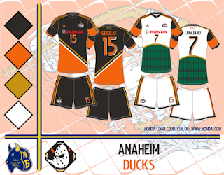
Anaheim Ducks Soccer Concept
Up points: The dark uniform is nice! The stripes is well placed that doesn't interfere with the numbers, and sponsor logo.
Down points: The white uniform is alright but I felt it belongs in the alternate. I feel that the white should have the same treatment as the dark uniform.

Well there go this post is done! come over here Sunday for my concept, til then later.


Saturday, 11 April 2015

Concept contributor: Fast lane to the Playoffs!

Howdy everyone, Alan here for my first post of April, and the last day of the NHL season. Today we got a concept from a contributor, now I know you’re thinking, is it from Ricky? It’s it from Jake? No! This one came from Jared L. one of rising concept artist seen from HJC. This concept he send to me base on one of my all-time favorite Sonic the Hedgehog series, Sonic SatAM! Let’s check it out shall we.

Up points: This jersey has Stadium Series with 90’s vibe written all over it. The numbers, and nameplate fonts is different but fits the theme very fine. Like the design of the jersey. Lastly love the logo period.

Down points: The TV numbers, the nameplate, and the “C” doesn't have the same trim treatment as the numbers on the back of the jersey. I feel like the front numbers doesn't need to be there. The socks I’m not a fan of vertical stripes, I feel the stripes should be horizontal. The pants colors doesn't match with the jersey, I prefer the pants blue with red, grey, and lime green stripes down the side of the pants. Some lines are on top of the outer lines of the jersey. Lastly even thou I like the design but the yokes on the back of the jersey does not match with the yoke on the front.

Overall: Good concept with some issues with the stitching, stripes, and the equipment we’ll get our self a winner.

Well today post is done, there will be no more concepts to be posted until the end of this year NHL playoffs. Until then, later see you all here again for the “Playoff Pickz!”

Monday, 28 April 2014

Concept Contributor: Going green

Hello I'm Alan, I'll get elbow to my head, so you don't have to. It's been weeks since the last time I did a Concept Contributor post, so let's get on with the concept.

Celtic FC concept [by Ricky]
Up points: For a concept base on a Scottish Football (soccer) club, it's a good looking concept. The stripes is nicely placed. The fonts fits with this concept very well. The Celtic patterns are awesome!
Down points: the bright green color doesn't seem look right to me.
My suggestion: Make the bright green on all of them to normal green like on the white jersey.

Well, today's post is in the books. Hopefully round 1 be done later this week so I can do my review of that round including my round 2 picks, until then later.