Showing posts with label OHL. Show all posts

Saturday, 16 April 2016

AJH HJA 5th anniversary: Champion

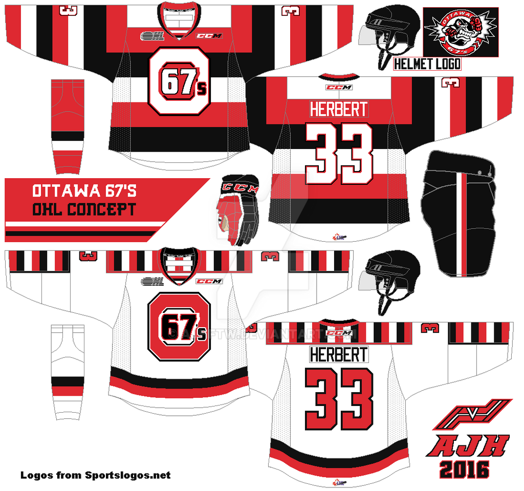
Hello everyone Alan here, today is the day my 5th anniversary post! It was on this day 5 years ago I made my first post, it was just me welcoming you all to my site, and I found it ironic that my first post would lead me to over 300 posts in five years let alone made so many concepts but 1 would win my first HJC COTW! When 1st saw that post I couldn’t believe it, until 6 refresh page later it was for real that win mean so much to me. Just when I thought it was over later on that month I won the COTY May! It blew my mind away winning the COTY month it was a moment I really never forget. But my Cinderella story came to an end when I lost the COTY 2nd quarter round, but in the end I enjoy the ride and cherish it, today is the Ottawa 67’s!

Here’s my COTW concept.

Now almost 3 years later here’s the new Ottawa 67’s concept.

On the dark jersey I change up the barber stripes order. On the white jersey I made a gap on the vertical barber stripes. I use the Dallas Stars current numbers font witch fits with the concept well to my taste.
Well this post is done, but question what is this surprise I talking about? The answer, this post is part 1! That’s right this 5th anniversary has two parts, this one and next Saturday, believe it or not next Saturday marks the 5th anniversary of my first concept post and what way to celebrate it with you guess it, a concept. Until then see you all next Saturday.

Saturday, 19 December 2015

Colt 2.0

Hi everyone Alan here for another post here at AJH HJA. Today is a OHL team that I made 3 three years ago, after that I thought I would never do it again until HJC had a contest and I can't help it but to do a concept of  that team again, today is the Barrie Colts.


Simple stripes on the arms, hem, sock, and even on the side of the pants. Added cuffs to the wrist, red on the blue jersey, and blue on the white jersey. Standard block font for both numbers, and nameplate. The main crest is indeed the team's Secondary Logo but recolored by me. Lastly the shoulder patch logo (also for the helmet as well) made by me with a small improvement.

HJC Feedback

And so the post is in the books, come over Sunday for my last concept post of 2015, til then later.

Sunday, 15 March 2015

Lone Contributor: A shocking post

Hello I'm Alan, I'll get elbow to my head, so you don't have to. It's been over a month since the last time I post anything here on this site, I admit that I have lack the feel of posting stuff on this site, mainly with a lot stuff  I've been busy outside the concept world so much that every time when the days is done I don't got anything left in me to do. So I pretty much got lazy in making concepts. I mean the last time I made a concept from scratch was back in November, until late in February a contest from good old HJC that got me back on track, I'll try to get them set up to be posted here! But for now I got some rants, and a concept contributor!

3 way relocation move news!

Alright people try to follow me on this one, it's a brain scrambler one. First the Winnipeg Jets officially announced that they are relocating the St. John's Ice Caps to Winnipeg. This is a surprise to me but 2 things. Number 1 I felt like they miss the boat on this one, I understand that there is a slow progress going on with the arena deal in Thunder Bay and all, and number 2 I felt like they could have move the team anywhere in Saskatchewan, that province is screaming AHL Market right there. Now the next question is will they be called the Manitoba Moose again? Most likely in my opinion, hey it didn't stop the Dallas Stars AHL team being called the "Texas Stars" so why not? might as well.

With that St. John lost one AHL team, but they gain a AHL team. The Montreal Canadiens will move their farm team the Hamilton Bulldogs to St. John's. Word is they'll still be named the Ice Caps, unless the Jets has something to say about that, or they will let this one slide with this whole Laval Quebec arena thing in progress that could be the Habs farm club's main home in the next two years.

Then came the shocker that I did not see it coming! With Hamilton no longer have a AHL team, so they went down a level to the OHL, with rumors that the Erie Otters moving to somewhere unknown, and the Plymouth Whalers moving that ended up going to Flint next season. In stand the former AHL Hamilton Bulldogs owner purchased and got approved by the OHL to move the Belleville Bulls to Hamilton to be called of course the "Bulldogs" this one a shocker to me because this team is well story team with a lot of history for this team, but sadly it make sense because the city can't put good money into getting a brand new arena, that city deserve a new arena, not seeing their beloved team moved.

Now that I got my rant fix time for a concept contributor.

Stockton Thunder Concept [by Jake88]
With Stockton getting themselves promoted from the ECHL level to the AHL level this could be perfect for the team, if not a good alternate jersey.
Up points: Yellow fit this team very nicely. The design on the jersey is good. Lastly liking the bolts stripe on the arms is a nice touch.
Down point: Grey is good but I felt that this jersey could look better without grey mostly trim around the numbers, it looks blended with the yellow.
My suggestion: Replace the grey with white, and add white on the hem to give that eye popper effect!

Well that's today post. Hopefully I can get the chance and feeling up to post more stuff here! Til then I'm Alan, I'll get elbow to my head, so you don't have to.

Saturday, 30 August 2014

Summer of Concept Contributor: The Finale!

Hello I'm Alan, I'll get elbow to my head, so you don't have to. Today marks the last week of  "Summer of Concept Contributor," and marks the 25th concept contributor post! This week contributor is a contributor that start it all, it was back in 2012, he is Steven G from SG-94. This link was the first concept contributor post featuring Steven. Now this time is Steve G send me a concept base on my favorite OHL team the London Knights.

Up Points: The stripes on both dark, and white are placed right. Love the addition of stripes at the end of the yoke on the white jersey. Nice call on the numbers and nameplate fonts. Lastly even thou I preferred the modern Knight logo, but the way the jersey was put together nicely to help the old school logo look good.
Down Point: The number fonts is a good choice but 1 trim around looks too plain to me.
My Suggestion: Add one more trim around the numbers, add green to the collar on the white jersey.

Well with this post done means the "Summer of Concept Contributor" is over, hope you all enjoy the rest of the summer, as well I would like to thank everyone who send their concepts to me to make this happen. Thank you guys! We will be going back to our normal posts hopefully soon, until then I'm Alan, I'll get elbow to my head, so you don't have to.

Thursday, 10 April 2014

Chatham-Kent Roadrunners concept

Hello I'm Alan, I'll get elbow to my head, so you don't have to. On my April fool's day post I got an Roadrunners concept and said my hometown is getting an OHL team. Well it's just a April fool's joke, but it was good idea. I present to you all the concept that I made for not only for my April fool's day post, but also as part of the HJC's Roadrunners contest, the Chatham-Kent Roadrunners concept.


I use the same template as my Windsor Spitfires concept, but on my horizontal stripes there is 3 small stripes on it. The nameplate is the Winnipeg Jets fonts, and the numbers is the Anaheim Ducks font without the tip in the end. The shoulder patch was originally going to be the main logo but I chose to keep it as a shoulder patch. The main logo is base on a old minor-pro, yes I said it a minor-pro hockey team in my hometown called the "Chatham Wheels" this team came from a league called Colonial Hockey League witch later became United Hockey League, and then became the International Hockey League witch it close it's doors after 2009-2010 season. As for the Chatham Wheels that team didn't last long, after 2 seasons, even fresh off being in the finals the team moved Saginaw to keep the Wheels name for only 2 seasons until renamed themselves to the Lumber Kings, then the Gears, and then move to Ohio keeping the Gears name for only 1 season until the ownership were forced to dissolve and cease operations.

HJC Feedback

 Well that is the post for today, next week I'll post some more concepts later on this month, until then I'm Alan, I'll get elbow to my head, so you don't have to.

Tuesday, 1 April 2014

2014 Jersey News!

Hello I'm Alan, I'll get elbow to my head, so you don't have to. Well I got some eye catching news to share with you all that could be for real, let's check it out.
 
Anaheim Ducks revival their new alternate jersey.
After months of rumors, the Ducks can happily report that this November the Ducks will hit the ice with there new alternate jersey. Base on the team's first ever alternate jersey that last only 1 season, the team decide to give the "wild wing" a second chance, but with some more orange. The fans will be happy to see these alternate on the ice then the rumored Stadium Series jersey.

OHL expanded to Chatham-Kent
After years of wait, my hometown got themselves  a OHL hockey club named the "Chatham-Kent Roadrunners. As part of the OHL big expansion plan that expanded from 20, to 24. With the buzz around the new club reviled the team's jersey set before they debut in 2015.
The team use maroon as the team's main color, followed by gold, and black. The logo is base on a Colonial Hockey League team (witch later became the United Hockey League 1991-97, and became the International Hockey League 2007-2010) the Chatham Wheels that last only two season (1992-1994.) The owners believes that the city of Chatham deserve an OHL team, witch will help not only the city grow, but also help the OHL grow too.

Canucks new alternate jersey for 2014-15 season
The Vancouver Canucks announced that they are replacing the team's 3rd jersey with their new 3rd jersey for 2014-15 season. Today the team reviled their new jersey.
Base on the team's first alternate jersey in 1996 recolored to the team's current included the addition of dark blue. The team put the skating Johnny Canuck logo on the front as the team's main logo for the alternate jersey. The 3rd jersey will hit the ice in December 2014.

Swift Current Broncos new special event jersey
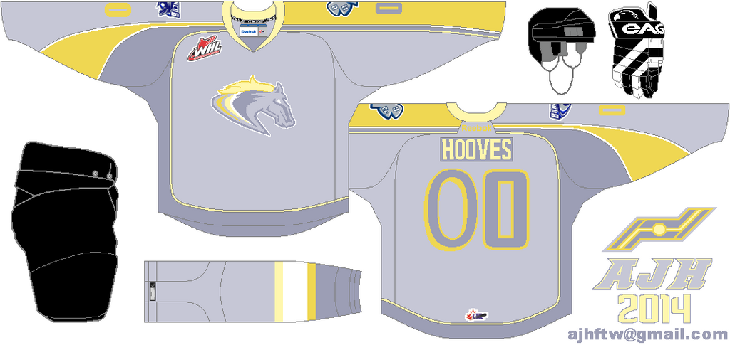
The WHL's Swift Current Broncos have reviled their new special event jersey. for the first time in two years the team decide to bring back the "My Little Pony" night, but instead of choosing any 6 jersey, they got only 1 to see it in action, and it's in titled "My Little Pony's Derpy Hooves" night.
Using the old 2009 NHL all-stars game jersey, using different fonts on both the letters, and numbers. Lastly using  the colors of Derpy Hooves.

Well that's all the news I got for you all hopefully I get some concepts put together later this month. Until then have a nice "April Fool's Day" later.

Anaheim Ducks concept, and the Vancouver Canucks concept made by Ricky M.
Chatham-Kent Roadrunners, and Swift Current Broncos Special event concept made by me.

Sunday, 30 June 2013

Kitchener Rangers concept

I decide to try to make the Rangers more "Kitchener" then "New York" with some simple moves, change the "Rangers" word mark with the soldier-head logo as the team's main crest, with a shoulder patch made by me. The alternate jersey is pretty much putting the "Rangers" word mark and the fonts on the Pens winter classic jersey only thinning the stripes that represent the 5 decades that this club been around. The colors on the home and road are navy, red, and light silver, the alternate jersey colors are royal blue, and red. The nameplate font on both home and road are the Nashville Predators current font, while the numbers are standard block, as for the alternate jersey it's the Rangers fonts.

Well that's the month of the rest of my OHL redesign quest hope you all enjoy this month, until then later.

HJC Feedback (Home and Road only) 
HJC Feedback (Alternate only)
Jake88 Feedback (Home and Road only)
 SG_94 Feedback (Home and Road only)

Wednesday, 26 June 2013

Plymouth Whalers Concepts

This concept was my first draft before my final look. I use the Connecticut Whale wave stripe and multiple on both arm and hem stripes to form their classic look (that also worn by the Hartford Whalers!), the only thing I felt that this concept didn't work for me was the Preds collar, it was a good idea at first, but after putting it on it's just seem didn't work for me.
This one is my final draft, I use a simple collar on this concept and it looked a lot better then the first draft. The colors are navy blue, grey, and green. The nameplate is Anaheim Ducks fonts, the numbers are also the Ducks but I took the pointy end off the numbers.

HJC Feedback 
BNG Feedback

Friday, 21 June 2013

Niagara IceDogs Concept

This jersey is pretty much simple modern Reebok cut my way. Do you see a striking resemblance? If you don't let me take you there.
The jersey got the side stripe from top to bottom, with normal arm stripe. The main crest I decide to clean it up a little... Well a lot O.K. I turn all the grey colors on the crest black turn the crossbones into the letter "N", and made the stripes on the dog look like the jersey. Add the crossbones logo as shoulder patch. Use red as main color with black, and grey. The fonts on the nameplate is the Avalanche font, with standard block for the numbers.

HJC Feedback

Saturday, 15 June 2013

Sault Ste. Marie Greyhounds concept

The current set the hounds got is classy but dull to me so I give some more live by using their current alternate jersey with some tweaks to it and "Ta-Da" here you go. The stars that they always have in front of the jersey I added trim around it to give modern feel to it. The colors are red, black and silver, and the fonts (both numbers and letters) are Pittsburgh Penguins fonts.

HJC Feedback

Tuesday, 11 June 2013

Saginaw Spirit Concept

I'm not going to lie, but I like the vertical piping on the jerseys, but one those that goes away from the collar, I fine with that and to me it's more creative then vertical piping from collar down.
On this concept got vertical piping that got complete around, add thin stripes on the arms follow by 4 thick stripes also on the arms, two thick lines and one thin line on the hem. The colors are blue, red, silver, and white. The numbers font is standard block, while the nameplates is the Avalanche font.

HJC Feedback 
HCI Feedback
BNG Feedback 

Friday, 7 June 2013

Owen Sound Attack concept

The Attacks current set is O.K. but making the Red as the main color is boring so I redesign the whole works! These jerseys got odd stripes and two thin stripes on the arms and hem, add three stripes on the yokes, and removed the "Owen Sound" wordmark off the bears head and made it big, not too big just right. Black is the team's main color follow by red and gold, and both the NOB and numbers fonts is the Vancouver Canucks.

HJC Feedback
HCI Feedback

Tuesday, 4 June 2013

Peterborough Petes concept

On the home and road jerseys pretty much classic stripes. I replace the side stripes with the hem that got two thin lines and one thick line. I use the team old T.P.T. Petes logo put the Petes main logo on top of it and here's the team main logo. The nameplate font is Winnipeg Jets, while the numbers are the Oilers old alternate from 2001-2007. The alternate is a simple jersey, with a little tweaks on the main crest, and add black and gold on it, with standard block on both nameplate and numbers.

HJC Feedback (Home and Road only)

Saturday, 1 June 2013

Ottawa 67's Alternate redone

Hi everyone it's June and as promise all this month will be nothing then OHL concepts, the rest of my "OHL Redesign Quest" that's right people, so let's not waste time and get things rolling with a fix on my Ottawa 67's Alternate jersey.

The only thing I change on this one is the main crest. from my first time it was barber stripes on the "O", after weeks and looking at the 3rd jersey I decide to change it so I made the "O" one solid color and that's all just the main crest, everything else is the same.

HJC Feedback

Saturday, 27 April 2013

Oshawa Generals Concept

This Concept is almost the same as their current set only squeezing the stripes together and curve them slightly for the Reebok effect feel to it, the only stripes that is straight is the yokes, the socks, and the side of the pants, two different shoulder patch is added on this concept, one was the Bruins theme crest, and the other is the "Honor and Tradition" patch and lastly made the helmets half Red and Blue like the old days before they made it one solid color.

HJC Feedback

Monday, 22 April 2013

Ottawa 67's concept

On this concept I modernized the main crest with the Ottawa Sens old fonts from 1997-98 to 2006-07, the home jersey is pretty much like their current look only thing I did is adding black on the shoulder yoke, the road I keep it simple with barber stripes on the yokes, and lastly the 3rd is the Sens current 3rd instead of Vintage White it's Dark Silver with barber stripes on the main crest.

HJC Feedback (Home & Road only)
BNG Feedback (Home & Road only) 

Tuesday, 16 April 2013

2 Year Anniversary All Rant Post

Hi everyone, today this site is two years old, wow I never thought I would be still doing this, but guess what, I am still doing it and this blogger is going strong. I decide not to post a concept on this post but instead I am posting some of my rants about hockey, now before we get to the rants here's some of my updates on stuff I'm working on.

Right now I'm getting close in finishing my OHL Redesign Quest I'm down to 5 teams, Witch it's a big thing for me because I never ever complete a whole league only hand picked teams I choose that need a new looked, so hopefully I can get the rest of the OHL teams done.

With the NHL back on track and the Playoffs pretty much coming around the corner I will be doing my "NHL Playoffs Pickz" again on this site hopefully I won't go off the track like last year not doing the 4th round picks, so keep your eyes on that.

Now with that on to my rant.

My Town getting a OHL Team?
On my big rant I did was me talking about my town Chatham, Ontario. Are trying to get a new arena to bring in a OHL team. Ever since the news that the Brampton Battalion are relocating to North Bay after the 2012-2013 season everyone talked and blogging about why Chatham should get a OHL team
 well you can check out my rant about it here, Well last week there's a "leaked report", yes you heard me right a "leaked report" that tick the City Council off in a big way that said a OHL team from a current city that is remain unnamed has a big intrust in my town. However according to the OHL office they are intrust in Chatham but they aren't going gun-ho right off the bat they will however keep in tap with Chatham to see how this goes through.

NHL Realignment Change
Coming 2013-2014 season all the teams in the NHL will be p/7ut back in 4 divisions instead of 6, witch is a good thing because there always that third division getting the title and the 3rd seed spot while having points lower then the 4th to even an odd 6th seed team. It'll be a wise move to do that and with the rules of the top 4 in each division goes to playoffs it'll be much intrusting to see any former 3rd seed division winners can get to the playoffs.

Phoenix Coyotes Year 5?
Once again the Coyotes still owned by the NHL, the Coyotes attempt of getting a new Owner fell apart once again, and once again Gary Bettman is still has the confides that their will be a owner that willing to buy the team and keep them in the desert. All I can say is Bettman better hurry up because I heard reports that some current NHL owners (Bettmen bosses) are getting a little sick and tired of keep paying big bucks for the Coyotes losing more money as a usually, indeed you all can say that place is big market but it's "How you use the Market Right" and sadly this market is still not working I can understand the NHL Owners not happy with this problem this can't last forever they need to move them, even if you do have a owner that can buy the team and keep them in the desert, how long will that last?

Brampton Battalion 2.0?
With the Battalion OT elimination in the 1st round of the OHL playoffs the team is moving to North Bay for not just for the 2013-14 season, but also marks the return of North Bay OHL Hockey. Keeping the name and the colors. I saw their new logo on CCSLC Forum the only thing they change is adding the "North Bay" wordmark above the logo. I like the idea of keeping the Battalion name and all, but can't they change the logo, or at least the colors errr... Because the Olive Green color is pretty much took it's course they need a new color, and even a new logo, now the next question is "are the uniforms going to be the same?" well one way to find out is we'll wait and see.

 Oilers New Arena
The City of Edmonton has approved on building an brand new arena, all I can say is I felt it should had that deal done sooner but the Oilers owner had to be a pain in the ass and ask the city for tax payers funds to even claiming that if he does not get his way he'll move the team witch it's a dumb move to my mind, yeah I know I made a rant about this stuff before and I do admit I went off the deep end and all, but you went come to claiming that if you don't get what you want, you'll get a threat of rising ticket price to even moving the whole team to different City, it was a slap in the face, I mean really you're thinking of moving a team out of a good market city just a snap of the finger like that, not a very good idea, but in the end they work it out and not only the Oilers will get a new arena, but also will benefit the City as well.

Well their you go, that's my rant. I got only 2 more concept set and squeeze the schedule between now to the last game of the season and after that it's playoffs time!

Until then.
Just Maybe?
Just Enjoy!

Friday, 22 March 2013

Mississauga Steelheads Concept

Mississauga will become the only Toronto area team ones the Brampton Battalion moves to North Bay witch it's sad because 15 years ago Toronto area had 3 teams. Mostly the city itself went through 3 different names from the "Mississauga Ice Dogs" witch that team was sold and moved to Niagara, to the "Mississauga St.Mikes" witch the the St.Mike school got their name back, and Finally the Steelheads. Let's not waste time "On to the Concept!"
I decide to make it original for the Steelheads with the Maple Leafs feel to it, curve the arms and the hem stripe, two thins, one thick stripe (Just like the Maple Leafs current 3rd). I fix the "A" on the main crest to make it look like the letter "A" more then having a maple leaf on it. I was debating on whether I should keep the piping or not, but meh go for broke on it maybe a quick fix will do before I sent this bad boy.

HJC Feedback

Sunday, 17 March 2013