

Showing posts with label Winnipeg Jets. Show all posts
Showing posts with label Winnipeg Jets. Show all posts
Tuesday, 1 October 2019
Sunday, 21 October 2018
NHL Adidas Nightmare Concept: Winnipeg Jets
Hello, Alan here for more concept here at AJH HJA. Remember the Atlanta Thrashers? Well believe it or not they were a team from 1999 to 2011 before they move to Winnipeg to become the Jets. The Reebok edge the Thrashers wore was a nightmare the road was a mess, and the home should’ve stayed as an alternate form during the CCM/KOHO era jersey.

On the powder blue jersey, I use silver over gold, replaced
the “ATLANTA” with “WINNIPEG” down the one side of the arm, used a little bit
of red on the jersey, and lastly use the Jets current logo minus the maple leaf
and just use the word mark logo on the shoulder. The white jersey pretty much
nothing to say just replaced a pipping that connects from the collar to the
armpit with a thin hem stripe.
Well, this nightmare series is getting more scarier as
we hit Halloween, so come back next week, later.
Saturday, 9 June 2018
NHL Adidas Concept Extra: Winnipeg Jets
Howdy everyone, Alan here for the last NHL Adidas concept extra here at AJH HJA. This week is the Winnipeg Jets.
But before we get to them I would like to congratulate the Washington Capitals on winning their "first" ever Stanley Cup in 5 games! (Yeah let that one sink in.) Also to Alexander Ovechkin winning the Conn Smythe as playoff MVP.
I would also like to give a congratulation to the Vegas Golden Knights on a grand first season they put this year, really gave everyone a surprise they'll never forget.
Now that out of the way on to the Jets.
But before we get to them I would like to congratulate the Washington Capitals on winning their "first" ever Stanley Cup in 5 games! (Yeah let that one sink in.) Also to Alexander Ovechkin winning the Conn Smythe as playoff MVP.
I would also like to give a congratulation to the Vegas Golden Knights on a grand first season they put this year, really gave everyone a surprise they'll never forget.
Now that out of the way on to the Jets.

As you can see it's the same jersey design but a different logo. The Jets current jet inside the logo is replaced by a jet with a "W" on it made by me.
Well nothing much to say any more about it, see you all next week.
Saturday, 28 April 2018
NHL Adidas concept: Winnipeg Jets
Hi everyone, Alan here for the final week of my "NHL Adidas series" and what better way to finish it off with my favorite team the Winnipeg Jets!
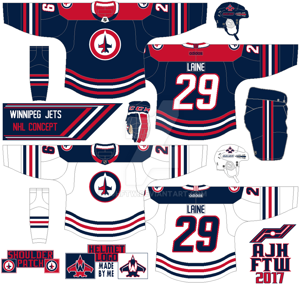
The design is based on the team’s WHA days with modified yoke. Removed the maple leaf off the logo and recolor it for both front of the jersey and on the shoulder. The helmet logo is made by me a different form jet with a “W” on top of it. Lastly, I kept the team’s current font to make this concept complete.
HJC Feedback
Well this series is in the books, yes there were scores from 7 to close to 5 from HJC, to a shocking first COTW win since May 2013. In the end, this was a ride I'll never forget, I went through busy schedules, to fan requests, to the passing of my grandmother, but I did it.
That's all for now, see you next week for my NHL Adidas concept extra! Until then, later.
Well this series is in the books, yes there were scores from 7 to close to 5 from HJC, to a shocking first COTW win since May 2013. In the end, this was a ride I'll never forget, I went through busy schedules, to fan requests, to the passing of my grandmother, but I did it.
That's all for now, see you next week for my NHL Adidas concept extra! Until then, later.
Saturday, 16 August 2014
Summer of Concept Contributor: Got some blues?
Hello I'm Alan, I'll get elbow to my head, so you don't have to. The "Summer of Concept Contributor" heart is still beating this week, Joey returns with "TWO" St.Louis Blues concept! Let's get to it.
St.Louis Blues Concept [by Joey F.]

Up point: The logo looks pretty good without the red. using the stripes base on the team's old 90's set is a good idea. The colors are blue, and yellow is a wise pick. The yokes are square but well put together and the Blues main logo as the shoulder patch save this concept.
Down points: the stripes the arms is placed way too low. The numbers is too plain to me without trims. On the road white and yellow just doesn't sit well with me. Lastly on both of them has no stitching on the jerseys, it feels less real, and more just put together without taking time to put it together nicely.
My suggestion: rise the arm stripes up more, add trims around the numbers, and on the road switch the yellow, and blue to make it road look good. Lastly don't forget the stitching.
St.Louis Blues concept [by Joey F.]
 Edited by Joey, he removed the arm stripes and put gradient style on the arms from blue to navy blue on the home, and from blue to white on the road, he also add it on the bottom side of the jersey for good measure. I felt the he should do the same on the yokes and add some yellow to the arms.
Winnipeg Jets Concept (Jake88)
 We are jumping from blue and gold, to blue and red!
Up points: Love the stripes on the arms, and the shoulders and the way to use the Flyers like arm template on it that made this concept an eye popper. Nice choices on the fonts for the numbers, nameplate, and even the captain patch too! Using the logo made by Brian Goff made this concept almost complete.
Down points: I like the idea of the maple leaf on the back of the jerseys, but with the numbers on top of it made look too busy to me. both the wrist stripe and hem stripe on the dark jersey look plain to me.
My suggestion: give both the wrist stripe and hem stripe on the dark jersey the same treatment as the hem stripes on the white jersey instead of blue make it white. I know this may torn everyone hearts but I say remove the maple leaf off the back of the jersey.
Another post done, but we got more to go next week until then I'm Alan, I'll get elbow to my head, so you don't have to.
St.Louis Blues concept [by Joey F.]
Winnipeg Jets Concept (Jake88)
Up points: Love the stripes on the arms, and the shoulders and the way to use the Flyers like arm template on it that made this concept an eye popper. Nice choices on the fonts for the numbers, nameplate, and even the captain patch too! Using the logo made by Brian Goff made this concept almost complete.
Down points: I like the idea of the maple leaf on the back of the jerseys, but with the numbers on top of it made look too busy to me. both the wrist stripe and hem stripe on the dark jersey look plain to me.
My suggestion: give both the wrist stripe and hem stripe on the dark jersey the same treatment as the hem stripes on the white jersey instead of blue make it white. I know this may torn everyone hearts but I say remove the maple leaf off the back of the jersey.
Another post done, but we got more to go next week until then I'm Alan, I'll get elbow to my head, so you don't have to.
Friday, 14 February 2014
The Big 200th post!
Hello I'm Alan, I'll get elbow to my head, so you don't have to. Welcome to my 200th post here on AJH Hockey Jersey Art! We got concepts by me, concepts from an contributor, and some other stuff right here all in one post. Let's not waste time and get things going shall we.
From my September 30th post I made prediction for the 2013-14 NHL season, and as promise (well I promise myself even thou we're on Olympic break) I give you my mid season prediction.
Here's my prediction from Sept 30th post.
* = division winner, # = Top 3 draft
Eastern
1. Pittsburgh*
2. Detroit*
3. Boston
4. Philly
5. Montreal
6. NY Rangers
7. Columbus
8. Toronto
9. Washington
10. NY Islanders
11. Buffalo
12. Carolina
13. Tampa Bay
14. Ottawa
15. New Jersey#
16. Florida#
Western
1. Chicago*
2. L.A.*
3. St.Louis
4. Anaheim
5. Vancouver
6. Minnesota
7. Edmonton
8. San Jose
9. Winnipeg
10. Dallas
11. Phoenix
12. Nashville
13. Colorado
14. Calgary#
Now here's my mid season prediction on how it'll look like at the end of this season.
* = division winner, # = Top 3 draft, % = wild card teams that could have a chance of getting in the playoffs.
Eastern
1. Pittsburgh*
2. Boston*
3. Detroit
4. Montreal
5. NY Rangers
6. Tampa Bay
7. Columbus%
8. Philly%
9. Toronto%
10. Washington%
11. NY Islanders
12. Ottawa
13. Carolina
14. Florida
15. New Jersey
16. Buffalo#
Western
1. Chicago*
2. Anaheim
3. L.A.
4. St.Louis
5. San Jose
6. Vancouver
7. Minnesota%
8. Colorado%
9. Dallas%
10. Nashville%
11. Phoenix
12. Winnipeg
13. Calgary#
14. Edmonton#
Now to the concepts
Team Canada Concept (Olympics Version) [by me]
 Just like my other Team
Canada concept only different is the main logo. Simple stripes on the hem, the socks, and on the side of
the pants. Simple stripes on the arms with a maple leaf cut off the end
of the middle stripe. The logo of team Canada with the classic word
mark from their alternate logo. The numbers, and nameplate are standard block.
HJC Feedback
SG-94 Feedback
Winnipeg Jets Alternate Concept [by Ricky M.]
 Up points: Nice combination of pieces, well put together, even thou the jersey were made from Thrashers old Reebok set. Using the team's word mark logo as the main logo is O.K with me.
Down points: Fonts on both numbers and nameplates made doesn't fit this jersey to me. Red as the main color doesn't suit my taste at all.
My Suggestion: Change the fonts, and switch the red with blue.
Creighton Blue Jays NCAA Concept [by me]
 This was an recolored version of my Boston Bruins concept. I felt that this template would fit the blue jays very well.
HJC Feedback
Stadium Series Anaheim vs LA concept [by Ricky M.]
 Anaheim
Up points: The jersey got hem stripe on this one then the official one that doesn't. Numbers on the back isn't stretched, witch it's a good thing. Using the shoulder patch from the team's alternate set was a wise choice.
Down points: Gold color under the arms is not my cup of tea. No stripes on the pants makes it too plain, and almost ruin the jersey.
My Suggestion: Change the gold to orange, and add stripes to the pants.
L.A.
Up points: Nicely done on the stripes, the team's old logo that was main crest from 1998 to 2002, and as shoulder patch from 2002 to 2011 is on this one is surprising, and an good choice to my taste.
Down points: Despite there is purple on the jersey, but I felt that this needs more on this jersey. Just like the Ducks pants no stripes.
My Suggestion: More purple on the stripes, and collar. Add stripes on the pants.
Stadium Series Rangers, Islanders, and Devils [by Ricky M.]
 NY Rangers
Up points: Using the lady liberty logo was an awesome idea to do! Red as the team's main color really made the jersey pop in a good way.
Down points: The blue under the arms, blue helmet, and blue socks are the 3 things that is keeping the look from near perfection.
My Suggestion: Make the stripe under the arms, blue helmet, and blue socks red!
New Jersey
Up points: The jersey design is well tamed, the stripes on both arms, and hem is well put. The yoke is well modern with some classic feel to it.
Down points: Red stripe under the arms. Black on the logo, and pants throws the jersey way off!
My Suggestion: Switch the black on the logo, and the pants to green. Turn the arm stripes from red to green.
NY Islanders
Up points: Orange is the best choice as the main color follow by navy to put an nice touch. Yes there navy blue stripe under the arms, but with cuffs on the wrist make sense to me. The stripes is well made.
Down points: Aluminum silver ruins it of what could be a perfect Stadium series jersey. The sock stripes does not match the stripes on the jersey.
My Suggestion: Lose the aluminum silver, and give the sock stripes the same treatment as the stripes on the jersey.
And lastly I got link here, it's to my banners I made in honor of contests I won including my first HJC's COTW!
Well that's today big 200th post! I hope you'll enjoy it may not be a big post that you all expect, but should be good enough. There will be more post coming but slow, I'm pretty much busy with work to even posting for HCI. Until then, I'm Alan, I'll get elbow to my head, so you don't have to.
Team Canada Concept (Olympics Version) [by me]

HJC Feedback
SG-94 Feedback
Winnipeg Jets Alternate Concept [by Ricky M.]
Down points: Fonts on both numbers and nameplates made doesn't fit this jersey to me. Red as the main color doesn't suit my taste at all.
My Suggestion: Change the fonts, and switch the red with blue.
Creighton Blue Jays NCAA Concept [by me]

HJC Feedback
Stadium Series Anaheim vs LA concept [by Ricky M.]
Up points: The jersey got hem stripe on this one then the official one that doesn't. Numbers on the back isn't stretched, witch it's a good thing. Using the shoulder patch from the team's alternate set was a wise choice.
Down points: Gold color under the arms is not my cup of tea. No stripes on the pants makes it too plain, and almost ruin the jersey.
My Suggestion: Change the gold to orange, and add stripes to the pants.
L.A.
Up points: Nicely done on the stripes, the team's old logo that was main crest from 1998 to 2002, and as shoulder patch from 2002 to 2011 is on this one is surprising, and an good choice to my taste.
Down points: Despite there is purple on the jersey, but I felt that this needs more on this jersey. Just like the Ducks pants no stripes.
My Suggestion: More purple on the stripes, and collar. Add stripes on the pants.
Stadium Series Rangers, Islanders, and Devils [by Ricky M.]
Up points: Using the lady liberty logo was an awesome idea to do! Red as the team's main color really made the jersey pop in a good way.
Down points: The blue under the arms, blue helmet, and blue socks are the 3 things that is keeping the look from near perfection.
My Suggestion: Make the stripe under the arms, blue helmet, and blue socks red!
New Jersey
Up points: The jersey design is well tamed, the stripes on both arms, and hem is well put. The yoke is well modern with some classic feel to it.
Down points: Red stripe under the arms. Black on the logo, and pants throws the jersey way off!
My Suggestion: Switch the black on the logo, and the pants to green. Turn the arm stripes from red to green.
NY Islanders
Up points: Orange is the best choice as the main color follow by navy to put an nice touch. Yes there navy blue stripe under the arms, but with cuffs on the wrist make sense to me. The stripes is well made.
Down points: Aluminum silver ruins it of what could be a perfect Stadium series jersey. The sock stripes does not match the stripes on the jersey.
My Suggestion: Lose the aluminum silver, and give the sock stripes the same treatment as the stripes on the jersey.
And lastly I got link here, it's to my banners I made in honor of contests I won including my first HJC's COTW!
Well that's today big 200th post! I hope you'll enjoy it may not be a big post that you all expect, but should be good enough. There will be more post coming but slow, I'm pretty much busy with work to even posting for HCI. Until then, I'm Alan, I'll get elbow to my head, so you don't have to.
Wednesday, 7 November 2012
Jet(ting) with some concepts
The day has come my brand new Winnipeg Jets concepts


Just in case if you'll don't remember I made this concept last year (uh don't let the date on the post fool you ha ha ha) on this the changes I made was pretty much more Reebok standards then my old one I removed the arrow vertical stripe from the hem both front and back, on the back of the jersey the vertical stripe that goes across now cut off to give that Reebok standards, made two stripes on the wrist to match the hem, I also add the Jets current main crest minus the maple leaf as shoulder patch, and finally the main crest itself it's the same as my old concept gave it a different color placement as voted by you all, I was thinking about filling the word JETS with different colors the more I look at it the more I think I'll keep it that way until it hit me a different shade of white I had on the cockpit area, so I use it and it look perfect and thus my new Jets concepts.
HJC Feedback
HJC Feedback

Oh just for fun I decide to do the same Jets concept on Uniforms dot com template.
It's pretty much the same as the old one only made some tweaks just to fit the template, but this one really gave me the inspiration to redesign my Jets concept.
So there you have it my Jets concept once I'm done adding some detail texts on my concepts it's ready to go! Unless you have a put in on it if not away I go.
Come by later this week as I'm posting another Top 5s this one is a you can call it a Remembrance Day/Memorial Cup theme Jerseys and believe me the Kitchener Rangers ain't the only team that has Remembrance Day/Memorial Cup theme Jerseys theirs others as well, you just have to wait and see until now.
Just Maybe?
Just Enjoy!
Saturday, 25 August 2012
Quick updates on some stuff
Hey everyone no concepts, nor a blog, just a quick update on things on what going on with this site.
1. I will not be sending any of my new concepts, but not forever just taking a break from it for now since HJC is going through some changes with the founder of the site is going be a father, so holding off of sending concepts check out the site on how it's fields out because sending a concept to impress one is one thing, trying to impress 5 people not an easy task because you don't know who going to review your concept, unless you made a concept that caught all 5 eyes then there's a good chance that you'll get a least a good feedback.
2. I'm still working on my AHL concepts projects, I guess I'll tell you what it this project is well let me tell you all, remember Anaheim and Tampa Bay switched there farm clubs, well I decide to do AHL Redesign/Rebrand Concepts, here's the low down I pick 1 AHL team and Pick 5 NHL teams at random to see what if a AHL team is affiliated with a different NHL team, Just for fun, so far I got 2 done only three more to go.
3. I extend my Jets logo poll till mid September because there's only 2 votes was made, so I decide to fix the options it's pretty much the same thing only one side got the navy blue background and the other white the logo is still the same.
So that's pretty much it for now until then.
Just Maybe?
Just Enjoy!
1. I will not be sending any of my new concepts, but not forever just taking a break from it for now since HJC is going through some changes with the founder of the site is going be a father, so holding off of sending concepts check out the site on how it's fields out because sending a concept to impress one is one thing, trying to impress 5 people not an easy task because you don't know who going to review your concept, unless you made a concept that caught all 5 eyes then there's a good chance that you'll get a least a good feedback.
2. I'm still working on my AHL concepts projects, I guess I'll tell you what it this project is well let me tell you all, remember Anaheim and Tampa Bay switched there farm clubs, well I decide to do AHL Redesign/Rebrand Concepts, here's the low down I pick 1 AHL team and Pick 5 NHL teams at random to see what if a AHL team is affiliated with a different NHL team, Just for fun, so far I got 2 done only three more to go.
3. I extend my Jets logo poll till mid September because there's only 2 votes was made, so I decide to fix the options it's pretty much the same thing only one side got the navy blue background and the other white the logo is still the same.
So that's pretty much it for now until then.
Just Maybe?
Just Enjoy!
Saturday, 11 August 2012
Two things became one, and the Quest for Redemption
Over 1 year ago there was a contest from Rick Gear that
caught my eye on, but the problem is I got no idea on witch template to go with,
but then I decide to make my very own by merging this template and this
together with adding some few stuff in it of my own into the "Pew Pew Laser" concept and (to my opinion) the most underrated template I’ve ever made,
sadly it didn’t become a winner but however this template would bring something
big in the future, and thus it did around the time the Jets was official in ink
as the Winnipeg’s new name I got on my computer and reopen the same template
that I used for the Rick Gear contest as I gave some tweaks here and there, to
comparing to the teams official color to my, but there’s one thing missing and
that is a crest the Jets current crest was O.K. but I felt like the crest won’t
fit the template to my taste, so I made a Jets crest around the same time the Jets crest was reviled, how the Logo was made you ask? Well let’s just say I went to
the next logical thing for inspiration creative idea, check out my Transformers
Collection! Mostly jets transformers from Jetfire, to Starscream (I got lots of
Starscream figures LOL) just looking at one of them that could be the right
shape for the Crest add a maple leaf and the letter “W” on it and “Ta-da” my Logo,
the feedback on it from HJC was O.K. but nothing over the top, as months went
by on September 6th the Jets jerseys was reviled and I know from the
top of my head I said to myself “this is not going to be easy!” so I decide to
change the logo a little, O.K. alot! So I replaced the maple leaf and the “W”
with the word “JETS” in front of the jet throw some tweaks here and there, and
throw the new crest on to my template together and here it is my Winnipeg Jets concept. I did have very good feedback on the concepts from HJC, but it was against
other concept that was better than my it was very tough to keep my head up high
that I know “YES” you made a very good concept, and yes indeed someone else’s
concept was the better one on that day. Well days ago I look through some of my
old concepts that I made over a year, yeah it been over a year but its years to
me the way time flies by, every time I look at my Jets concept that feel of
defeat still hits me, yeah of course I admitted I’m still bitter about it, but
the more I think about it, the more I want this concept to redeem itself witch
I decided to “update” my Jets Concept! I gave my Jets jersey template some
tweaks on it to make it something I like while keep it Reebok standards, but
the only problem is the crest that right my logo, I made some color changes, I
change the jet colors from silver and royal blue to silver and grey as for the
word mark and decal on the jet I’m a little stuck on I can’t decide on witch
one of the 3 colors to use as the main color on the crest while the 2 other
colors will be for the decal on the jet I got here to see which one is the best
to complete the Concept, the first the main color is Royal Blue, the second one Red, and the third is Navy Blue. The Poll is up on the corner of this page
to vote or comment down below the page, whatever floats your boat.
Here's my last years Crest to compere
Here's my last years Crest to compere

Until then that’s all for now.
Just Maybe?
Just Enjoy!
Tuesday, 21 February 2012

Saturday, 21 January 2012
Winnipeg Jets Concept

This is my Winnipeg Jets Concept, the logo of the jet with the word
mark in front of the jet is made by me, the jersey I try to mix with two Reebok edge cookie cutter design by using the Blue Jackets current set, and the Flyers old Reebok set. The colors is navy, royal blue, and red on
the jersey.
HJC Feedback
HJC Feedback
Monday, 24 October 2011

Subscribe to:
Posts (Atom)