Showing posts with label Fan Request. Show all posts

Sunday, 8 December 2019

Request to wish upon the Stars

Welcome back, everyone Alan here for some more concepts here at AJH HJA. With the 2020 Winter Classic is getting closer, everyone is going to see both the Preds and the Stars Winter Classic jerseys in action I'm just giving you a quick review of both of them.
Stars: Everything looks good, but the pants ruin it, and I know its part of Dallas hockey history and all but come on at least finish the perfection by making them green that's all I wish for.
Preds: From top to bottom works well for the Preds, including the shoulder patch is a nice touch.
Overall: Preds set is better than the Stars.

Now off to the Concept, actually it's a fan request concept by yours truely John O.
This one is based on the Dallas Stars classic star shape design that they used from 1998 to 2007 and it been used by many, and I mean "MANY" concept artists had used this design to death unlike theirs that is on a Reebok edge template I'm using the Adidas template so I can keep my mind at ease.

Classic star design, there are two different fonts on the back of the jerseys. The letters and the number 2 is J-LOG Rebellion Slab Sans Small Caps font, and the number 4 is J-LOG Rebellion Sans Small Caps font. The home and road jerseys are what it is along with a black 3rd jersey.
Same as the first one but with the team's current logo, shoulder patch, and colours.

Well, that's covers it sees you all next time on AJH HJA, later.

Friday, 26 July 2019

Request to celebrate.

Hi everyone Alan here for another post here at AJH HJA. 5 years ago on this day, I posted which later on to be now known as "Fan Request" started by John O. Since then there been numbers of requests, and I decided to celebrate with the very first concept that he requested is the Toronto Maple Leafs.

Here's the first concept from 2014.

As I look at this, I kinda felt that I can do it better so here's the 5th-anniversary edition of the Toronto Maple Leafs Fan Request concept.
On this Adidas template form, indeed the design is based on the Boston Bruins old home and road set that they had from 1995 to 2007. Unlike the past set the shows little silver, on this new set, I decided to step up and show some more silver to them; I even put silver on the Leafs primary logo and slap it on the white jersey. On the old set, the fonts were the Leafs old font that they used from 1997 to 2010 along with Anaheim Ducks old numbers fonts from 1997 to 2000. The new set was too good to put them on so I replaced both letters and numbers with J-LOG Rebellion Slab Sans Normal font, and I got to say I like them way better than the old set in my opinion.

Well, that's it, I hope that I can put together some more goodies as much as I can do until then, later.

Saturday, 20 July 2019

Request to bring back the blues

Hello everyone Alan here for another fan request post here at AJH HJA. What better way to have a post before next Friday for a special fan request post then to go back in time well it's been 3 years since a wild marathon of nothing but Blues requests. However, this one is tamed it's the Blues old 07-08 Reebok edge set with J-Log Rebellion Sans Small Caps Font for both nameplate and numbers. Also, a navy blue jersey to go along with the set so here it is the St.Louis Blues Fan Request concept.


Well that's it sees you all next Friday for a special post till then, later.

Friday, 12 July 2019

Fan Request Concept Flyers week: Day 5

Today is the last day of the Philadelphia Flyers Fan Request week, and this one is a bonus set.
2017 Stadium Series and current alternate jersey with a white jersey, orange jersey, and another white with both black and orange on the arms switched.

Well, this one is done. Come back next Saturday for another fan request and lastly on July 26 for my 5th anniversary of fan requests and the one team that started it all, who it is? You'll have to wait and see until then, later.

Thursday, 11 July 2019

Fan Request Concept Flyers week: Day 4

Day 4 Flyers current set with a black jersey and tweaks to the arms to fit the TV numbers in.

Tuesday, 9 July 2019

Monday, 8 July 2019

Fan Request Concept Flyers week: Day 1

Hello you all, Alan here for special event posts here at AJH HJA. All this week from today to this Friday it'll be nothing but Flyers Fan request concepts requested by as always John O. Same idea he had from other ideas. The primary logo is the Flyers old alternate logo they used from 2002 to 2007. Fonts for both letters and numbers are based on the Flyers old wordmark logo from 1967 to 2016 with silver trim and drop shadow trim for that last touch. Let's not waste time and get to the Philadelphia Flyers Fan Request week.
The Classic design from 1982 to 2007.

Well, that's day 1 come by tomorrow for day 2 of the Philadelphia Flyers Fan Request week. Until then, later.

Saturday, 22 September 2018

Fan Request: Pittsburgh Penguins 3: The Nightmare

Hi everyone Alan here for another Saturday, another week is done, and another post here at AJH HJA.

Well if you read the title indeed this next request is 2007-08 Pens Reebok design this team wore, it's the same design as Ottawa wore also but with tweaks on the hem sides. John also requested this design in Adidas form which it's pretty much the same as the Sens currently wearing with tweaks to at least make it more Pens then the Sens. Just like the 02-03 request the front logo is the robo penguin along with the "P" from the team's wordmark logo on the shoulders. and pretty much the numbers and the nameplate is the same as the two other Pens requests.

Vegas gold version.

Classic gold version.

Well, the Pens fan request is complete, we'll be back to our regular Alan style concept making posting program. Until then later.

Saturday, 15 September 2018

Fan Request: Pittsburgh Penguins 2: The revenge

Welcome back everyone to AJH HJA. Part 2 of the Penguins Fan Request concept requested by John O.
Let's get to it, everybody.

Once was an alternate jersey (the black jersey) from 2000 to 2002 then it became the main dark jersey along with a white jersey version as the 2002-03 season began til a bitter end in 2007. As you see the front logo is the robo penguin along with the "P" from the team's wordmark logo on the shoulders. Just like the 92-93 request set both the numbers and nameplate is J-Log Razor Edge Sans small caps with trims.

These are the same but in old gold version.

Well, part 2 is the books, come back here next week for the 3rd and final part of the Pens fan request. Until then later.

Saturday, 8 September 2018

Fan Request: Pittsburgh Penguins

Hello everyone Alan here for another post here at AJH HJA.
Fan Request, by John O. Pittsburgh Penguins, but for the first time in a baggy template my kind of a template that he let me now use! Nothing more to say let's get going.

The design is based on the Pittsburgh Penguins 92-93 white jersey in both Reebok and Adidas form along with the team's infamous Robo penguin logo on the front and on the shoulder. The fonts for both numbers and nameplate is J-Log Razor Edge Sans small caps with trims. 1st row it's just the team's 92-93 design with the curve hem stripes treatment. 2nd row the same but both gold and black switch roles. 3rd row it's actually based on the team's unused jersey. 4th-row gold jersey, enough said.

Same on these but with vegas gold.

Well, you think that's all John O. requested well you haven't seen other posts he requested, so come over next week for part 2 until then later.

Saturday, 1 September 2018

Hot Rodding the Caps Part 2

Hi folks Alan here for another Saturday post here at AJH HJA. I'm going straight to part 2 right now!

Just like last week that I hot rod the Caps with the light blue, black, bronze colours on the caps current jersey design, on this one, it's the team's old light blue, black, bronze era jersey design in the Caps current colour set. I really like this set for some odd reason I guess that with the right jersey design and the right colours can make a good set these are in my opinion the best Caps concept I've ever made. Oh OK, maybe not because I made only 3 Caps concepts so far but at least I made them that's all the matters to me.
Alright, that's this week post, come by next week for the return of Fan Request by John O. Until then, later.

Saturday, 25 August 2018

Hot Rodding the Caps Part 1

Hi everyone Alan here for another Saturday post here at AJH HJA. If you all remember the Washington Capitals Fan Request Concept around 2 months ago that I made for John O. well funny story I was working on them and I realized that I accidentally put them on the new Adidas template, so I quickly fix it. So, after that, I didn’t delete them, so I decided to give them a “Hot Rod” treatment now you all thinking hot rod? Well, I try to come up with something professional and/or fun, so I came up with hot rod just work with me on this one it’s random I know.
Now that out of the way here’s the Caps fan request hot rod edition.

Using the Caps current Adidas design recolored to their old light blue, black, and bronze era colours with two tweaks the first I gave the arms on the back of the jerseys the same treatment as the front, while the second add stripes on the hems and there you go.

Part 1 is in the books come by here next week for part 2 until then later.

Saturday, 7 July 2018

Fan Request: Washington Capitals Part 2

Hi everyone, Alan here for part 2 of the Washington Capitals fan request post here at AJH HJA. This one the designs are color switched.

Caps 95 to 07 jersey in the team's current colors with a addition of silver.

Both Caps Reebok, and Adidas design in the Caps old lighter blue, black, and bronze.

That's covers it. See you all at the next post. til then later.

Saturday, 30 June 2018

Fan Request: Washington Capitals part 1

Hi everyone, Alan here for another fan request post here at AJH HJA. This is part 1 of the Washington Capitals fan request. On this one it's different format, he requested sets that featured the team's current fonts on the numbers and nameplate with two trims instead of one, and other the Caps old fonts from 1995 to 2007. On one side all Reebok, on the other Adidas.

  Not much to explain but on the dark jerseys if you look very closely to the numbers there is silver in between the blue and white.

Now on this one it's the Caps blue, gold, and black era featuring jerseys designs from 1995 to 2000 without the "CAPITALS" word mark inside the hem stripe.
Unlike the actual jerseys the Caps wore I made the arm stripes look the same, if you check out NHLUniforms.com one arm stripe is closer to the cuffs, the other side the stripes further itself away from the cuffs. If you can see the gold trim in between the white number, and black trim without a close up, more power to you.

Well that's covers it see you all next week for part 2, later. 

Saturday, 23 June 2018

Fan Request post: Nashville Predators part 2

Hi everybody, Alan here for another Fan Request post here at AJH HJA. Last week we saw the Preds set both Reebok, and Adidas. This week the Preds again but in a different colors.

Reebok
Same design but gold is the main color for both home and road, while on the alternate jersey it's navy blue.

Adidas
Both home, and road are the same. The alternate jersey it's white.

Well that's covers this post. Next week it's the Washington Capitals. Until then, later.

Saturday, 16 June 2018

Fan Request post: Nashville Predators part 1

Hi, Alan here for another week here at AJH HJA. It's still June, and this week will be another "Fan Request" by you guess it John O. and like all of his request, it's classic pre-Edge design on a Reebok template as usually. This week is the Nashville Predators.
Same design as the Preds first set from the beginning in a Reebok form including the infamous "Mustard" colour jersey. with two nice logos that this jersey had that I wish they use on the rest of the jerseys the Preds had. The only change he requested was the fonts on both nameplates, and the numbers, the numbers are the Preds current font, while the nameplate is  J-Log Razor Edge Sans Small Caps.

Somewhat Bonus
Same thing but in Adidas form nothing to explain on this one.

Well, that's this week, be here next week for another fan request post. Til then, later. 

Sunday, 24 September 2017

Weekend post

Hi everyone, Alan here for some more rants here at AJH HJA! These are some I forgot to talk about, so let’s get on some rants!

Calgary Arena trouble
We jumped one problem with one team wanting to build an arena at taxpayer’s expense, I’m not going to talk long on this one because it’s just the same old story, different team. If you’re thinking that the Calgary Flames are going to relocated somewhere else don’t hold your breath both the team and the city of Calgary will come to an agreement on building an brand-new arena soon.

Fan Request on hold
Remember my last post that had fan request post, well after that post John O. request another one but the problem is Hurricane Maria hit his home country Puerto Rico hard so the fan request concept is on hold till everything alright over there. My thoughts and prayers to him, his family, and the people of Puerto Rico during this harsh time.

Updates, and new template
I’ve updated the link page with some hockey league sites, even an fanfic site I like reading. Also updated the template page replacing the Reebok jersey template with Adidas jersey templates, with collars all made by Steven G. Lastly, I add my version of the Adidas collar, go check them out. Maybe with the new template I can use that for future fan request concepts. (I know I’m stretching that one, I’ll try selling that one to him.)

Pictures on this site
During the summer where I had barely time to do I replaced pictures from Photobucket to Google photo due to the whole 3rd party b.s.  Photobucket put a price tag to make my image show on this site, but that’s alright with me because that site has been slow to load, slow to upload, and pop up ads everywhere it was very tiring and an pain to work with to think after over ten years of using it, time to move on from that site.

Adidas jerseys system: Next league to follow
Well I got a good question for you all. When the AHL and CHL (Canadian Hockey League) follow suit into the Adidas jerseys system? I predict for the AHL it’ll be 2 years after this season, and for CHL, give it 5 years after this season for them to get into the Adidas jerseys system, I’m calling for it.

What’s next after NHL Adidas series?
Well for now there are indeed plans in the works, I’m thinking of doing an alternate series for all 31 NHL teams, and there are others flowing in my head also that has my local junior teams written all over it.

And that’s today post! The next will be my weekly NHL Adidas series, till then later.

Tuesday, 5 September 2017

Request to rant

Hi long time no posting, Alan here and back on the train here at AJH HJA. It’s been months since my last post here let’s just say the outside of the concept world was a roller coaster for me, from pushing the sale of my late grandma’s house witch in mid July the house is sold, to working extra hours at my workplace. But now everything is now calm for now so let’s get a ranting shall we.

Penguins back to back!
Well for the first time since the Wings did it in 97-98, the Pittsburgh Penguins won the Stanley Cup two years in a row! It’s was an unthinkable thing I mean think about it from addition of Nashville Predators, Atlanta Thrashers (now Winnipeg Jets,) Minnesota Wild, and Columbus Blue Jackets to make it a 30-team league. To the Salary Cap factor, you would’ve thought that there would never be a team winning the cup back to back but the Pens did it.

NHL’s new uniforms
Well we all got to see new uniforms at this year’s NHL draft witch later see the rest. I’m going keep this short and sweet.
Winner: Pittsburgh Penguins for keeping the same design.
Some what a winner: Colorado Avalanche for bringing back their old-style design.
Almost an upgrade winner: San Jose Sharks, they had a chance to put those sweet alternate logos on the front to go along with their new shoulder patch.
Upgrade that didn’t go well to me: Edmonton Oilers, really? Three thin lines on both arms and hem.
Bad upgrade: Nashville Predators, I miss their last year set.
Big time “Loser!”: Ottawa Senators, you guys made news about rebrand and stuff but no you guys keep that stupid Reebok cookie cutter. Come on Sens!

My NHL Adidas concept series update
It’s official like I said from the top I finally got the series done as of right now I’m uploading them on my DeviantArt page one a day. But you’re thinking am I’m going to send my concepts to HJC? I will but unlike my format of sending 1 concept per week, I’m going to send all of them, it kind of got to the point that with my work schedule at high octane I’ll more likely miss a week so sending all my concepts is the only way to go. It’ll either wow them or blind the writer’s eyes (just kidding) we’ll see the outcome soon. As for posting them on this site it’ll be once a week starting September 30th.

Well my rant is done, time for concepts, request concepts if you look the “S” on the concept that means I got not 1, but 2 request concepts made by as always John O. this one is the Buffalo Sabres one I was O.K. with, but the other I had to bite my tongue on it. Let’s get to them.

Buffalo Sabres good old goat head era both logos, and colors on a buff slug design with J-Log razor edge sans small caps with two trims on both nameplate and numbers.

This one I really had to bite my tongue the buff slug logo or as I call them Trump’s hairpiece, with their colors on the jersey design based on the goat head era. Just like the first one the font for both nameplate and numbers is J-Log razor edge sans small caps.

Well that’s all I got all for today, see you all later on Sept 30th or if I get another John O’s concept request soon, as speaking of John, his home Puerto Rico along with other country are bracing for the worst from Hurricane Irma, my thoughts and prayers going out to there stay safe everyone. Until then, later.

Sunday, 28 May 2017

2017 NHL Playoff Pickz: Round 3 review, Stanley Cup Final pick.

Hi everyone Alan here for both Round 3 review, and my Stanley Cup Finals pick.

Here's Round 3 review.

Western Conference

1) Anaheim vs WC2) Nashville
My pick: Preds in 6 games
Result: Preds wins it in 6 games
My thought: I never thought that this team would be heading to the Stanley Cup finals.

Eastern Conference

2) Ottawa vs 2) Pittsburgh
My pick: Pens in 7 games
Result: Pens in 7 games
My thought: I got this series right just like the Western Conference finals.

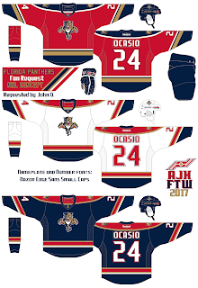
Now before I place my final pick, it's time for another fan request concept but it's not the Calgary Flames, this time it's the Florida Panthers.


On this set it's the Panthers first 3 jersey set in Reebok form, the colors is from the team's current set, and lastly the nameplate and the number fonts is J-LOG Razor Edge Sans Small Caps.


This one is the same but the jersey design are recolored.


Lastly this is the team's first Reebok set plus their red jersey with the same pipping treatment as the others, and of course in the team's current colors.

Now it's time for my final pick and it is for the NHL Stanley Cup Championship. From the west the Challenger, the Nashville Predators. Their opponent, from the east, making their return for the 2nd time in a row, and the 2016 Stanley Cup Champion the Pittsburgh Penguins! Who will win?
My pick: Sorry Pittsburgh but I'm going with Nashville in 6 games.

Well that's it for now enjoy this year Stanley Cup Finals, til then later.