Showing posts with label Detroit Red Wings. Show all posts
Showing posts with label Detroit Red Wings. Show all posts
Monday, 21 October 2019
Saturday, 9 December 2017
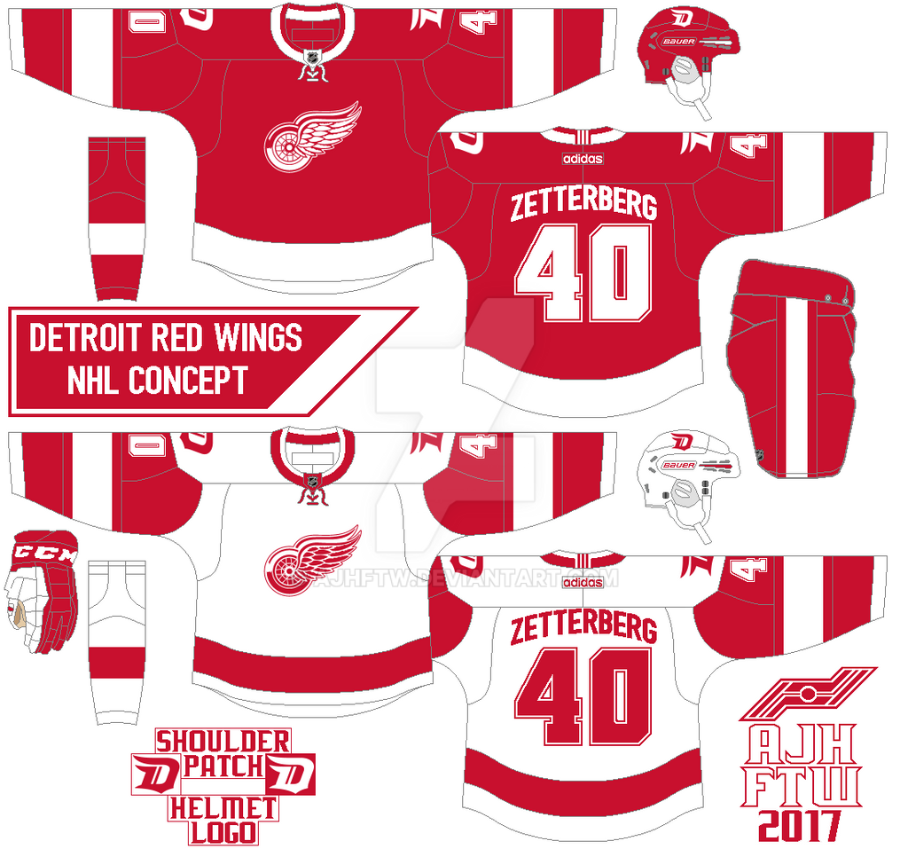
NHL Adidas concept: Detroit Red Wings
This one is pretty much the same as they wore but 3 things I did to this concept. 1. Add the team Stadium Series “D” logo on both shoulders and helmets. 2. Change the shoulder yoke that looks like the Dallas Stars 2013-17 set. 3. Nameplate is the Detroit Lions old nameplate fonts from 2009 to 2016, and the numbers are standards block with modernize corners.
HJC Feedback
HJC Feedback
Thursday, 23 June 2016
Requesting to take a break.
Hi everyone Alan here
at AJH HJA. Just like last year I’m taking a summer break from this site, and
hopefully unlike last year I’ll get back on track this September. I got a lot
of goodies on this post to get to, so let’s get to it.
Penguins wins the Stanley Cup!
First up I would like
to congrats to the Pittsburgh Penguins on winning the Stanley Cup as they beat
the San Jose Sharks in 6 games, witch I’m disappointed that it didn’t end in 5
I felt like the Sharks use their last litres of gas in them for nothing, but in
the end the Pens got the job done and claim their 4th Stanley Cup
title and for 4th time they won it on the road.
Hockey comes to Las Vegas
Well its official,
Las Vegas is getting a hockey team. This has been a heavy rumored about it
pretty much a long time. The word is the team name will be called the “Black
Knights” others said it’s should be called something else who knows we’ll wait
till October to see if they reviled the official name. That means once again
Quebec got jib out of the expansion, man this city just can’t catch a break,
hopefully they’ll get a team ether expansion, or relocation if our Canadian
dollar stop sucking bad.
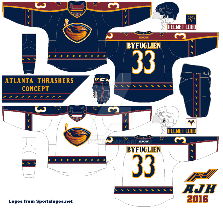
Remember my Atlanta
Thrashers concept, well I made some tweaks on that concept mainly on the arm
stripes, I cut off the arrows stripes and fix the some stripes here and there
and that’s all.
Now we get to the
request concept once again made by John O. You may remember him from his past
requests as the “Chicago Blackhawks Stadium Series” concept, the “Ottawa
Senators Concept” and the “Toronto Maple Leafs Boston style concept.” This time
it’s the St. Louis Blues. This one is a Blues classic pre-edge uniform
(1998-2007) in Reebok edge form, but only difference is the numbers and
nameplates gets a J-LOG Rebellion Sans Small
Caps font custom made by John O. Before I started to work on it I show
him the new templates I saw that I really like and I ask him, well really I was
hoping he was cool with it but it didn’t happen but oh well I try my best.
Anyways it’s a theme of what if the jerseys look like in different ways within
blue, gold, and navy blue, from his liking to my oops. So instead of posting them by Home, Road,
Alternate set style I decided to post them in groups, one all white jerseys,
one in blue jerseys, and one in navy blue.
 |
| White Jerseys |
 |
| Blue Jerseys |
 |
| Navy Blue Jerseys |
Before I go there was
sad news everywhere in hockey world that we lost a legend, on June the 10th
we the hockey world lost Gordie Howe. He was all-time greats, Hall of Famer,
and in my opinion the man that put the Detroit Red Wings on the map! We the
Hockey fans are going to miss you Gordie.
Saturday, 23 August 2014
Summer of Concept Contributor: Red vs. Blue
Hello I'm Alan, I'll get elbow to my head, so you don't have to. Well this week is once again another double concept contributor post in week 8 of "Summer of Concept Contributor" once again it's Ricky's turn. Now on to the concepts.
Detroit Red Wings Concept [by Ricky]
Ricky give us a Red wings concept that out of this world. Well not exactly out of this world, but close enough, just putting the team's main logo on the shoulder, two stripes on the arms, straight nameplate is alright with me, and lastly word mark with drop shadow is a nice touch. The problem is the numbers is also drop shadow, but is black with white drop shadow, I felt like it need to be like the word mark just white with black drop shadow, and you got yourself a winner.
Montreal Canadiens Concept [by Ricky]
Up points: seeing the Habs in blue is rare a thing to see, and this one was put together smartly. Adding the yokes, and tie down collar is a nice touch. Add another trim around the numbers is alright with me.
Down points: The only things I can come up with are lack of red trims on the wrist cuffs, and trims on the bottom of the hem.
My suggestion: See the down points.
Well that's this week, next week will be the last of the "Summer of Concept Contributor" and this one is special to me, a concept from a contributor that start it all back in 2012! Also next week will be my 25th concept contributor post, it'll be fun to do next week til then I'm Alan, I'll get elbow to my head, so you don't have to.
Wednesday, 1 January 2014
Top 11 NHL Outdoor games jersey
Hi everyone Happy New Year everyone as we are hours away from the Wings-Leafs Winter Classic game. One of six outdoor games this year so I decide to do a first ever "Top 11 NHL Outdoor games jerseys." Let's not waste time and get going.
11. Anaheim Ducks
| Picture Credit: The (unofficial) NHL Uniform Database |
The idea of Anaheim Ducks in orange jersey was always in many fans mind, and every concept artist desire, and dream come to life. But this one is "NIGHTMARE!" Chromed logo, one thin hem stripe with thick side panel, half stripes on the arms, and tilted TV numbers. The only thing good from this disaster jersey is the "OC" shoulder patch, and that's all.
10. New York Islanders
| Picture Credit: The (unofficial) NHL Uniform Database |
Despite of just the "NY" chromed logo, the nameplate, stretched numbers in the back, tilted numbers, white yoke, and just one hem stripe. This one got an good collar, and the arm stripe is pretty much tamed, not the best, but better then the Ducks.
9. New York Rangers
| Picture Credit: The (unofficial) NHL Uniform Database |
This one was an disappointment for me, stretched numbers in the back, tilted numbers, one hem stripe, and thick side panel. The arm stripe is messed up in an bad way. The collar, yoke, and the "New York" word mark logo makes up for an not so good jersey that got that "Lady Liberty" feel to it.
8. Pittsburgh Penguins
| Picture Credit: The (unofficial) NHL Uniform Database |
This one maybe like the others, but it's better then the team's current set. I like the stripes on both arms, and hem. An small vegas gold on the back of the yoke could have gone all the way to the front of the yoke. Finally using the Oilers collar is an good call! Overall: It just an SS jersey, but fix it more and it could be the next set for the team.
7. Chicago Blackhawks
| Picture Credit: The (unofficial) NHL Uniform Database |
This had everything going, but fell short, stretched numbers in the back, chromed logo, and tilted numbers. But at lease they have hem stripes on it. Overall: If it weren't for stretched numbers in the back, chromed logo, and tilted numbers. This one would be the team's future 3rd.
6. Vancouver Canucks
| Picture Credit: The (unofficial) NHL Uniform Database |
Last year this was worn by the Canucks, on March 2 the team will wear it again. The jersey is alright but I felt like they should wear their first jersey from the beginning, and cream pants "Not a big fan!" Nothing too much to say about it, moving on.
5. Los Angeles Kings
| Picture Credit: The (unofficial) NHL Uniform Database |
Out of all Stadium Series jerseys, this team is one of my favorite! The chromed logo really fit this jersey nicely. Grey as the team's main color on this jersey is really an eye catcher. I got nothing to say about this, despite of the tilted TV numbers, this one is an solid SS jersey.
4. Detroit Red Wings
 |
| Picture Credit: The (unofficial) NHL Uniform Database |
Classic, and nostalgia. The stripes are wisely place, straight nameplate is fine with me, numbers are classy, and the logo pure classic. The downer is the word mark above the logo make it busy, and vintage white, really? Overall: Good WC jersey but two things kept it away from the top 3.
3. New Jersey Devils
| Picture Credit: The (unofficial) NHL Uniform Database |
Even though the logo is chromed, but glad that this team did not followed the other teams that give jersey collectors an eye sore. Base on the team's first ever set. Overall: Very classic jersey, favorable, and why haven't the team promote it to full time 3rd?
2. Toronto Maple Leafs
 |
| Picture Credit: The (unofficial) NHL Uniform Database |
Stripes, stripes, stripes everywhere on this jersey! Despite I hate this team, but you got to give them credit they know how to present classic jerseys nicely. Overall: Nice WC jersey from an team I hate.
And the Number 1 of the top 11 NHL Outdoor games jersey is.....
1. Ottawa Senators
| Picture Credit: The (unofficial) NHL Uniform Database |
I'm going off the record and say that I hate vintage white, such a overrated colored, but this one was used very well done to my taste. An vintage white version of the team's current 3rd jersey. Nice stripes that is well balanced that is simple but great. Overall: Vintage white or true white make it full time road along with the current 3rd as home to replaced the team's current set.
And that's my top 11 NHL Outdoor games jerseys hope you'll enjoy the Winter Classic, and other outdoor games, until then, I'm Alan, I'll get elbow to my head, so you don't have to.
Monday, 25 February 2013
Detroit Red Wings Concept 3
Howdy everyone I present to you all my first concept made from my new computer and boy it wasn't easy mostly using the new MS Paint, to even setting some of HJC's new rules about sizing and stuff but I felt like I pull it off, for now It's going to be just straight Home and Road concepts while leaving the 3rds to ride solo until I can think about resizing my concepts witch is not a easy task for me mostly every time I resize it go pixely on me and I hate it, not a big fan of it, but sooner or later I'm going to end up doing it and might have to put up with it.
Now enough ranting let's get on with the concept.
This is another Detroit Red Wings concept made by me but this one is for the HJC's Untouchable Competition, same template as my Winnipeg Jets concepts, it kinda look pretty good with just Red and White.
Wednesday, 26 September 2012
Detroit Red Wings Concepts 2
Well not really a concept but just a few changes on them, ever since their winter classic game in 2009 their winter classic jersey gave me an idea to give this team some what an upgrade, on both home and road jerseys I changed the collars from V-neck to laces, the 2nd change the nameplate from vertically-arched to straight, and finally the 3rd mixing all the wings history in one move the crest over to center just the wheel, the tail stripe is repositioned, and the red color is more lighter then the current red color.
Friday, 4 May 2012
Sunday, 1 April 2012
Big News about Hockey!
There were lots of reports source I found that is very interesting to me to tell you all so here we go.
Phoenix "Renamed!?"
With the National Hockey League still trying their best to sell the Coyotes to a buyer to keep the team in Glendale, the NHL has decide to do one final desperate act to bring in a chance of an Buyer that's willing to buy the team and keep the team where it is instead of relocating them, the NHL calls for a "Renamed" so for the 2012-2013 the team are no longer the Phoenix Coyotes they are now The Phoenix Trollotes!
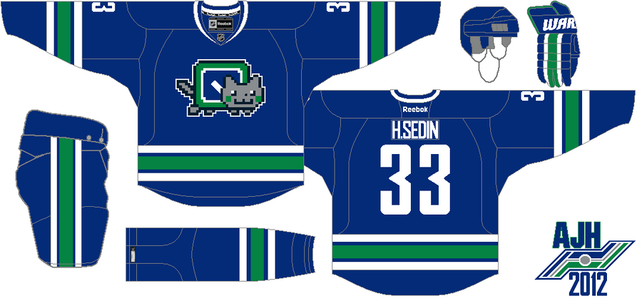
Vancouver Renamed too!?
The Coyotes aren't the only team that are being Renamed, the Vancouver organization has decide to change their name from the Canucks to The "Vancouver Nyanucks"
So far the team's road jersey isn't available at the moment, but it could be revealed at the 2012 draft.
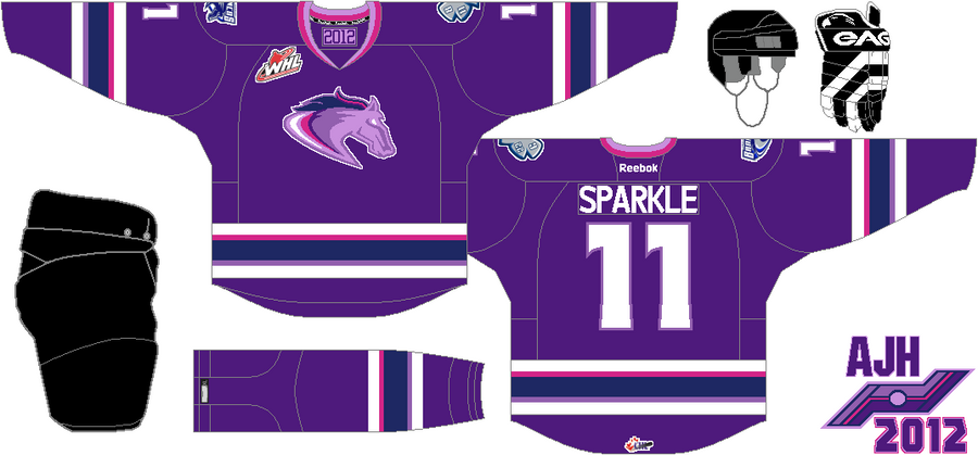
6 way tie for the Broncos!
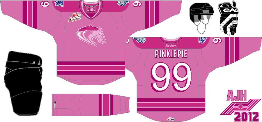
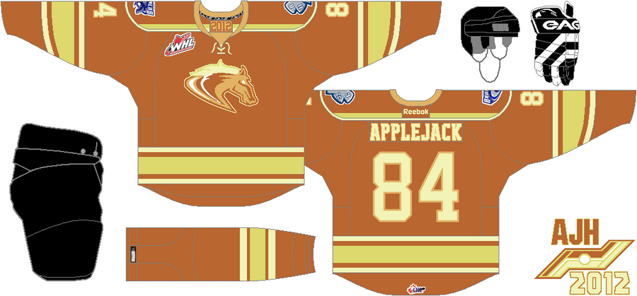
It's been word that the Swift Current Broncos of the Western Hockey League has decided to to do a "My Little Pony" special event game for the 2012-2013 season, but with all the votes were made, and alot of supports from the fans it's a 6 way tie of witch Pony should be part of the one night event at Swift Current, here are the 6 pones that are battling to be the one.
Winter Classic Uniforms revealed?
That's right just this afternoon around 1pm that both Detroit Red Wings and the Toronto Maple Leafs had just revealed their 2013 Winter Classic Uniforms here's the first and only photo of the uniforms.
Well that's all the reports that I found out, I'll be keeping my eye on any more reports happening around the Hockey world, for now have a Happy April Fool's Day!
HJC Feedback
HJC Feedback
Thursday, 1 March 2012
Subscribe to:
Posts (Atom)


