Showing posts with label Colorado Avalanche. Show all posts
Showing posts with label Colorado Avalanche. Show all posts
Thursday, 24 October 2019
Saturday, 13 October 2018
NHL Adidas Nightmare Concept: Colorado Avalanche & Philadelphia Flyers
Hi, I’m back here for another nightmare post
here at AJH HJA. Continuing the nightmare with the Colorado Avalanche thinking
what if they decide to keep the Reebok edge
design for Adidas.
The only difference on this one is I replace the vertical piping with hem stripes; I also brought back the yeti foot logo because the “C” logo looks plain to me.
So this one was short and sweet I decide to throw another nightmare concept.
I’m not going to lie to you all, but I like the Flyers 07-08 Reebok edge set I felt the design is underrated and it could last longer, but sadly that didn’t happen, and I understand why everyone didn’t like the design. I kept it look like the Reebok look, but I only added a trim to the hem to replace the piping that once connects from the collar to the armpit.
And so this post is in the books. I got more nightmare concepts for you all, so stay tuned till then later.
Saturday, 18 November 2017
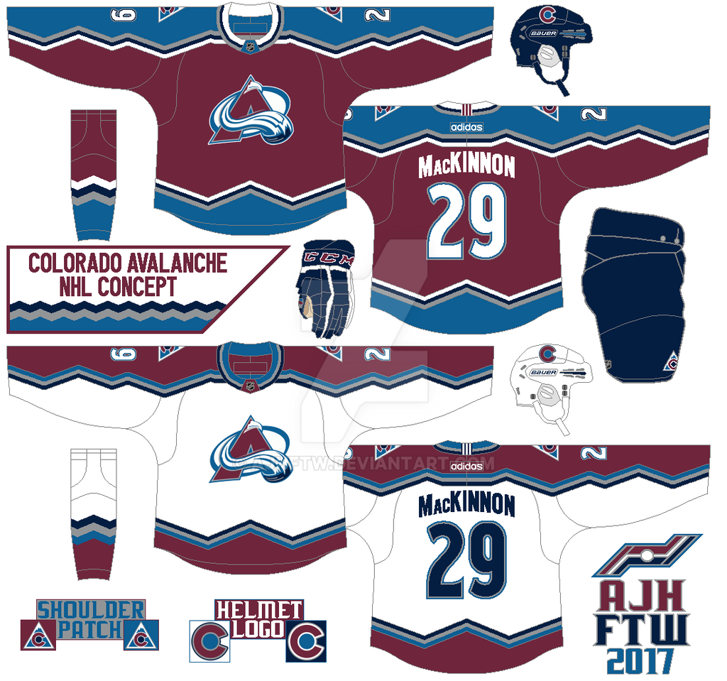
NHL Adidas concept: Colorado Avalanche
Mountain style stripes on both arms, hem and socks. Replaced black with navy blue along with burgundy, steel blue, and silver. Kept the font for the letters, while using the team new font for the numbers.
HJC Feedback
HJC Feedback
Monday, 4 April 2016
AJH HJA 5th anniversary countdown: Too many? Not enough!
Hi everyone, Alan
here for another countdown to my 5th anniversary post. Sorry for lack of posts
for couple of days due to my work life in a nutshell, I'll leave it at that. So
this countdown post is a team I pretty much make mostly 1 to 2 a year, I made so
many I have to put this link for you all to see, if you all didn't catch my drift
today is the Colorado Avalanche.
Yes indeed the
design is based on the team's classic first set but little more Reebok cut to
it. Here's a first for me, I replaced black with navy blue it seems to fit well
with this concept on the jerseys to even the logos in my opinion. I kept the
foot logo as shoulder patch, but use the team's current alternate mountain logo
for the helmet, and the pants. I tried to make the number fonts look like the
team's current alternate fonts with trims around it. Lastly of all the years I
made concepts, this set is the first that I made the nameplate vertically
arched!
HJC Feedback
HJC Feedback
Well this one is done, hopefully I'll get back on
track again to post more up on this site, till then later.
Friday, 6 November 2015
Colorado Avalanche Concept: Stadium version
Hello everyone Alan here for today's post, from my last post I forgot to link a font site, it's J-LOG Custom Fonts. It's a font site made by John O. go and check it out!
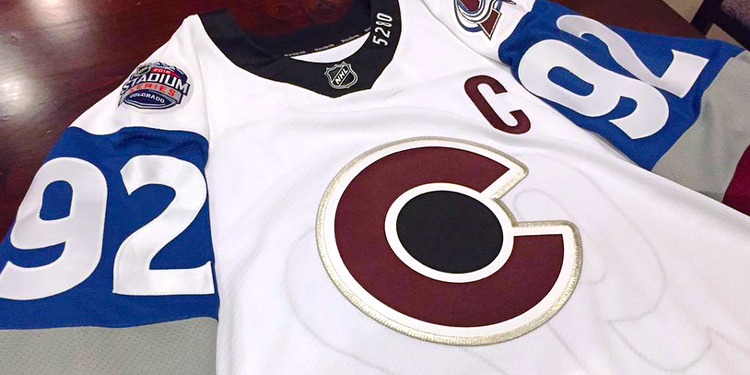
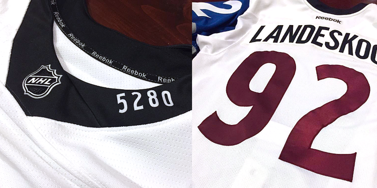
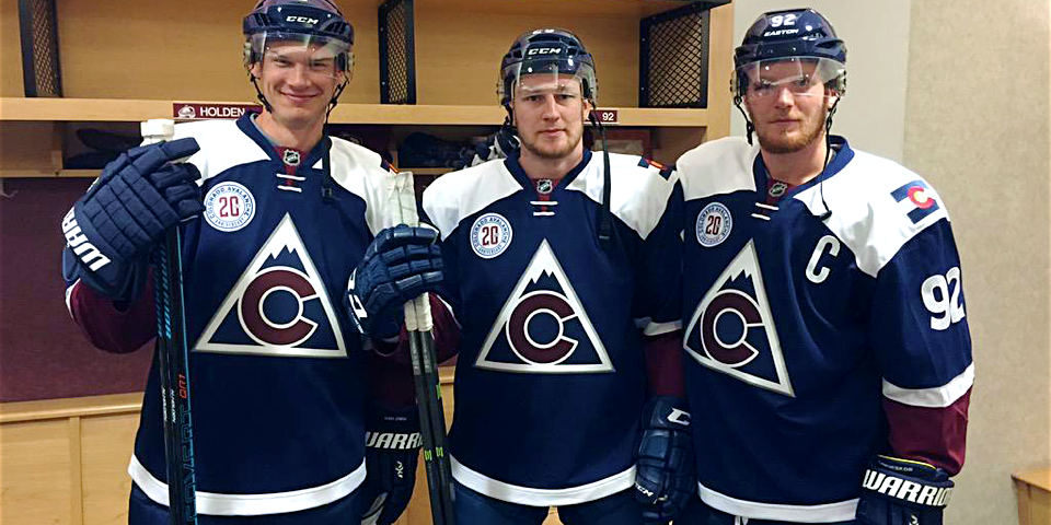
Well to try for myself to get back on track I got a concept, a Stadium Series Concept that is. Today Colorado Avalanche. But First I'm reviewing their 2016 Stadium Series Jersey, and their new alternate jersey.
Stadium Series
This is not Avalanche! This is a Disaster! Bad stripes, over size TV numbers, awful collar, and the list goes on. Just terrible jersey one of worst.
Alternate Jersey
Let see here, they call it a tribute to the state's hockey history. Hey Guys here's an idea how about using one of these as your alternate jersey! The logo is fine and all, nice nod to the old Rockies, but in my opinion it belongs on the shoulders not on the front. Navy jersey is good, but with the white yokes ruins it. Lastly the number fonts is new and fresh, but lacks trims. Overall: Could have been a good alternate jersey, but the things I talked about keeps me away from buying this one, even at 50% off.
With that of the way it's time for my Stadium Series Concept as part of the HJC's Stadium Series contest few months ago, let's take a look.
Well to try for myself to get back on track I got a concept, a Stadium Series Concept that is. Today Colorado Avalanche. But First I'm reviewing their 2016 Stadium Series Jersey, and their new alternate jersey.
Stadium Series
 |
| image from http://www.icethetics.co/ |
 |
| image from http://www.icethetics.co/ |
Alternate Jersey
 |
| image from http://www.icethetics.co/ |
With that of the way it's time for my Stadium Series Concept as part of the HJC's Stadium Series contest few months ago, let's take a look.
Mountain stripes on the arms and on the sides to fit the Stadium series theme, just simple but effect. Of course when it comes to Stadium series there are odd pieces to make it more "Stadium Series" and that's is the pants, burgundy on the front, and steel blue on the back, hey if the Kings can get away with white pants why not with this one?
Well this post is done. I'll try my best to keep this boat going, til then later.
Tuesday, 8 October 2013
Colorado Avalanche Concept 6
For the 6th time on this site, once again the Colorado Avalanche concept, I said it before and I'll say it again "I always seem to have more ideas on this team more than any other teams in the NHL!" Well with one is base on their old set only made it more mountains on it and just the mountain hem stripe and that's pretty much it.
Wednesday, 21 November 2012
Colorado Avalanche Concepts 5
Well here we are and once again another Colorado Avalanche concept set, I'm telling you people I'll admit I always seem to have more ideas on this team more than any other teams in the NHL, lets not waste time and get to the concepts
I made this concept as part of HJC "No Horizontal Lines Competition" despite this sucker is a beauty, but it's pretty much wasn't good to everyone taste I end up with 4 points, oh well compare to other Aves concepts this was my best one or the worst one, what ever you look at it.
HJC Feedback
HJC Feedback
I was so in love with the concept I had to make the alternate jersey become the basis of the team's home and road jerseys, so the design is indeed has "mountains" all over it on the arm stripes, the hems, the yokes, and even the socks got mountains design all over it, sure these concepts aren't winners but they are in my book.
HJC Feedback
BNG Feedback
HJC Feedback
BNG Feedback
Well that's my concepts this week come by this Sunday afternoon after 1:30pm I have made a big rant this however is involves with my town and hockey about trying to get a nice brand new hockey arena, the problems, and two guys that could have got Chatham a OHL team, and many more, now they're some point of my rant that has me shooting down my town not harsh, but made me feel that I don't see my town going to be at a OHL level, just to give you all a fair warning, for now.
Just Maybe?
Just Enjoy!
Saturday, 28 July 2012
Avalanching!!!!
Hi everybody today I got not one but two concepts one made
by me and one from someone else, "that’s right!" someone else's concept is on my
blogger so let’s not waste time and get going!
Colorado Avalanche (by Me)
Well I decide to give it a updated modern look in pre-edge form,
my style change the arm stripe to a somewhat of a pulse like mountain design,
the road one I try to put a different color format on it instead of steel blue
arm stripe is white, and the third I made a switch with the red and steel blue,
and lastly I change the fonts to block form add some spike ends to it.
Colorado Avalanche (by Steven G.)
I always said to myself that the Avs Jerseys should be modern
no "if’s" or "buts" about it, and this concept that Steven made really hit the ball
park. The design looks way better then the Avs current 3rd right now
also it gives the 50/50 feel to it, a look that the fans will like at the same
time have that Reebok standards, nice work Steven.
Want to see more of his work check out his Blogger page!
Hope you all enjoy this one now on to my secret project I'm working on let's just say it's involves with the AHL oh I said too much you'll all have to wait and see for now.
Just Maybe?
Just Enjoy!
Wednesday, 30 November 2011
Monday, 11 July 2011
Colorado Avalanche Concept 2
This is my Colorado Avalanche Concept the pre-edge style Jersey this concept was base on one of my Fanfic project (if I ever going to do it) so anyway I decided to throw the Avalanche logo on it and add the old Colorado Rockies logo on the shoulder, and there you go.
Well, that's all for now.
Just Maybe?
Just Enjoy!
Monday, 25 April 2011
Colorado Avalanche Concepts
This Colorado Avalanche concept I tried to give it the team's old mountain design in Reebok form, I just made the name on the back straight, pretty much keeping the colours the same as they put together on their old set.
HCI Feedback
Subscribe to:
Posts (Atom)


