Showing posts with label QMJHL. Show all posts

Saturday, 20 February 2016

The fire in me still burns brightly!

Hi everyone, Alan here for post number 301 here at AJH HJA! Well the All-Star games is alright, not the greatest that's all I can say to that. But there are two news I got to say about it.

First one, Los Angeles Kings will be hosting the 2017 NHL All-Stars, some though that the Leafs would host next year but the NHL said otherwise. I'm O.K. with it because the Kings are celebrating 50th anniversary next season, so it's fitting for the Kings to host the All-Star event by celebrating the league's 100th anniversary by going big Hollywood style!

Second, The news tells that Gary Bettman got a extension for the next 6 years, to some feel bitter, and angry. For me it's the Coyotes will still be around for next 6 years, and we'll see a 4th lockout coming I'm calling it.

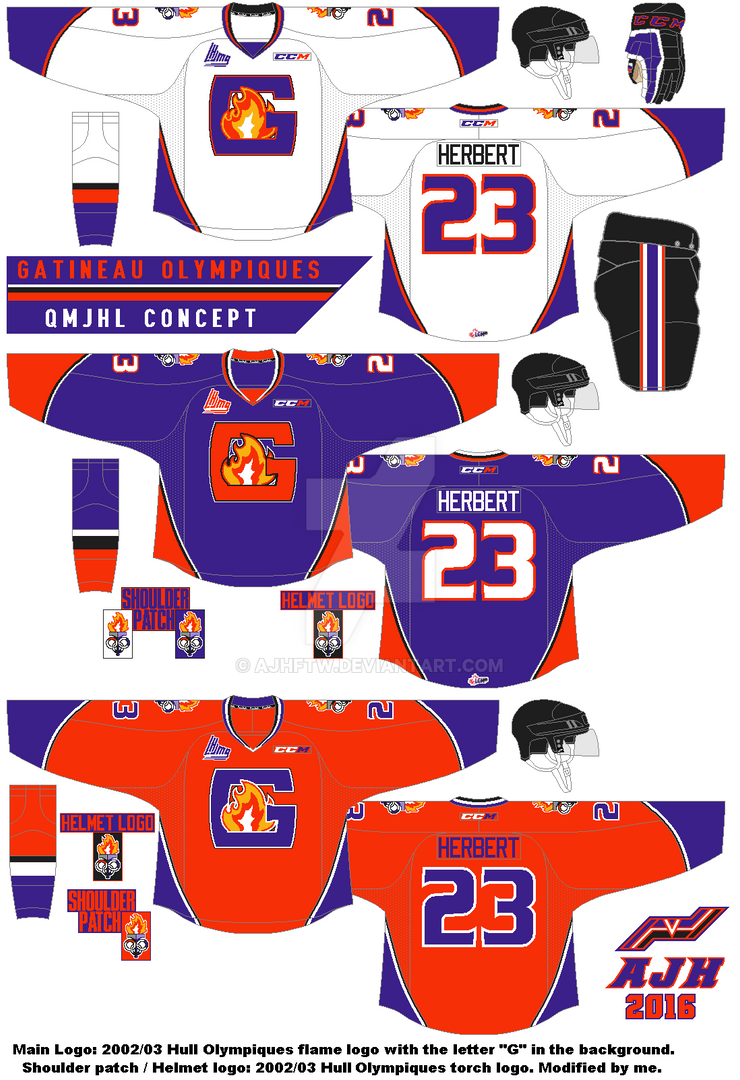
Today is the QMJHL concept known as Gatineau Olympiques, both set, and alternate. Let's get to the concept shall we.
Curves on both arms, and side hem put to use for this set. Purple is the main color, follow by orange, and black. Standard block font for the nameplate, and the Ottawa old alternate font from 1997 to 2007. The main logo is a letter "G" with a flame from the team's 2002/03 logo when they use to be Hull Olympiques. Lastly the helmet and shoulder patch logo is 2002/03 torch logo modified by me.
The alternate is same as the set, just orange as main color.
Well this one is in the books. The next post will start the countdown to my 5th anniversary post, these concepts are based on past concepts I made that made impacts for me from getting HJC’s COTW nominations, one of the best concepts I made that I was proud of, concepts in running for the COTW, to even winning my only HJC contest, and my only COTW! Hope you all ready for the countdown because it will start February 28. Until then later.

Sunday, 15 November 2015

My wait for that one logo is over

Hi everyone Alan here for once again another post here at AJH HJA.
Today is the Saint John (not St. John) Sea Dogs. Here's the thing, their current logo is alright but I felt like they could have done better. In 2012 they unveiled their first alternate jersey that featured a logo that base on the former AHL team the Saint John Flames, the logo was awesome and it fits the team better then their current one even thou the jersey was terrible but the logo is a must have so I search, and search, and search for the logo and I finally found it! With a lots of cleaning off the pixels to even sizing it to fit the jersey, with some addition of tweaks on the logo and there it is my Saint John Sea Dogs Concept.
Yes I know this is the same design you seen over and over again sadly this design was suppose to be made just for the Sea Dogs but as years of trying to find the logo to even my hopes of trying get another taste of COTW from HJC I pretty much in term "Reeboking" the design (yes I know it's not a word but bear with me on this one.) Using it with the color placement base on the team's first set. Nameplate is Winnipeg Jets font. Lastly UConn's font for the Numbers.

So that's it for this post more will come in better time, or more likely the weekends. Until then, later. 

Monday, 1 December 2014

Another 2.0 concept made by me

Hello, I'm Alan, I'll get an elbow to my head, so you don't have to. Today is my first post of December, and I got only one for today, my Quebec Ramparts concept 2.0.

My first Ramparts concept

And now here's my Ramparts 2.0.
Unlike my first one, I removed the castle pattern on the yoke, thicken the castle pattern on the arms and on the hem. I use the Dallas Stars current number font with thick trim around it. Black is the primary colour, followed by red and white. Lastly, I use the Dallas Stars yoke and sides design on this concept.

Well, that's today's post. Hopefully, if there's no busy stuff going on outside the concept world for me so I can post some more, until then,  I'm Alan, I'll get an elbow to my head, so you don't have to.

Tuesday, 7 October 2014

Concept of the Dead: One dud Wonder

Hello, I'm Alan, I'll get an elbow to my head, so you don't have to. Today as part of the "Concept of the Dead" this team came from the QMJHL. That's right people, not NHA, "QMJHL!" A team that was so bad the club lasted only 17 games! It's the Plattsburgh Pioneers.
On this concept, I took the Anaheim Ducks arm stripes from their now current home/road set and turn it to the Vancouver Canucks present home/road striping, and added stripes on the yokes for good measure. I darken the team's colours a little bit to give it a more modern feel to it. I use the Columbus Blue Jackets numbers and Carolina Hurricanes letters for the nameplate.

Well, that's it for today. More is on the way until then,  I'm Alan, I'll get an elbow to my head, so you don't have to.

Friday, 31 May 2013

Team's new look rant

Howdy and yes it's time for another rant by me, so let's get going.

PEI Rockets re brand to Charlottetown Islanders.
After 10 years of being called the "PEI Rockets", the team have change the name to the "Charlottetown Islanders" and they unveiled their new logo.
The logo looks good but 2 things. 1. Arial Black as the font for the "Charlottetown" is not a very bright idea to put on the logo. 2. Vegas Gold, Really? Instead of keeping red, blue, or green of all the colors you could've choose why in your creative mind go straight to Vegas Gold?
Change the font or remove the "Charlottetown"word mark, and change the colors for crying out loud.

 Dallas Stars new logo leaked?
Yup the Stars new logo got leaked or so everyone claim.
Here's my question, why Silver? Why would you replace the gold the have been with the team since the North Stars era with silver? But here's another question, what's the jerseys would look? So many questions will be answered on June 4.

Teasing like a Hurricane.
At the same date as the Stars (June 4) the Hurricanes will unveiled their new home and road jerseys. So far the team have been posting some images of their new set, the only thing I felt that they'll make a big mistake is removing their flag hem stripe witch it's always been their ID, it always the reason this team have some nice jerseys over the years, this could be ether good? or bad? You decide.

Ontario Jr.C relocated team.
I don't usually talk about any teams lower then the Jr.A (beside my Jr.B Maroons rants) I have to rant on this one. Two months ago the Kingsville Comets from the OHA Great Lakes Jr.C have relocated to Amherstburg, and the new team called them self the "Admirals." I think it's a good name and all, but after seeing the pictures the teams logo let just say they put the Calgary Cannons Baseball team, replaced a baseball cap with a pirates hat and add a big "A" in the background and there you go. I just don't know what to say about this. I just felt that there is no creativity what so ever. Sad just sad.

Well that's some rant for now, come this Saturday as I start a whole month of nothing but OHL concepts, until then later.

Sunday, 11 November 2012

Top 5 CHL Remembrance Day/Memorial Cup theme Jerseys

Well here we are today is Remembrance Day and as always few of the CHL teams do a Remembrance Day game, and to add to this day very special they would wear a Remembrance Day theme Jerseys, one of those that isn't over the top, just normal look for only one game, and then auction them off to rise money to any Canadian Armed Forces from the teams city, however not only they do this on Remembrance Day since 2008 the host team from the Memorial Cup tournament wears Memorial Cup theme jerseys also, so with these two big events that means so much to everyone here are my top 5 CHL Remembrance Day/Memorial Cup theme Jerseys, there is some I won't explain them correctly but I'll let the jerseys speak for themselves.

5. 2008 Kitchener Rangers Memorial Cup Jersey
Let's look at this way I admit I hate cream color on jerseys I really do! But this Memorial Cup Jersey that Kitchener worn in 2008 really made it work, it really gave that vintage look and feel while at the same time pays a tribute to the men and women of the army and the main crest is neat witch the Rangers would use that for their current alternate jersey and hopefully in the future on.

4. 2009 Mississauga St. Michael's Majors Remembrance Day Jersey
Another great tribute jersey by the St. Mikes this one is for the Remembrance Day game this one really caught my eye and really proves that you don't really need the teams colors to make a good tribute jersey you have to try something different and unique, solid colors, nice use of the main crest, and the right look make a very good tribute jersey.

3. 2010 Brandon Wheat Kings Memorial Cup Jersey
This one is my favorite Memorial Cup Jersey, great use of the Chicago Blackhawks Winter Classic jersey recolored, the main crest is nicely done, a maple leaf with two sword behind it and a banner with the word "Brandon" to give a final touch a great jersey.

2. 2011 Kitchener Rangers Remembrance Day Jersey
Kitchener always seem to make good Remembrance Day Jersey every year and gets better and better at it, this one looks simple but however theirs a saying "You thinks that putting a good crest on a simple jersey is nothing think again!" This jersey is well put together this jersey pays tribute to the 31 Combat Engineer Regiment (The Elgins). 31 Combat Engineer Regiment is an Army Reserve Engineer unit in 31 Canadian Brigade Group.This jersey is nice and not over the top like other teams from other leagues that used camouflage patterns, this one really gives that classic feel and enjoyment of watching them in action, yes indeed this one is my favorite Remembrance Day jersey ever.

 1. 2011 Mississauga St. Michael's Majors Memorial Cup Jersey
This is pretty nice and very unique the main crest is a image of Canadian soldier Marc Diab, a Mississauga native who lost his life in Afghanistan to defend his country, while the maple leaf in the back is from the Toronto Scottish Regiment logo. The Toronto Scottish was an armed forces unit based out of Mississauga that fought in World War 1. Also adding St. Mikes history to their four stripes both the arms and the hem to represent the four Memorial Cups won by the St. Michael's Majors indeed a classic Memorial Cup Jersey.

So that's my top 5 Remembrance Day/Memorial Cup theme Jerseys, it's a very fitting to pay tribute to the Men and Women that lost their lives in the line of duty, to rise money for a good cost these CHL teams have always give us the reason why we should thank them for defending our nation know as Canada, hopefully we will see some more tribute jerseys down the road.
Until then.
Just Maybe?
Just Enjoy!

Here are some honorable mentions.
 All images on this post came from SportsLogos.net

Wednesday, 29 August 2012

P.E.I. Rockets: [insert new name]

Well after 10 years the P.E.I. Rockets Group have decide to change their name, well this came as a no shock to me because that name was better off stayed in Montreal, indeed it was named after the great late "Maurice Richard", when I heard the news about the team relocated from Montreal to P.E.I. I thought they were going to rename the team, but it didn't happen, and now they're going to do it they are going to change their name like they should have done 10 years ago, with this renaming the team in P.E.I. that had the "P.E.I. Senators" for only 2 years surely enough they would name the team after that or anything name some theme related nickname that made P.E.I. such a good place to go to, well guess what now you can, this link will give you the power to give the team a real name, I for one believe that they should be called the "P.E.I. Dragons"! Why you may ask? Well because if check out the province flag you know right off the bat theirs a dragon I think it's a cool idea to name name the team that, but you don't have to agreed with me, go to the team's site and put in any name you want the team should be called.

That's all for now.
Just Maybe?
Just Enjoy!

Sunday, 25 March 2012

Québec Remparts Concept

This concept I decide to rip their castle crest off from their circle logo and make it their primary logo, made their arm stripe and hem stripe a castle pattern like there old 1997-98 to 2002-03 jerseys with the additions of the castle patterns on the yokes for good measure, and lastly I made black as there primary colour with red and white, it fits the team more than their current ones they got right now.