Showing posts with label Jr. C Team. Show all posts

Monday, 30 September 2019

Blenheim Blades concept 2019

Hi you all, Alan here for a non-Saturday post here at AJH HJA. Before we get to the concept, I have announced that from October 1st to October 31st, I will be posting concepts, 31 days, one team. From the GOJHL (OHA Jr B. league) is my hometown team the Chatham Maroons! The title will be called "Maroontober." I wanted to do this for a long time, and I think this is an excellent time to do it, so that's my announcement now back to your regular schedule post.

 Over 5 years ago, I made a concept for an OHA Jr. C hockey team Known as the Blenheim Blades. 5 years ago they were in OHA Great Lakes Jr. C league and they wore the Calgary Flames pre-edge jerseys with the "BLADES" wordmark logo with a sword underneath it. 5 years later the league is now known as PJHL (Provincial Junior Hockey League) Stobbs Division while the jerseys still the same. If you read my PJHL outdoor game jerseys review the Blades wore the Vancouver Canucks old 96 alternate jerseys that became my inspiration to make a Canucks inspired design in hopes that they can gut out of being red as the team's primary colour and hopefully see them back in black.
I decide to stick with the wordmark logo minus the sword, change the font, add trims and place it in diagonally across the front like the NY Rangers do. I made a shoulder patch logo (which is also on the helmet too) it just the word "Blades" sandwiched with two swords. Black is the primary colour follow by red and gold to finish the set.

And so this one is done! See you all tomorrow for the Maroontober month just to let you all know there won't be any of me explaining about the concepts because it's just the Maroons wearing NHL design jerseys just recoloured and there are some changes on the fonts for both nameplate and numbers nothing more. Until then, later.

Saturday, 9 February 2019

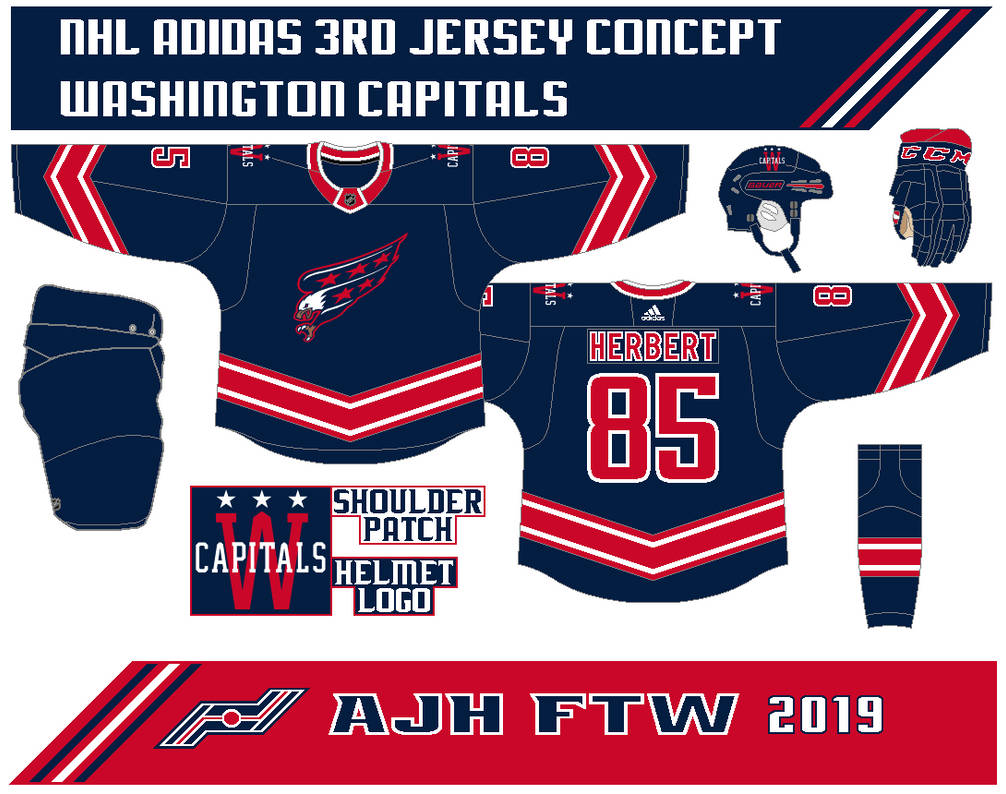
Washington Capitals 3rd Jersey concept

Hello everyone, Alan here for another concept post here at AJH HJA. This one is short and sweet because it's the same but recoloured, it's one of my first concepts that I sent over to the Stopgap Concept site if you have a concept that needs to be reviewed go over to site, find the E-mail and sent in your concept over to them and support the site.

Now with that out of the way on to the 3rd jersey concept.
Pretty much the same as the Caps dark jersey from my Caps set but the red and blue are switched.

Stopgap Concept Feedback

Well, that's the concept, time for some rants.

2020 NHL Winter Classic
Well, it official The Dallas Stars opponent for the 2020 Winter Classic at the Cotton Bowl is the Nashville Predators. The question now is what they will wear at the event? I believe in my mind for Dallas, the Stars first black jersey, or the star shape jersey they wore it while winning the 1999 Stanley Cup title. As for Nashville, I'm thinking their first white jersey or something based on the city old minor league days.

Lakers on the move
Going down to Ontario Jr.C level news that I pretty much the only one that cares about, there are talks that the Wallaceburg Lakers could be relocated to Tilbury Ontario. For Wallaceburg, it's a heartbreaker, for Tilbury it's for the first time since 1994 where the team had to bail out due to a hazing scandal resulting in hundreds of criminal charges being laid. I'm hoping for a name that works for Tilbury something that doesn't stick with the past but gives the town the fill with pride and could rival with the Wheatly Sharks.

So my rant is done, hope for some more posts soon if I get the chance to do them until then, later.

Saturday, 19 January 2019

2019 PJHL Outdoor game jerseys review

Hell everyone Alan here for another non-concept post here at AJH HJA. From January 11 to January 12 the PJHL's Stodds Division did an event called "Outdoor Shiny Series" it took place at Lanspeary Park in Windsor Ontario. Six teams played in this showcase, so when it comes to outdoor games one thing comes in mind is the jerseys, one looks good, one is over gimmicky, and the rest were meh. Today I'm going to review them, but first here are the links that I got photos from each team's Facebook page I cropped some pictures to focus on the jerseys in general. 

Wallaceburg Lakers Facebook Page
Wheatley Omstead Sharks Facebook Page

First, two teams for me to review them are the Lakeshore Canadiens and the Petrolia Flyers.

 Lakeshore Canadiens


Blue Habs dark jersey with big white chest and arm stripes with thin red lines, while the hem got just red and white thin stripes. The numbers are standard block is white but with red and blue trims around it helps to make it readable from far away. The team's primary logo works really well with the blue jersey far better than their current set they got.
The down point is the socks don't really match with the jerseys, and that's the only thing I had a beef with it.
Overall: I hope this team decides to promote these jerseys as the new dark jersey.
Score: 8 out of 10

Petrolia Flyers


I like how they did with the stripes under the arms to the sides with the additions of maple leafs on it, the socks match it well with the jerseys.
Red and white digital camo is an alright theme, but it really not necessarily need on the whole jersey it kinda blends with blue letters that make it hard to read from far, the collar was just lazy. Lastly, the logo is very outdated and does not fit well with the jersey.
Overall: too many ideas create one lousy jersey.
Score: 3 out of 10

Now off to the next 2 teams, The Amherstburg Admiral vs Wallaceburg Lakers

Amherstburg Admiral


Believe it or not, these were the team's first jersey set from the beginning along a light blue light jersey (for real!) it's just the Pittsburgh Penguins winter classic with standard block numbers in gold along with white trim around it. I'm not going to start ranting about the logo I'll put it simply it's just old end of story. Nothing much to say anything else about this just the pants barely match with the jersey and the white helmet throws the whole thing way off.
Overall: Not very much classic from a team that started in 2013.
Score: 2 out of 10

Wallaceburg Lakers


Now I said before many time I hate vintage white/cream white colour, but there is that rare time that I'm alright with it, and this one is okay with me. Montreal Canadiens style in cream jersey as main colour along with green stripes and gold trim. Numbers works very well in this one being gold with green and cream for the trims. Black equipment throws off the look, and green socks didn't really help out either.
Overall: Good looking jersey, but the equipment and socks throw off of what could be a classic set.
Score: 5 out of 10

Last two, Wheatley Omstead Sharks vs Blenheim Blades

Wheatley Omstead Sharks


The logo is the best ever in this event, it's so good I'm hoping they'll make it permanent shortly. The gold jersey doesn't fit well, while there is navy blue and white are on the jersey but no light blue. Stripes and yoke are well balanced, but the socks need to match with the uniform to make it look complete.
Overall: If they make the gold either silver or light blue this one would be a good looking jersey.
Score: 6 out of 10

Blenheim Blades

The jersey is the Vancouver Canucks old alternate 3rd with just the letter "B" on the front, that's all I can say about it. If they change the logo, nameplate and the numbers from gold to white, then it would barely look different and readable too.
Overall: It's different but not different enough.
Score: 5 out of 10

Well, hope you all not got tortured by this post. Come back next time, and there will be a concept post I promise. Until then, later.

Tuesday, 23 June 2015

After the Stanley Cup rant post

Hi everyone, Alan here for my last post on this site and I'm on hiatus till probably around in the fall of 2015 with just bunch of rants, and an logo review so here we go.

Chicago Blackhawks 2015 Stanley Cup champions
I called it, I totally called it, I said (included others) the Blackhawks would win it in 6 games. Tampa got the right players to bring them to the big dance, but in the end the Hawks with their experience from their past cup appearance beat the Lightning to win their 3rd cup since 2010.

Manchester Monarchs 2015 Calder Cup Champions
The Monarchs won their first championship. Sadly this is their last title as the team will play in the ECHL for the 2015-16 season what a way to go off on top. Congrats and good luck in the ECHL Manchester Monarchs.

Allen Americans ECHL Kelly Cup Champions
 What a year it is for this team! From winning back to back CeHL titles to being the 2015 ECHL Kelly Cup champions, I been following this team all season because of Blenheim's Jamie Schaafsma the captain of the team, heck I work with his mother and she tells me story of his time to from ECHL to Europe leagues. It's cool to see some locals from around my area doing fine with their hockey careers. Congrats to Jamie Schaafsma and the Allen Americans on winning the ECHL title and hope for being part of the ECHL for years to come.

Coyotes Saga again!
Year number 6, or 7 I don't know, with the city of Glendale, AZ have decide to drop their lease agreement with the Coyotes leaving them no arena to play in. Some of the yotes fan are trying to rally everyone to tell Glendale to live up the agreement, but the problem is those fans are from outside the city they don't understand that the problems are as bad as what they think.

Time for my logo review, this one caught my eye and I don't want to miss out on this one even thou this team came from Jr.C level league but their new logo got me wanna review this.

Wheatley Omstead Sharks
This is a nice re brand update! This is their old logo see the difference? I sure do! The shark looks badass one those look that the San Jose Sharks can't pull off like this. The fonts on the word mark fits the team. Nice way to put their old Omstead logo on the shark's fin to remind of their past history. The only some what of a down point is the colors put together for some odd reason it had that Columbus Blue Jackets alternate logo vibe to it. Overall pretty darn good looking logo for a Jr.C hockey team. Now the next thing is what their jerseys look like? I'm going have to wait until more likely in September.

Well that's today post, as I'm taking a summer break from this site, but don't worry my Twitter page, and my Facebook page will still be going. Until then I'm Alan have a great summer everyone.

Saturday, 24 January 2015

This post is brought to you by: Me!

Hello I'm Alan, I'll get elbow to my head, so you don't have to. On my first post of 2015 I decide to do a rant about a story of the NHL putting ads on jerseys, everyone is throwing flags left and right on this one mainly because over in Europe leagues those teams got ads all over their jerseys, pants, socks, and helmets. Just when you think putting ads on the boards and on the ice isn't enough they had to put them on the jerseys too. My though is why NHL? You guys are making darn good amount of money from your sponsors, and far too established league to do that. Over at Europe is understandable, here, no, just no. However when you think about it most of the NHL (more likely all of them) are wearing sponsorship patch on their practice jerseys that's fine with me, but on the team's actual jerseys it's a no for me. But the question is, if we can't stop the NHL from doing this, are we prepared for this trend? If you're an AHL fan you would say "yes" others say "no" because ads on the jerseys should always belongs in leagues lower then the NHL. Think about this, in the AHL all the teams there got one sponsorship patch on their jersey, and few also got sponsorship decal on their helmets, you all would call it ruined, I called it "tamed" because it's there, but small enough to be less distracting and less likely to ruin a good jersey, unless you got vertical piping on those jerseys then that's a different story. 
That's were we get to the Jr levels, in Jr.A as I know right now ( if a Jr.A tier lower then like OHL) doesn't has ads on their jerseys, then comes the Jr.B level, as a hockey fan that goes to those games like myself I see no ads, but they got sponsor plates that means instead of players last name on the back, it's the team's sponsors on it some got one, while others got their name on the the normal spot, and sponsor plate on the hem, or the other way around and sometimes two, one where the nameplate is, and another on the hem area. I'm not joking people the pictures tells all!
Pics from the Chatham Jr Maroons Facebook page
Image found from Google
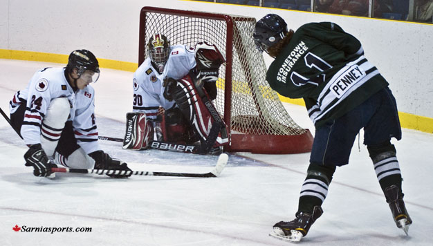
Then we go to the Jr.C level, some teams are the same as the Jr.B teams with sponsor plates on the back of their jerseys, but most got ads patches that may look tamed but if you put them with a Canadian flag patch or a memorial patch in the mix, it may makes you think and afraid of it, if the NHL ever decide to walk down to this path. Here are the pictures to witness it.
Image found from Google
Image from the Blenheim Blades Facebook page
Well there you have it my thoughts on ads being on jerseys, and showing pictures of Jr.B, and Jr.C teams with sponsorship patches, and sponsorship nameplates. Maybe I'm over thinking about this whole ads on NHL jerseys thing, but we may never know.
Until then, I'm Alan, I'll get elbow to my head, so you don't have to. Enjoy this year All-Stars weekend.

Sunday, 14 September 2014

Blenheim Blades OHA Great Lakes Jr.C concept

Hello, I'm Alan, I'll get an elbow to my head, so you don't have to. Today is Sunday, and tonight I'm off to a hockey game featuring today's concept, the Blenheim Blades.

The Blades were founded in 1965 as the "Golden Blades" until in 1974 when they removed the "Golden" and just called themselves "Blades." The last time this team won a championship was the BCJHL Jr.D title, ever since then this team had a lot of low seed results more than high seeds results, they can't even make it through the first round until the 2014 playoffs were they finally made it to the 2nd round only to get screwed out of it were they had 2-0 series lead gunning for 3-0 lead, but it was in half in the 3rd period in Belle River when the light went out, and instead of ending that game they decide to restart game 3 the next night, with that call the Blades fell apart and lost to the Belle River Canadiens 4-2.

Now with my yap yap aside time for the concept.
This link will show you what their current set looks like. This is just simple with stripes at the right places. I use the Toronto Maple Leafs old nameplate and using the Minnesota Wild old number fonts to fit this theme I was going for, which I am going to explain about the logo now. Thanks to inspiration from the team's old late 90's logo,  I mixed a saw blade, spokes, and the team's current shoulder patch altogether. The shoulder patch is made by me. Lastly, the colours are black, gold, and white.

SG-94 Feedback
HJC Feedback

Well, that's today post! Again if you want to send your defunct hockey concept to be part of October's "Concept of the Dead" send them to me, and I'll post them here! Also, don't forget to like my Facebook page. Until then I'm Alan, I'll get an elbow to my head, so you don't have to.

Wednesday, 10 September 2014

Wallaceburg Lakers OHA Great Lakes Jr.C concept

Hello I'm Alan, I'll get elbow to my head, so you don't have to. Today is Wednesday, to some it's a normal Wednesday, but to me hockey season is here well Junior C league that is even thou I won't be able to attend to the first game of this season, but that doesn't mean I can't show you my concept of this team, so let's get going with the Wallaceburg Lakers OHA Great Lakes Jr.C concept!

The Wallaceburg Lakers is a OHA Great Lakes Jr.C hockey club base from Wallaceburg, Ontario. Established in 1972, they won only 1 Great Lakes Jr.C title in 1999, and at the same year made all the way to the OHA Jr.C finals only to lose in 4 games. After their championship season they've been up and down from making it to the Great Lakes Jr.C finals, to missing playoffs, this team have been through a lot. Last season they wore the Lizard biting a hockey stick with the net in the background as the team's logo! Most of this team's logo history it's always word mark logo that said "LAKERS" on it with they brought it back for the 2014-15 season. Now with yapping about the team's history aside, on to the concept.

The stripes on the arms and hem is the wave style, pretty much simple yet effect to me. The fonts on the nameplate is UConn, and fonts for the numbers are the Connecticut Whale (now Hartford Wolf Pack) I felt the it fits well with this concept. The logo is made by me I try to give wavy like shield with waves in between the team's name above and "Jr.C" below. The colors are indeed green, gold, and black.

SG-94 Feedback
HJC Feedback

Well that's today post. Remember send in your defunct hockey concepts if you want to part of my "Concept of the Dead" month this October. Lastly once again check out my Facebook page, and like it! Until then I'm Alan, I'll get elbow to my head, so you don't have to.

Friday, 31 May 2013

Team's new look rant

Howdy and yes it's time for another rant by me, so let's get going.

PEI Rockets re brand to Charlottetown Islanders.
After 10 years of being called the "PEI Rockets", the team have change the name to the "Charlottetown Islanders" and they unveiled their new logo.
The logo looks good but 2 things. 1. Arial Black as the font for the "Charlottetown" is not a very bright idea to put on the logo. 2. Vegas Gold, Really? Instead of keeping red, blue, or green of all the colors you could've choose why in your creative mind go straight to Vegas Gold?
Change the font or remove the "Charlottetown"word mark, and change the colors for crying out loud.

 Dallas Stars new logo leaked?
Yup the Stars new logo got leaked or so everyone claim.
Here's my question, why Silver? Why would you replace the gold the have been with the team since the North Stars era with silver? But here's another question, what's the jerseys would look? So many questions will be answered on June 4.

Teasing like a Hurricane.
At the same date as the Stars (June 4) the Hurricanes will unveiled their new home and road jerseys. So far the team have been posting some images of their new set, the only thing I felt that they'll make a big mistake is removing their flag hem stripe witch it's always been their ID, it always the reason this team have some nice jerseys over the years, this could be ether good? or bad? You decide.

Ontario Jr.C relocated team.
I don't usually talk about any teams lower then the Jr.A (beside my Jr.B Maroons rants) I have to rant on this one. Two months ago the Kingsville Comets from the OHA Great Lakes Jr.C have relocated to Amherstburg, and the new team called them self the "Admirals." I think it's a good name and all, but after seeing the pictures the teams logo let just say they put the Calgary Cannons Baseball team, replaced a baseball cap with a pirates hat and add a big "A" in the background and there you go. I just don't know what to say about this. I just felt that there is no creativity what so ever. Sad just sad.

Well that's some rant for now, come this Saturday as I start a whole month of nothing but OHL concepts, until then later.

Wednesday, 8 August 2012

Wheatly Sharks

This is the Wheatly Sharks OHA Great Lakes Jr C Jerseys Concept; it’s pretty much a recolor Worcester Sharks concept just to fit the teams theme, their main crest is their own just add outer lines around the crest, the colors I gave them is navy blue, royal blue, red, and silver, and of course like most of junior C teams have a Canadian Flag on their yokes.

HJC Feedback