Showing posts with label AHL. Show all posts

Saturday, 23 February 2019

Montreal Canadiens 3rd Jersey concept (2 versions)

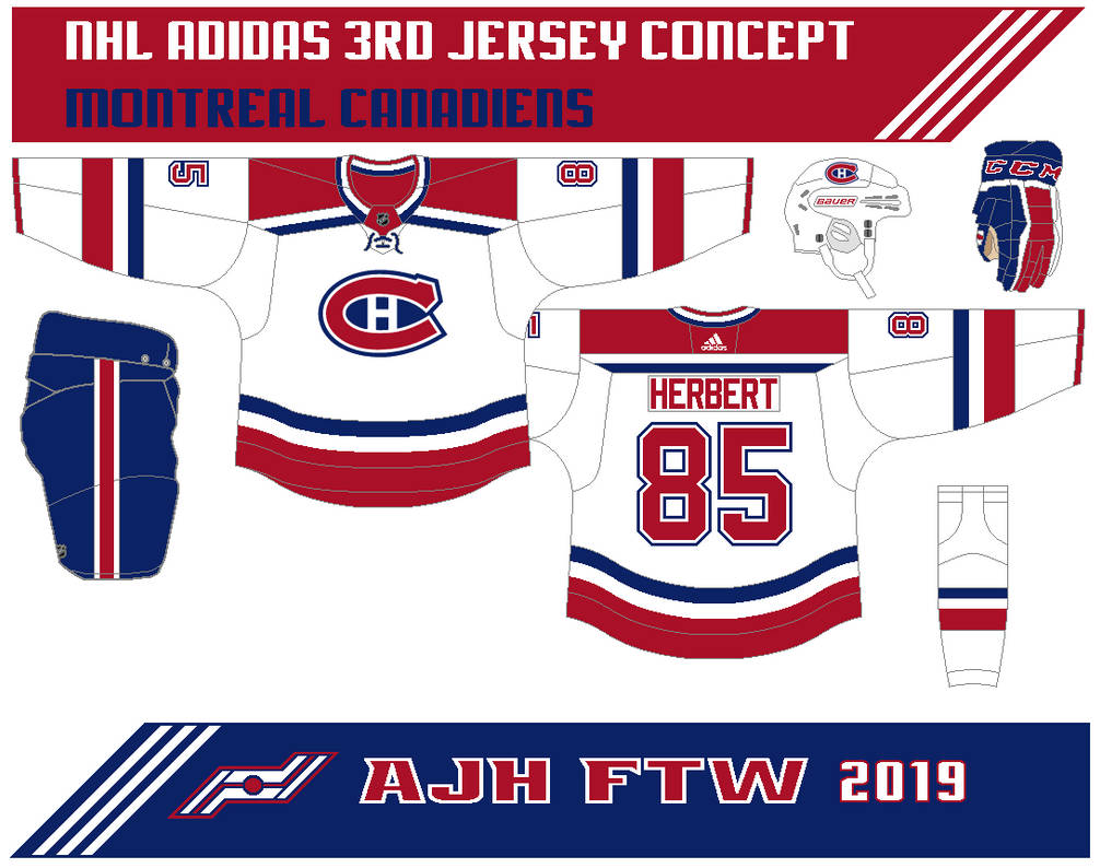
Hi everyone, Alan here for another post here at AJH HJA. Took a break for a week from this site and what better way to return to this site then a 3rd jersey concept, 2 versions of 3rd jerseys that is, it's the Montreal Canadiens.
This 3rd jersey is white with thick red stripes on the arms, hem, yokes, and on the socks along with thin navy blue and white stripes. The logo got the centennial classic treatment.


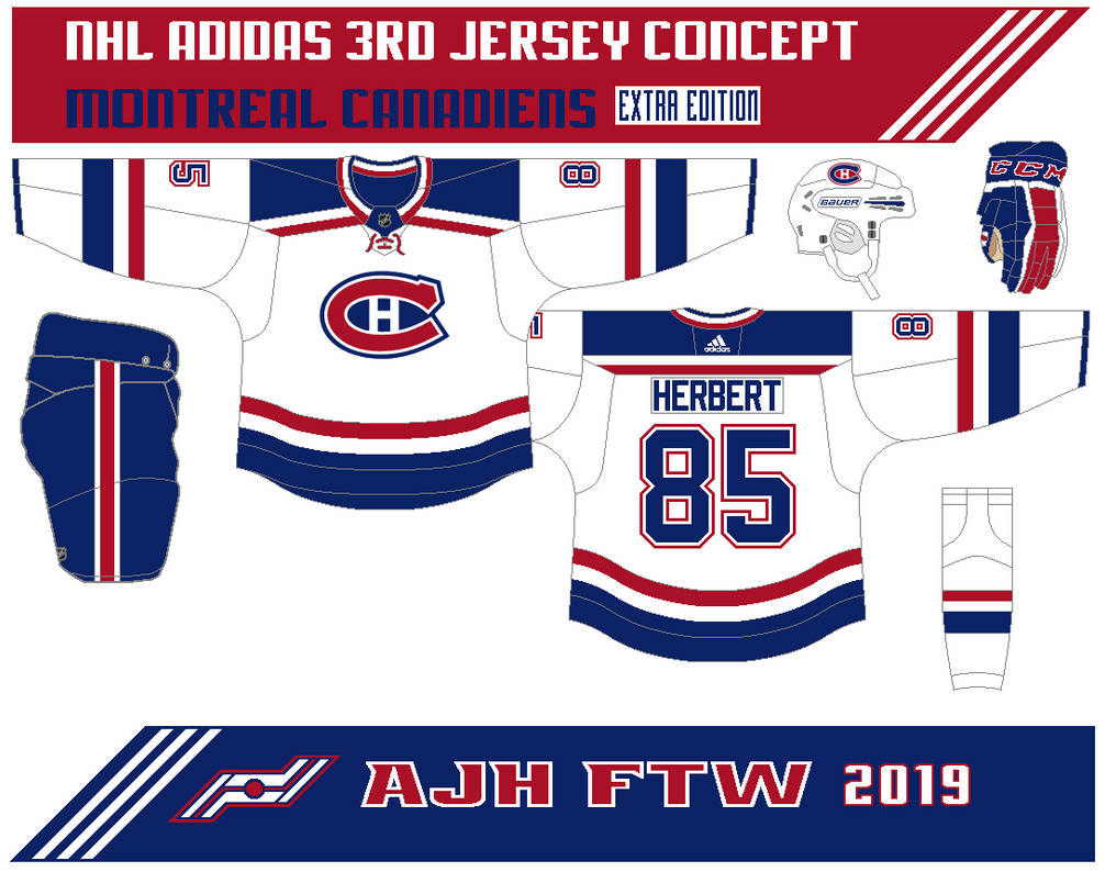
Here's version 2.
Same as the first one but both red and navy blue are switched.

Well, that's the concepts I update my link page and add the CCM Quicklite collar template on the template page you can use it for your concept making.

Well, nothing more to this post it's done for now see you all at the next post until then, later.

Sunday, 24 September 2017

Weekend post

Hi everyone, Alan here for some more rants here at AJH HJA! These are some I forgot to talk about, so let’s get on some rants!

Calgary Arena trouble
We jumped one problem with one team wanting to build an arena at taxpayer’s expense, I’m not going to talk long on this one because it’s just the same old story, different team. If you’re thinking that the Calgary Flames are going to relocated somewhere else don’t hold your breath both the team and the city of Calgary will come to an agreement on building an brand-new arena soon.

Fan Request on hold
Remember my last post that had fan request post, well after that post John O. request another one but the problem is Hurricane Maria hit his home country Puerto Rico hard so the fan request concept is on hold till everything alright over there. My thoughts and prayers to him, his family, and the people of Puerto Rico during this harsh time.

Updates, and new template
I’ve updated the link page with some hockey league sites, even an fanfic site I like reading. Also updated the template page replacing the Reebok jersey template with Adidas jersey templates, with collars all made by Steven G. Lastly, I add my version of the Adidas collar, go check them out. Maybe with the new template I can use that for future fan request concepts. (I know I’m stretching that one, I’ll try selling that one to him.)

Pictures on this site
During the summer where I had barely time to do I replaced pictures from Photobucket to Google photo due to the whole 3rd party b.s.  Photobucket put a price tag to make my image show on this site, but that’s alright with me because that site has been slow to load, slow to upload, and pop up ads everywhere it was very tiring and an pain to work with to think after over ten years of using it, time to move on from that site.

Adidas jerseys system: Next league to follow
Well I got a good question for you all. When the AHL and CHL (Canadian Hockey League) follow suit into the Adidas jerseys system? I predict for the AHL it’ll be 2 years after this season, and for CHL, give it 5 years after this season for them to get into the Adidas jerseys system, I’m calling for it.

What’s next after NHL Adidas series?
Well for now there are indeed plans in the works, I’m thinking of doing an alternate series for all 31 NHL teams, and there are others flowing in my head also that has my local junior teams written all over it.

And that’s today post! The next will be my weekly NHL Adidas series, till then later.

Thursday, 17 March 2016

AJH HJA 5th anniversary countdown: Moose gone Homicidal

Hi everyone, Alan here for another post here at AJH HJA's 5th anniversary countdown. Today post is Special event, one of few concepts I rarely do, sometimes every two years or so. From making mostly the Swift Current Broncos special event "My little pony night" concepts, to the one hit wonder Syracuse Crunch special event "Power Rangers" night concept. This one is mix of concepts I made base on a classic film Hockey Homicide, and the AHL's Manitoba Moose. I wanted to do this for a long time but due the return of the Winnipeg Jets, and the Moose moved to St.John. Now with the Moose back with a more updated logo I decide to go forth and put it together.

Indeed the jersey is base on a classic film Hockey Homicide along with the socks and pants to go with it. The main logo got a recolor treatment which is was hard to do until I add dark green with both green, and lime green to it to help the concept. I add the Jets main logo on the shoulders. Lastly the number fonts is indeed the moose font with adding thick white trim around it to give this concept that final touch.

HJC Feedback

Well this one is in the books, hopefully I'll get some more concepts soon (I know you all are tried of hearing that) til then later, and Happy St. Patrick's Day!

Saturday, 12 March 2016

AJH HJA 5th anniversary countdown: Milwaukee Admirals Concept Part 4: Nord-Flux-School

Hello everyone Alan here for the final part of the Milwaukee Admirals week. Today it's a concept based on an alternate jerseys I made in 2012 was a nod-back to the teams IHL days when they were the Quebec Nordiques farm club, with some flux back touch to it. Today I decide to make a set out of it, so here it is the Nord-Flux-School Milwaukee Admirals concept.
Pretty much Nordiques jerseys with Admirals stuff on it, from their main logo, their anchor logos, to even that team's current number fonts. Made ice blue main color with navy blue as secondary.

Here's an set mainly navy blue just for fun. Same thing but navy blue as main color.

Well that's it. hope you all enjoy this week there will be more very soon til then, later.

Thursday, 10 March 2016

AJH HJA 5th anniversary countdown: Milwaukee Admirals Concept Part 3: Dropping the silver

Hello everyone Alan here to continue my countdown towards the 5th anniversary post. I'm going to cut to chase here so let's get to today with more Milwaukee Admirals Concept.

Since a feedback about my first set I gave this concept a tweak by removing silver off and it looks pretty darn good if I say so myself. Just navy, and ice blue gives it a better look then what they are currently wear right now.

HJC Feedback


Well part 3 is done, be here this Saturday for the final part of my Admirals week, till then later.

Tuesday, 8 March 2016

AJH HJA 5th anniversary countdown: Milwaukee Admirals Concept Part 2: 2.0

Hello everyone Alan here to continue my countdown towards the 5th anniversary post. Today is part 2 of the Milwaukee Admirals week. Before we get to the concept I didn't get to show you all my old Admirals concepts but today I will now.
Here's my old Milwaukee Admirals concepts.


Now here's the new Admirals 2.0! 
Pretty much the same as my first set you all saw on Sunday, but the difference is the arms and that's all, nothing too much to tell about this concept.
Well this one is in books, be here this Thursday for part 3, till then later.

Sunday, 6 March 2016

AJH HJA 5th anniversary countdown: Milwaukee Admirals Concept Part 1: The first set

Hi everyone Alan here as we continue on with the countdown to my 5th anniversary post. I got 4 concepts but that's the problem I made 4 different concepts for one team, so the solution is I'll make a week out of it! You will see a concept today, one on Tuesday, another on Thursday, and last one on Saturday all nothing but the Milwaukee Admirals. For now let's get to today shall we.

This concept is simple, the stripes on the arms, hem, socks, pants, to even on the wrist cuffs. Using the team's new number font with trim, while standard block with trim for the nameplate. I kept the anchor logo for the shoulders. Lastly the logo, the team's new main logo. It was hard for me mainly because I love their staking Adms logo and use it on all of my Adms concept (and so far to my knowledge if I'm wrong the only one that using the logo for concepts) but I gut it up and use the new logo.

HJC Feedback
Well part 1 is done! Come back Tuesday for part 2 of my Milwaukee Admirals week, till then later.

Sunday, 13 December 2015

Ooooo Barracuda!

Hello readers, Alan here to keep this ship staying on course here on AJH HJA. Today is an AHL concept that has been stuck in my head since this team came into scene, today it's the San Jose Barracuda.

First up the logo, I remove the corporate logo background behind the barracuda, and remove the grin off the barracuda to make it look better to my taste. The arm stripes is base on the team's corporate logo. The colors are teal, black, and silver, I choose silver over orange because I felt it doesn't fit this concept to my taste. Lastly I use the Sharks old number fonts before the edge era.

HJC Feedback
Icethetics Feedback

Well this weekend is in the books, hopefully I got some more in line for the next weekend til then, later.

Sunday, 22 November 2015

Try to warm things up on a Sunday

Hi everyone, Alan here for part 2 of the AHL weekend here on AJH HJA. Today is the Stockton Heat Concept.

Pretty much just simple stripes on both arms, and hem. Simple fonts for both nameplate, and numbers. The logo I pulled the "S" out of the rounded word mark logo.


Well this weekend is in the books. I will try to set some more posts up for the next weekend. Until then, later.

Saturday, 21 November 2015

Classically Wild

Hi everybody, Alan here for another weekend post here on AJH HJA. This is part 1 of the AHL weekend post today we got the Iowa Wild.

This one is classic put together to fit a minor league team! The right striping on the arms, hem, to even on the Dallas Stars style yoke. Standard block font for the nameplate, and use the Wild font for the numbers, one those font that I wish the Minnesota Wild still use them.

Well that's Saturday, come back tomorrow for another AHL concept to wrap up the AHL weekend. Until then later.

Tuesday, 23 June 2015

After the Stanley Cup rant post

Hi everyone, Alan here for my last post on this site and I'm on hiatus till probably around in the fall of 2015 with just bunch of rants, and an logo review so here we go.

Chicago Blackhawks 2015 Stanley Cup champions
I called it, I totally called it, I said (included others) the Blackhawks would win it in 6 games. Tampa got the right players to bring them to the big dance, but in the end the Hawks with their experience from their past cup appearance beat the Lightning to win their 3rd cup since 2010.

Manchester Monarchs 2015 Calder Cup Champions
The Monarchs won their first championship. Sadly this is their last title as the team will play in the ECHL for the 2015-16 season what a way to go off on top. Congrats and good luck in the ECHL Manchester Monarchs.

Allen Americans ECHL Kelly Cup Champions
 What a year it is for this team! From winning back to back CeHL titles to being the 2015 ECHL Kelly Cup champions, I been following this team all season because of Blenheim's Jamie Schaafsma the captain of the team, heck I work with his mother and she tells me story of his time to from ECHL to Europe leagues. It's cool to see some locals from around my area doing fine with their hockey careers. Congrats to Jamie Schaafsma and the Allen Americans on winning the ECHL title and hope for being part of the ECHL for years to come.

Coyotes Saga again!
Year number 6, or 7 I don't know, with the city of Glendale, AZ have decide to drop their lease agreement with the Coyotes leaving them no arena to play in. Some of the yotes fan are trying to rally everyone to tell Glendale to live up the agreement, but the problem is those fans are from outside the city they don't understand that the problems are as bad as what they think.

Time for my logo review, this one caught my eye and I don't want to miss out on this one even thou this team came from Jr.C level league but their new logo got me wanna review this.

Wheatley Omstead Sharks
This is a nice re brand update! This is their old logo see the difference? I sure do! The shark looks badass one those look that the San Jose Sharks can't pull off like this. The fonts on the word mark fits the team. Nice way to put their old Omstead logo on the shark's fin to remind of their past history. The only some what of a down point is the colors put together for some odd reason it had that Columbus Blue Jackets alternate logo vibe to it. Overall pretty darn good looking logo for a Jr.C hockey team. Now the next thing is what their jerseys look like? I'm going have to wait until more likely in September.

Well that's today post, as I'm taking a summer break from this site, but don't worry my Twitter page, and my Facebook page will still be going. Until then I'm Alan have a great summer everyone.

Sunday, 15 March 2015

Lone Contributor: A shocking post

Hello I'm Alan, I'll get elbow to my head, so you don't have to. It's been over a month since the last time I post anything here on this site, I admit that I have lack the feel of posting stuff on this site, mainly with a lot stuff  I've been busy outside the concept world so much that every time when the days is done I don't got anything left in me to do. So I pretty much got lazy in making concepts. I mean the last time I made a concept from scratch was back in November, until late in February a contest from good old HJC that got me back on track, I'll try to get them set up to be posted here! But for now I got some rants, and a concept contributor!

3 way relocation move news!

Alright people try to follow me on this one, it's a brain scrambler one. First the Winnipeg Jets officially announced that they are relocating the St. John's Ice Caps to Winnipeg. This is a surprise to me but 2 things. Number 1 I felt like they miss the boat on this one, I understand that there is a slow progress going on with the arena deal in Thunder Bay and all, and number 2 I felt like they could have move the team anywhere in Saskatchewan, that province is screaming AHL Market right there. Now the next question is will they be called the Manitoba Moose again? Most likely in my opinion, hey it didn't stop the Dallas Stars AHL team being called the "Texas Stars" so why not? might as well.

With that St. John lost one AHL team, but they gain a AHL team. The Montreal Canadiens will move their farm team the Hamilton Bulldogs to St. John's. Word is they'll still be named the Ice Caps, unless the Jets has something to say about that, or they will let this one slide with this whole Laval Quebec arena thing in progress that could be the Habs farm club's main home in the next two years.

Then came the shocker that I did not see it coming! With Hamilton no longer have a AHL team, so they went down a level to the OHL, with rumors that the Erie Otters moving to somewhere unknown, and the Plymouth Whalers moving that ended up going to Flint next season. In stand the former AHL Hamilton Bulldogs owner purchased and got approved by the OHL to move the Belleville Bulls to Hamilton to be called of course the "Bulldogs" this one a shocker to me because this team is well story team with a lot of history for this team, but sadly it make sense because the city can't put good money into getting a brand new arena, that city deserve a new arena, not seeing their beloved team moved.

Now that I got my rant fix time for a concept contributor.

Stockton Thunder Concept [by Jake88]
With Stockton getting themselves promoted from the ECHL level to the AHL level this could be perfect for the team, if not a good alternate jersey.
Up points: Yellow fit this team very nicely. The design on the jersey is good. Lastly liking the bolts stripe on the arms is a nice touch.
Down point: Grey is good but I felt that this jersey could look better without grey mostly trim around the numbers, it looks blended with the yellow.
My suggestion: Replace the grey with white, and add white on the hem to give that eye popper effect!

Well that's today post. Hopefully I can get the chance and feeling up to post more stuff here! Til then I'm Alan, I'll get elbow to my head, so you don't have to.

Tuesday, 27 May 2014

AHL Stadium Series Concept Hartford vs. Bridgeport

Hello I'm Alan, I'll get elbow to my head, so you don't have to. Now normally I don't miss every concepts being posted here, only odd ones, and this is one of them.

Oh boy where should I start. The Wolf-pack jersey is simple Stripes on the arms, hem, and even small stripes on the yoke. The logo is a wolf's head with shield that has "HWP" on it under it. Colors are blue, red, and silver.
The Sound Tigers jersey are wild in their own way. Tiger stripes on the arms, hem, yoke and even on the socks. The logo is their current, nothing much to talk about it. I used the Seattle Seahawks NFL numbers to fit this concept.

HJC Feedback
HCI Feedback

Well everyone that's this week post. Until then I'm Alan, I'll get elbow to my head, so you don't have to.

Wednesday, 4 December 2013

Milwaukee Admirals Concept 2013

Weeks ago I made this for the HJC Admirals Contest, it's pretty much the same concept as my other ones from last year, but with some tweaks to it. On the white jersey I removed the colored yoke and kept it white. Both jerseys got their numbers and nameplates change to different fonts, the nameplate is standard block, while the numbers is the Dallas Stars current fonts.


Here's my alternate jersey that I didn't add to my set, it' same design only the main color is black.
HJC Feedback

Well that's today post, til then later.

Sunday, 5 May 2013

Sunday: Time to Vote!

Well today the voting phase of the Hartford Wolf Pack has begin. With only 10 entries battling for your votes to see who's has the best concept that will make the Wolf Pack team wish they use them for their return to the AHL.

Oh here's my Hartford Wolf Pack Concept

HJC Feedback

For now Later.

Monday, 1 April 2013

"Whoopee" A April Fool's Post

Well it's Monday were you read some dirty magazines, watch some dirty video, make some dirty jokes and... alright, alright if you didn't catch my drift today is "April Fools Post!" let's get going with two concepts. one that will give you diabetes, the other with give you uhhhh I'm not going to touch it with a 40 foot pole, I mean rod, no no no I mean stick, wait I mean uhhh I got dirty jokes stuck in my head, let's get going.

Hersey Bears Concept
On this is pretty much the Bears Main Crest, and Shoulder patch on the Washington Capitals template, instead of Red and Blue, it's Chocolate Brown, Cocoa Brown, and Sand.

Macon Whoopee Concept
Alright I'll let you read Wikipedia about what "Whoopee" mean let's put it at that. Anyways the concept is pretty much your topical arm stripe combo and vertical piping that stop halfway and connects around the sides to the back vertical piping, and add two lines to the bottom of the jerseys for the hem, and there you go a Macon Whoopee Concept.

Well that's my April Fool's Post now I'm taking a cold shower until then.

Just Maybe?
Just Enjoy!

Friday, 11 January 2013

Binghamton Senators Specialty Jersey

Just got back from watching the Dresden Kings Jr.C game and I feel like posting another concept here, I'm not going to put details on it, it's just a concept that I entered for the HJC Binghamton Senators Specialty Jersey contest.


Wednesday, 26 December 2012

Syracuse Crunch Special Event Concept

With bunch of AHL teams doing special events I decide to make my own AHL special event concept, what better way to do it then with two things in my life "Hockey", and "Power Rangers", put them together and you'll get a special event concept. In case you all don't remember my "Hidden Treasure"posts that I made years ago around the same time during the 04-05 lockout I made Power Rangers theme hockey Jerseys, witch brings me to my rant about the Syracuse Crunch's new look, I had this idea stuck in my head for the longest time so I took a break from working on my OHL redesign concepts to do this idea and here it is my special event concept.

This concept is a Syracuse Crunch Special Event Power Rangers night the jersey is base on the Mighty Morphin Power Rangers with the teams colors, the main crest is the same but change the visor from silver to black to fit the theme, and the team's affiliate logo (Tampa Bay Lightning) is on the hem belt. So yeah that's my concept, hopefully I'll sent this concept to other sites, so far I sent it to icethetics hopefully it'll get on their concept page maybe on "Freaky Friday".

Icethetics Feedback 
HJC Feedback

Well that's for today, as for my Christmas it went well I got my self a London Knights Home Jersey (Black color), and a iPod touch greatest give ever!

Friday, 19 October 2012

Brewing up some Admirals

Once upon a time theirs a team began in the year 1977 in the old IHL (International Hockey League) called the Milwaukee Admirals, in the year 2001 the IHL close it's doors and the Admirals joins the AHL and in 2004 the Admirals won their first (and so far the only) Calder Cup title.
For the past months I try to make the Admirals concepts to top their current set, their look is not bad and heck I even own their ice blue 3rd, but one thing that bothers the heck out of me is their socks, it drove me nuts and ruins a good set, and so here's "3" Milwaukee Admirals concepts I tried to brew up.
Oh one more thing just for info of why their is a Milwaukee Brewers old logo on the Adms jerseys? The answer is one of the part owners of the Adms is also the Owner of the Milwaukee Brewers with that the Brewers are their main sponsor.

 Milwaukee Admirals Concepts number 1
This one I try to make it easy, simple, and have that classic feel to it with their full body Admiral not only it's fits this concepts but also it's my favorite crest ever. And so I made black as their main color and give their ice blue some more spotlight with silver as addition color, the 3rd concept is much base on their 80s look they had when they were the Quebec Nordiques farm club instead of the fleur de lis, I use the teams anchor logo to give that flux back feel to it.


Milwaukee Admirals Concepts number 2
Now this one I really had a hard time, I decide to make their ice blue as the main color both colored and 3rd, while the white stay the same, and quite honestly to tell you the truth I have a hard time in making the ice blue as the road I really don't want to make it as the road it's too good to be a road jersey, so I decide to pull a NHL jersey rule, even though the AHL jerseys rule is the white jersey is home and the color ones are the road, but I just pulled the NHL jerseys rule and did it that way, indeed that is not how AHL roll but couldn't bare my self to do.


Milwaukee Admirals Concepts number 3

There's a saying go "if it doesn't succeed try, try again" and thus I did! On the home jersey I switched the black with ice blue, the road jersey the arm strips is switch from white to ice blue, the 3rd and special event is the same as my second concepts, you kinda say it's a complete set right here, I really like this concept so hopefully you all enjoy these concepts.

Friday, 5 October 2012

AHL Affiliate Fantasy Week Day 5

Well today is the last day so here we go.
If Oklahoma City is affiliate with the Tampa Bay Lightning you get
I named them the Storm just to fit with other sport team like the NBA's Oklahoma City Thunder, and the WNBA's Tulsa Shock to name few. This concepts I made is pretty much different from Tampa, just pretty much use the Lightning' old crest from 07-08 to 10-11 replace the "Tampa Bay" word mark on it and put "Oklahoma City" on the top of the logo and add "Storm" on the bottom, add black to the teams color with blue, grey, and white just give it a little bit more live to it with the stripes and trims around the letters and numbers, I didn't add the Lightning main crest on the shoulders on this concepts because there's the lightning bolt on the side of the pants that pretty much got some people knowing who's this team is affiliate with.

And so that's my "AHL Affiliate Fantasy Week" hope you all enjoy it as much as I do, will I do this again? Maybe or maybe not, but who knows, right now I got other concepts ideas including remakes stuck in my head to work on for now.
Just Maybe?
Just Enjoy!