Showing posts with label Alternate. Show all posts

Saturday, 21 December 2019

New York Islanders 3rd jersey concept

Hello everyone, Alan, here for another alternate jersey concept post here at AJH HJA.
Orange jersey with navy blue wavey arm stripes with white trims. The hem is regular, and with the stripes, go along with the curve hem is good with me. The "NY" logo that the team is currently using on their alternate jersey is recoloured to navy blue. There also an orange version of the "NY" logo on both the navy blue helmet and the navy blue pants. Lastly, The team primely logo is recoloured and sitting on the shoulders.
And so this post is in the books see you all next time until then, Merry Christmas and Happy Holidays.

Sunday, 24 November 2019

Chicago Blackhawks 3rd jerseys concept

Good day everyone, Alan here at AJH HJA. You pretty much now know the drill, so let's get to it.
I took the Blackhawks 2019 winter classic logo and just add red on it. The stripes are red and white. The numbers are red with white trim, and the letters are white in a red nameplate.

Icethetics Feedback

So this one is done on to the next one until then, later.

Saturday, 16 November 2019

Boston Bruins 3rd jersey concept

Hi folks, Alan, here for another 3rd jersey concept here at AJH HJA, let's get to it.
Using Boston's alternate logo from 2008 to 2016 recolored to give it more white on the black jersey with a hint of both gold and brown.

Icethetics Feedback

Well, there's nothing more to tell you all about this one so on to the next one until then, later.

Friday, 1 November 2019

Edmonton Oilers 3rd jersey concept

Welcome back everyone, Alan here for a regular concept post at AJH HJA. I hope you all enjoy Maroontober month, now let's get back to our usual concept with an alternate jersey. But first I want to review the Edmonton Oilers new 3rd jersey and let's just say I got mix feelings since it got leaked so let's get this done and over with.
Source: Icethetics.com
This Stadium series like jersey is navy blue as the main with orange stripes, orange letters, orange numbers, orange collar and orange logo. What more I can say about the equipment doesn't help this alternate at all. My Jersey Collection Rate: Fanatics form at discount price.

Now that's out of the way on to the concept.
Navy Blue as primary along with silver, white and making its return copper! The front logo is the gear teeth pulled off from the old shoulder patch logo from 2002-2007 recolored.  The team's current logo got recolored, and it sitting on both the shoulders and the helmet.
So today's post is done, I still got some more coming as soon as I can until then, later.

Friday, 20 September 2019

Buffalo Sabres Alternate Concept (plus a jersey review!)

Welcome back everyone Alan here for another post at AJH HJA. One news that gave a spark to the jersey nerds nerve both good and bad.

Source: Icethetics.com
Metallic gold and navy blue combo on a white jersey is an excellent look for a team I give them credit these are beautiful alternate jersey they got for the first time since they whipped these beauties back in 2010. The down points I got with is the numbers they need to add a navy blue trim around it so you can see the gold trim on it. As pretty much as always to me and others, the collar won't it hurt them to as least put more colours on them than just that thin navy blue trim on the collar. My Jersey Collection Rate: Buy it in Fanatics brand at regular price. 

So that out of the way, I will show you my Sabres 3rd jersey concept that I think would look good.
Simple stripes on the arms, hem, socks and the pants along with royal blue yoke and metallic gold trims. The logo is the team's old alternate logo from the old red alternate jersey they wore from 2000 to 2006 and add the Sabres shoulder logo they wore at the 2018 NHL winter classic on top of it, place the royal blue, metallic gold, and white on it and you got a logo for both the front and shoulder on the alternate jersey.

So this post is in the books come back next time for more AJH HJA til then, later.

Saturday, 7 September 2019

Philadelphia Flyers Alternate concept

Hi everyone Alan here for another post here at AJH HJA. In 2016-17 NHL season the Flyers wore the 50th-anniversary jersey which it's alright, but I felt that the team missed the boat logo wise, I was hoping the team would bring back their so-called famous 3-D logo that goes along with the alternate jersey they wore from 2002 to 2007. What better way to bring back that 3-D logo? Recolour the silver to gold and put on my simple jersey design, add gold trims on the numbers and gold letters and you got yourself an alternate jersey concept.


Well, this one is in the books see you all next time here at AJH HJA until then, later.

Saturday, 24 August 2019

Vancouver Canucks 3rd Jersey concept

Hi, Alan here for another post here at AJH HJA. On this post, I got an alternate jersey concept, the team is the Vancouver Canunks.
I pretty much made blue and green working together with white as the trim. Put the "V" on the arms in green with blue, green and white trims. Standard block for both nameplate and numbers.

Icethetics Feedback

So, that's pretty much it. I'll see what I can do to put more together down the road until then, later.

Saturday, 23 February 2019

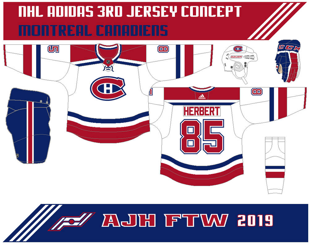
Montreal Canadiens 3rd Jersey concept (2 versions)

Hi everyone, Alan here for another post here at AJH HJA. Took a break for a week from this site and what better way to return to this site then a 3rd jersey concept, 2 versions of 3rd jerseys that is, it's the Montreal Canadiens.
This 3rd jersey is white with thick red stripes on the arms, hem, yokes, and on the socks along with thin navy blue and white stripes. The logo got the centennial classic treatment.


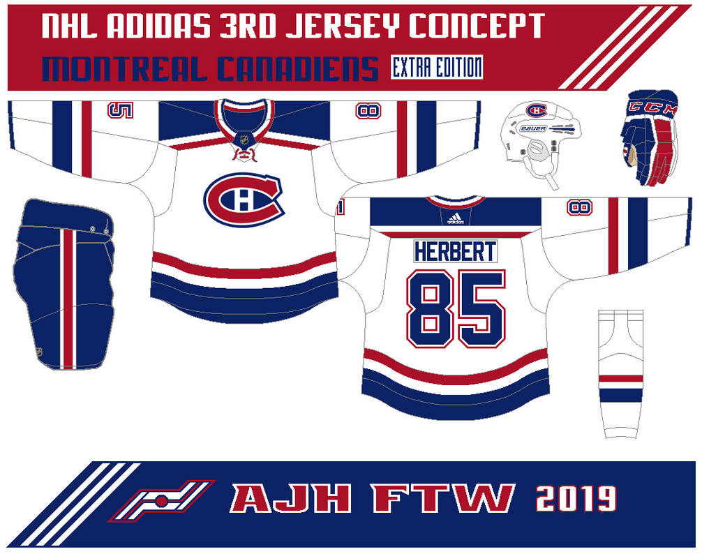
Here's version 2.
Same as the first one but both red and navy blue are switched.

Well, that's the concepts I update my link page and add the CCM Quicklite collar template on the template page you can use it for your concept making.

Well, nothing more to this post it's done for now see you all at the next post until then, later.

Saturday, 9 February 2019

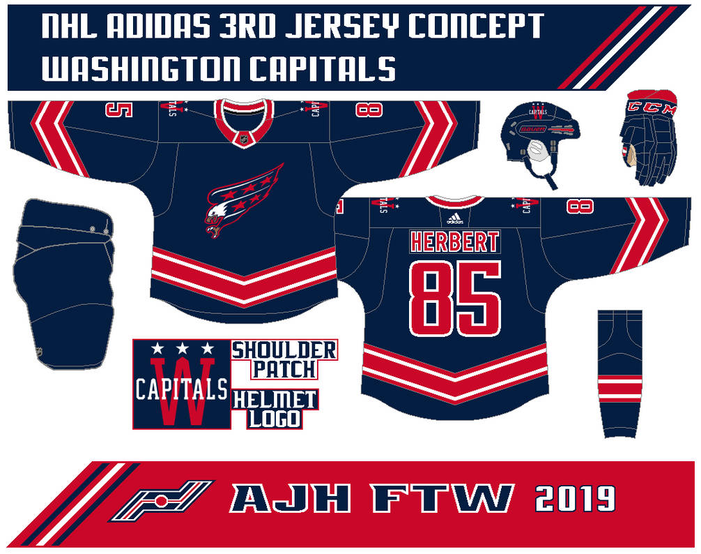
Washington Capitals 3rd Jersey concept

Hello everyone, Alan here for another concept post here at AJH HJA. This one is short and sweet because it's the same but recoloured, it's one of my first concepts that I sent over to the Stopgap Concept site if you have a concept that needs to be reviewed go over to site, find the E-mail and sent in your concept over to them and support the site.

Now with that out of the way on to the 3rd jersey concept.
Pretty much the same as the Caps dark jersey from my Caps set but the red and blue are switched.

Stopgap Concept Feedback

Well, that's the concept, time for some rants.

2020 NHL Winter Classic
Well, it official The Dallas Stars opponent for the 2020 Winter Classic at the Cotton Bowl is the Nashville Predators. The question now is what they will wear at the event? I believe in my mind for Dallas, the Stars first black jersey, or the star shape jersey they wore it while winning the 1999 Stanley Cup title. As for Nashville, I'm thinking their first white jersey or something based on the city old minor league days.

Lakers on the move
Going down to Ontario Jr.C level news that I pretty much the only one that cares about, there are talks that the Wallaceburg Lakers could be relocated to Tilbury Ontario. For Wallaceburg, it's a heartbreaker, for Tilbury it's for the first time since 1994 where the team had to bail out due to a hazing scandal resulting in hundreds of criminal charges being laid. I'm hoping for a name that works for Tilbury something that doesn't stick with the past but gives the town the fill with pride and could rival with the Wheatly Sharks.

So my rant is done, hope for some more posts soon if I get the chance to do them until then, later.

Saturday, 23 April 2016

AJH HJA 5th anniversary: Gradient Gem

Hi everyone, Alan here for part 2 of my 5th anniversary post here at AJH HJA! On this day in 2011 I posted my very first concept, it was the Pittsburgh Penguins alternate concept it was based on the Pens first alternate jersey in Reebok cut form, I send this to HJC and it got good praises, and on that day I got hooked and been doing concepts since then.

Here's my first Pens alternate jersey concept.


A year later I decided to tame the concept with this one.

Now 2016 here's my Pittsburgh Penguins alternate concept.
I made it more gradient as I could, beside that and giving the hem the same treatment as the arm stripes it pretty much the same as my 2012 concept.

HJC Feedback

Well that's it, the celebration is over it's been a rough one for me juggling this, work, to even odd jobs but in the end I made through for now the only posts I'm making for now is my "Playoff Pickz" and so far is not looking good for me. Until then, later.

Monday, 15 December 2014

Today is just Ducky!

Hello I'm Alan, I'll get elbow to my head, so you don't have to. Today is all Ducks post! We got Anaheim Ducks concept by a contributor, and a Quad City Mallards alternate jersey concept, let's get to it.

Quad City Mallards Alternate concept (by me)
The Mallards wanted a alternate jersey for themselves, so they had HJC to host the contest. I send this one in, I like the duck head with the helmet logo so much that I use it as the main front logo, followed by the circle and two sticks crossed logo as the shoulder patch. using the wave stripes for both the arms, and hem. Big green yoke put on this concept for a finishing touch.

HJC Feedback

Anaheim Ducks concept (by Ricky)
Up points:  Orange jersey is always a plus for me. Stripes on both arms, and hem is well made just like the team's old mighty ducks black alternate jersey. The "OC" logo as the shoulder patch is a good idea to me!
Down points: Numbers on the front doesn't fit this concept to my taste. Word mark logo is fine, but I prefer the webbed "D" logo at any time.

Well that's today, more coming soon, if I can get to them until then I'm Alan, I'll get elbow to my head, so you don't have to.

Friday, 19 September 2014

Friday: "ABOUT DANG TIME!"

Hello I'm Alan, I'll get elbow to my head, so you don't have to. Now normally I rant on new jerseys whenever I fell like it, to even not ranting about it. Until today when the Pittsburgh Penguins unveiled their new third jersey for the 2014-2015 season, and all I can say is "ABOUT DANG TIME!"

Check them out!
Sportslogos.net

It took this team a long time to really bring back this classic to the Reebok form, base on their famous 1986 to 1992 set worn and made famous by Mario Lemieux that also brought the Pens their back-to-back Stanley Cup titles. The Alternate Jersey is brilliantly made, the stripes is placed nicely, the colors are the way it's suppose to be. Overall: Buy this jersey in a heart beat!

Well that's all I can rant about this jersey it's perfect enough for me not putting anymore yap about it, but I hope this leads to something more like what the Oilers, Flyers, and the Islanders did that's all I can say.
Remember if you want to be part of October's "Concept of the Dead" event send in your defunct hockey team concepts, I repeat it's not a contest, it's just a showcase, good, or bad nothing more.
Oh and I got a Facebook page, O.K. I'm done for now, until then I'm Alan, I'll get elbow to my head, so you don't have to.

Monday, 5 May 2014

Edmonton Oilers Alternate Concept

Hello I'm Alan, I'll get elbow to my head, so you don't have to. I got a NHL concept today, an alternate concept, an alternate concept that was part of the HJC contest, a Edmonton Oilers alternate jersey concept! Let's get going shall we.
 I used the arm stripes base on my Boston Bruins concept, but with the stripes of the Oilers current set, then I spin it, and flip it to fit it nicely. I use the Dallas Stars yokes with trim around it. The shoulder patch came from the Oilers old alternate shoulder patch, but without the word mark above it. The main logo is the team's old alternate logo, well design logo if I say so myself.

HJC Feedback
HCI Feedback

Well today's post is in the books. There will be a post per week made by me most likely, as for concept contributor posts it'll be on hold until the Playoffs are over, witch means just like last year in summer with my IceHL concepts I'll be doing a weekly post of just concept contributors, mainly because I'm getting (not a lot, but) good numbers of concepts from contributors, so I decide what the hey put them together for this summer (in July) called "Summer of Contributors!" If you want to be part of this event send your concepts to ajhftw@gmail.com. Hope you all enjoy this summer, Until then, I'm Alan, I'll get elbow to my head, so you don't have to.

Wednesday, 11 December 2013

Fishstick, Sabers all in one island!

Hi Everyone once again it's another post, that is scheduled witch it's a good thing because I'm working 10 hours this week at my workplace before Christmas, thou it last for two days last week because of running out of stuff to put together to worth an wild week, now I'm working 8 hours in mornings. Enough about my life story we got an alternate jersey made by me, and an concept set from an contributor named Ricky M. You might remember him writing for HJC, now writing for HCI on fridays, also he has his own website called Buffalo Nickel Graphics check it out. So let's get going.

New York Islanders Alternate concept [by me]
This was part of an HJC contest called "Make the Fishstick logo look good Competition." I use the wave stripes that was base on my Erie Otters concept, made it 4 stripes for "you know what the 4 stripes means by now," the logo was tricky to do, but pulled off nicely. The colors are blue, orange, navy blue, and white. What do you think?

HJC Feedback
DD60 Feedback 

Buffalo Sabres Concept [by Rick M.]
This one of thing I believe if the Sabres decide to change their look completely, this is it! The design on the home, and road is well made, the arm stripe is solid with a small and short trim made it look good, with the additional of 4 stripes on the hem is an good move. The alternate is different but creative. The front logos on all are indeed a good choice, and the fonts for the numbers, and nameplate is clever. The down point is on the home change the silver to white, it feels like it doesn't need to be that color, on the road not an fan of the white pants, and lastly get rid of the small front numbers off of the home, and the 3rd. Overall: Nice set could have the potential to be the best Sabres concept, just do those little things and this one is an winner. Score: 8.5/10

Well that's today post, as we are getting closer to Christmas, have you'll got your shopping done? I hopping my should be done too. Come back here next week for some more concepts by me and an contributor. Til then later.

Wednesday, 4 December 2013

Milwaukee Admirals Concept 2013

Weeks ago I made this for the HJC Admirals Contest, it's pretty much the same concept as my other ones from last year, but with some tweaks to it. On the white jersey I removed the colored yoke and kept it white. Both jerseys got their numbers and nameplates change to different fonts, the nameplate is standard block, while the numbers is the Dallas Stars current fonts.


Here's my alternate jersey that I didn't add to my set, it' same design only the main color is black.
HJC Feedback

Well that's today post, til then later.

Saturday, 1 June 2013

Ottawa 67's Alternate redone

Hi everyone it's June and as promise all this month will be nothing then OHL concepts, the rest of my "OHL Redesign Quest" that's right people, so let's not waste time and get things rolling with a fix on my Ottawa 67's Alternate jersey.

The only thing I change on this one is the main crest. from my first time it was barber stripes on the "O", after weeks and looking at the 3rd jersey I decide to change it so I made the "O" one solid color and that's all just the main crest, everything else is the same.

HJC Feedback

Tuesday, 31 July 2012

Pittsburgh Penguins Concept X2

Well over a year ago in April I made my first concept for this site, it was the Pittsburgh Penguins and knowing now it's been a year since opening the site I've decide to give it a little bit, well kinda, alright, alright a big make over but I did something to try to give me a experience going out of my usual templates and give the NHLUniforms.com template a shot.

Well this was my first shot at the template looks OK to me, but the only problem I got is that I misjudged it, the template is big the main crest and the numbers on the back and NOB were small on this template so this idea was out the window.

So I made this one in my usual template, it almost look like there inaugural '95 alternate jersey, but I gave it some few changes, the first one was switch the grey to gold, add gold to dark gold hem stripe for good measure, and if you look at the Pens crest the gold area it'll change from gold to dark gold.

And that's my Pittsburgh Penguins Concepts hope you all enjoy it until then.

Just Maybe?