Showing posts with label Dallas Stars. Show all posts

Sunday, 8 December 2019

Request to wish upon the Stars

Welcome back, everyone Alan here for some more concepts here at AJH HJA. With the 2020 Winter Classic is getting closer, everyone is going to see both the Preds and the Stars Winter Classic jerseys in action I'm just giving you a quick review of both of them.
Stars: Everything looks good, but the pants ruin it, and I know its part of Dallas hockey history and all but come on at least finish the perfection by making them green that's all I wish for.
Preds: From top to bottom works well for the Preds, including the shoulder patch is a nice touch.
Overall: Preds set is better than the Stars.

Now off to the Concept, actually it's a fan request concept by yours truely John O.
This one is based on the Dallas Stars classic star shape design that they used from 1998 to 2007 and it been used by many, and I mean "MANY" concept artists had used this design to death unlike theirs that is on a Reebok edge template I'm using the Adidas template so I can keep my mind at ease.

Classic star design, there are two different fonts on the back of the jerseys. The letters and the number 2 is J-LOG Rebellion Slab Sans Small Caps font, and the number 4 is J-LOG Rebellion Sans Small Caps font. The home and road jerseys are what it is along with a black 3rd jersey.
Same as the first one but with the team's current logo, shoulder patch, and colours.

Well, that's covers it sees you all next time on AJH HJA, later.

Saturday, 2 December 2017

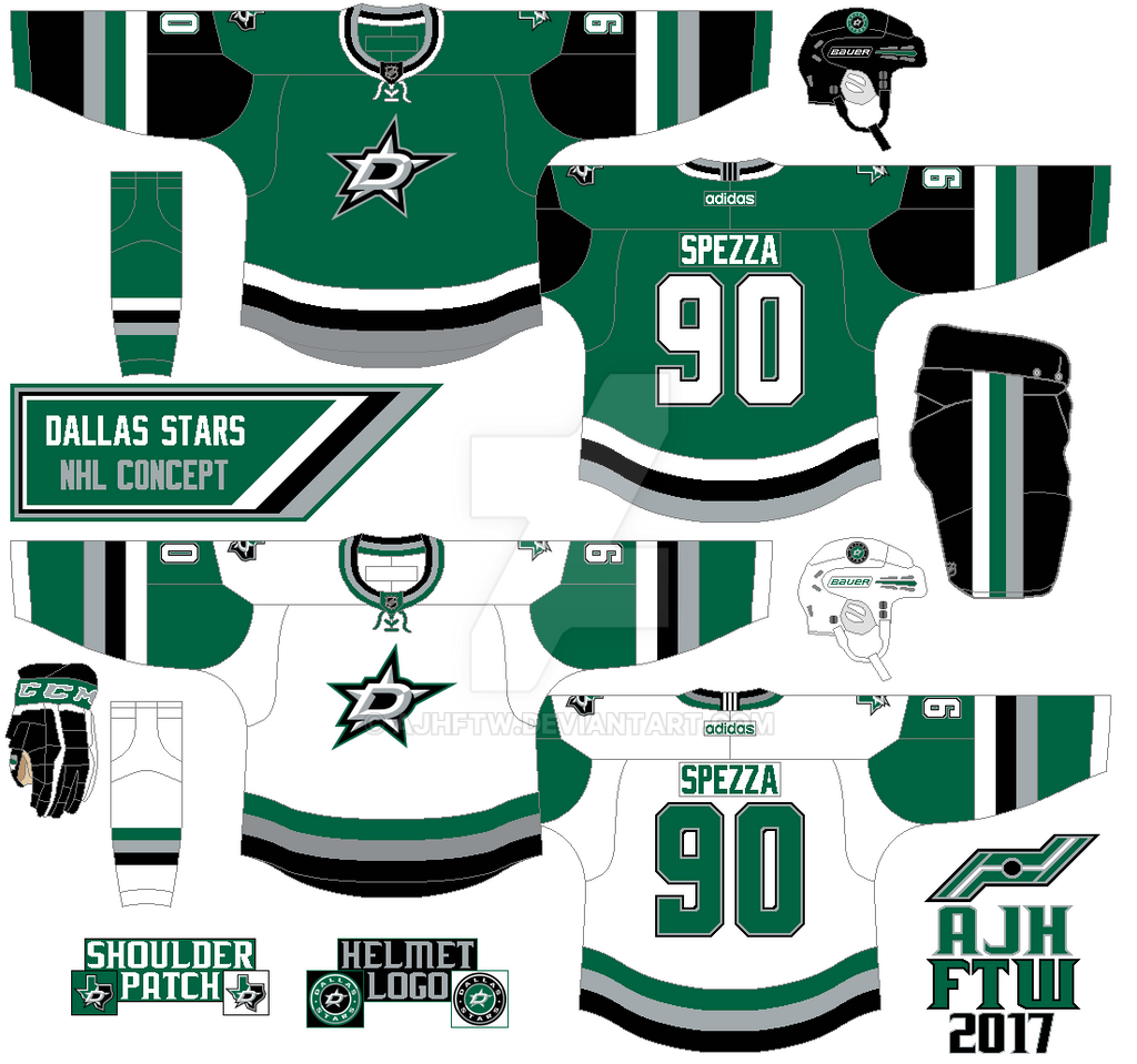
NHL Adidas concept: Dallas Stars

On the green jersey, the arms are mainly black. On the white the arms are mainly green. I add silver to this concept to go with the logos. 

HJC Feedback

Thursday, 27 November 2014

Trying not to be a "ROYAL" pain in the "STARS!"

Hello I'm Alan, I'll get elbow to my head, so you don't have to. I'm trying my darn best to get back in the groove here so today we got two, one made by me, and one by Ricky! lets get to it shell we!

Dallas Stars concept [by Ricky]
Up points: The design on these jerseys are awesome! Colors are put together nicely, and the choice of collar was pull off pretty good.
Down point: The number font is good, and adding the drop shadow is O.K. But without trims around the numbers this look too plain, and doesn't fit well with the concept at all.

Royal London concept [by me]
This one is the Ottawa Sens old pre-edge template, but tweak the arm stripes to match with the chest stripe. I choose the Sacramento Kings number font because I felt like it fit the concept easily to my taste.

Well this post is done, more will come as soon as I can until then, I'm Alan, I'll get elbow to my head, so you don't have to.

Thursday, 7 November 2013

Thursday: Stars Sabre

From my last Dallas Stars concept post, the only thing things I updated is the helmet, pants, and gloves recolored nothing over the top.
HJC Feedback 
HCI Feedback
BNG Feedback
DD60 Feedback

(Buffalo Sabres concept by Caden)
On this concept the stripes is well balance for both home, and road. The main logo got some pixels around the trim that just barely noticeable to a normal eye. The phantom trim on the yoke is a good idea, my suggestion put blue on the yoke on the white jersey. Good move on making the trim thick around the numbers and nameplate to make gold color work on both jerseys. Overall: A good jerseys set. Score: 7/10

Well that's my post for today, Check out both Friday, and Saturday, for my Hockey Concept Ideas debut. Til then later. 

Friday, 27 September 2013

Dallas Stars Concept version number 3

As we end this week with Dallas Stars concept version number 3. After seeing the Stars new look was O.K. But could have been better so I use my same template as my last 2 Stars set, using the team's now current colors, use the team's new main crest, and the team's alternate logo on the shoulder yoke, and add trims around the team's now current number font.
Here you go my Dallas Stars Concept week! hope you all enjoy it, til then later.

Wednesday, 25 September 2013

Dallas Stars concept version number 2

This is version number 2, pretty much the same but change the yokes, the number font is Kroftsmann, and that's it. Be here this Friday for the 3rd and final version of my Dallas Stars concept.
Later.

Monday, 23 September 2013

Dallas Stars Concept Version number 1

Remember this Dallas Alternate concept? If so way before the Stars rebrand their look, I decide to make a white uniform to go along with the green uniform, the changes I made from my last concept was the Texas patch on the shoulder now instead of on the arm stripes, made the number font to standard block, and made the hem stripe more thicker. 
Well that's version number 1, be here this Wednesday for version number 2, til then later.

Saturday, 29 June 2013

Long Weekend rant

Hi everyone, it's been awhile since my last rant, so let's get going.

Blackhawks Stanley Cup Champs.
"I Called it!" I said the Hawks will beat the Bruins in 6 games, and the Hawks beat the Bruins in 6 games, this is for the first time ever that I got it right on a Stanley Cup finals, aside from that congratulation to the Chicago Blackhawks 2013 Stanley Cup Champions.

Dallas Stars new set.
On June the 4th the Dallas Stars got themselves new jerseys and I have to say they look pretty good I was a little not pleased with silver replacing gold but the way the kept the silver on just the logos I'm O.K. with it the only thing I wish they do is add trim around the numbers and it would be in the top 10 on my book.

Hurricanes new set.
First Tampa Bay, now the Hurricanes, I can tell you these teams trying to be like the original 6 teams is a big fail no matter what you do, and this is a poor direction to go to. I mean their new set is like team Canada set, the fonts is bad, no shoulder patch, and to make things worst they depromoted their warning flag stripe from hem to the collar. It's a joke! If I want these jerseys I'll wait to be at discount price.

Coyotes final nail?
Mark your calendar, July 2nd will be the date to see if the Coyotes stays, or goes. I for one is getting sick and tired of this it's been 4 years this have to end soon. if they go they move to Seattle as this so called plan B, if they stay, then they stay but for how long? And with this so called new owners in bid to buy this team do this so called new owners knows what they're up against? we'll wait and see.

Well that's my rant for now I big plans this July, well three things really.
1. Hopefully enter in this year HJC Open, don't quote me on that with my job changing time shifts here and there, and some other concept artist hungry for a chance to be in the HJC Open it won't be easy, but I'll give it a shot.
2. Working on some concepts for the IceHL jersey design contest. I think I got enough ideas flowing in my head to make at least 4 or 5 out of 11 teams with no problems in front of me.
3. Making a fanfic hockey league. I been trying this for a long time mainly early this year I had the first 5 seasons story all done and ready to go until my computer's motherboard got fried and all that data trapped I had to start all over again, hopefully I can get at least 5 seasons done to make it happen.

Tomorrow is the last day of my rest of the OHL redesign concept, then on Monday also known as Canada Day another concept, until then later.

Friday, 31 May 2013

Team's new look rant

Howdy and yes it's time for another rant by me, so let's get going.

PEI Rockets re brand to Charlottetown Islanders.
After 10 years of being called the "PEI Rockets", the team have change the name to the "Charlottetown Islanders" and they unveiled their new logo.
The logo looks good but 2 things. 1. Arial Black as the font for the "Charlottetown" is not a very bright idea to put on the logo. 2. Vegas Gold, Really? Instead of keeping red, blue, or green of all the colors you could've choose why in your creative mind go straight to Vegas Gold?
Change the font or remove the "Charlottetown"word mark, and change the colors for crying out loud.

 Dallas Stars new logo leaked?
Yup the Stars new logo got leaked or so everyone claim.
Here's my question, why Silver? Why would you replace the gold the have been with the team since the North Stars era with silver? But here's another question, what's the jerseys would look? So many questions will be answered on June 4.

Teasing like a Hurricane.
At the same date as the Stars (June 4) the Hurricanes will unveiled their new home and road jerseys. So far the team have been posting some images of their new set, the only thing I felt that they'll make a big mistake is removing their flag hem stripe witch it's always been their ID, it always the reason this team have some nice jerseys over the years, this could be ether good? or bad? You decide.

Ontario Jr.C relocated team.
I don't usually talk about any teams lower then the Jr.A (beside my Jr.B Maroons rants) I have to rant on this one. Two months ago the Kingsville Comets from the OHA Great Lakes Jr.C have relocated to Amherstburg, and the new team called them self the "Admirals." I think it's a good name and all, but after seeing the pictures the teams logo let just say they put the Calgary Cannons Baseball team, replaced a baseball cap with a pirates hat and add a big "A" in the background and there you go. I just don't know what to say about this. I just felt that there is no creativity what so ever. Sad just sad.

Well that's some rant for now, come this Saturday as I start a whole month of nothing but OHL concepts, until then later.

Wednesday, 20 June 2012

HJC Open, Dallas Stars, Fonts, Oh My! (Warning: May contain bad spelling!)

Well due to me working last night at my job, I missed the boat to HJC Open and I was bummed out and mostly misjudged it because I didn't expect the entry to fill up that quick, but you know it goes to show how these people are hungry in wanting to win a contest like these, I mean these concept artist out there got something that I rarely show and that's the will, and the drive to keep sending there work out there and I respect that no matter what.  Well except the one that steal logos from someone else work that's whole different story.

[Dallas Stars Concept by Me]

 This is the Dallas Star 3rd Jersey concept.
I pretty much made simple with some tweaks on it, I changed the fonts on the Stars main crest with Kroftsmann with two different gold on it, Green is the main color with gold and a little black on the arm stripes and hem with stripes on the yokes, and put the Secondary Logo on the arm stripe, and the numbers and the NOB are also Kroftsmann fonts with some tweaks by me.

if you want the Kroftsmann font or any other fonts the best bet to go to is dafont.com they have all kinds of fonts.

Here's the Numbers and letters with Kroftsmann font that I add trims on it.
The Kroftsmann font is made by Abdulmakesfonts from www.dafont.com

So I've been seeing every other people asking other concept artist to send there concepts to them, so I decide to give it a shot if you got a concept send a e-mail of your concept to me and I'll post it on here with my thoughts on it, give you heads up on miss spots on it and "blah, blah, blah" all that other stuff bloggers say things like always (LOL), and if you have your own Blogger page or any other web page send it to me and I'll post it on my page too.
my e-mail is "ajhftw@gmail.com"

Until then that's all for now.
Just Maybe?