Showing posts with label AJH HJA 5th. Show all posts

Saturday, 23 April 2016

AJH HJA 5th anniversary: Gradient Gem

Hi everyone, Alan here for part 2 of my 5th anniversary post here at AJH HJA! On this day in 2011 I posted my very first concept, it was the Pittsburgh Penguins alternate concept it was based on the Pens first alternate jersey in Reebok cut form, I send this to HJC and it got good praises, and on that day I got hooked and been doing concepts since then.

Here's my first Pens alternate jersey concept.


A year later I decided to tame the concept with this one.

Now 2016 here's my Pittsburgh Penguins alternate concept.
I made it more gradient as I could, beside that and giving the hem the same treatment as the arm stripes it pretty much the same as my 2012 concept.

HJC Feedback

Well that's it, the celebration is over it's been a rough one for me juggling this, work, to even odd jobs but in the end I made through for now the only posts I'm making for now is my "Playoff Pickz" and so far is not looking good for me. Until then, later.

Saturday, 16 April 2016

AJH HJA 5th anniversary: Champion

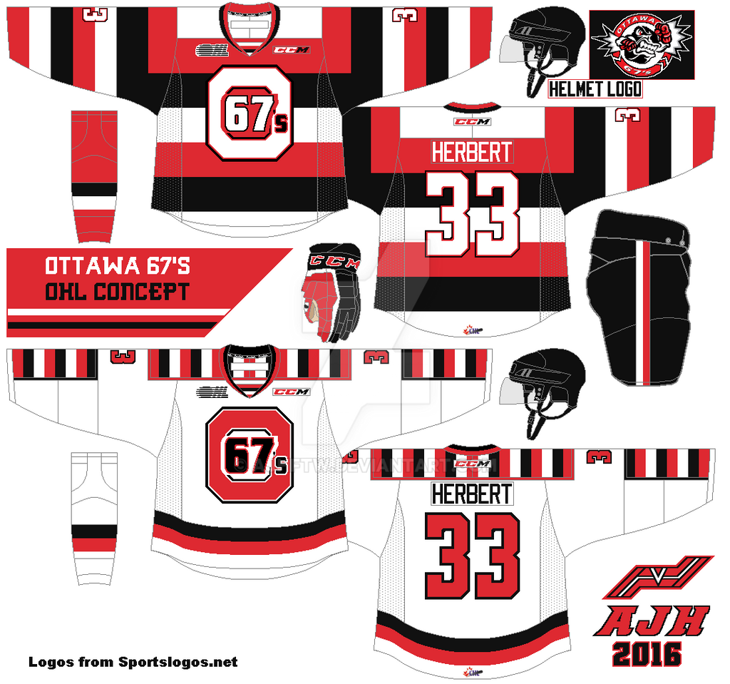
Hello everyone Alan here, today is the day my 5th anniversary post! It was on this day 5 years ago I made my first post, it was just me welcoming you all to my site, and I found it ironic that my first post would lead me to over 300 posts in five years let alone made so many concepts but 1 would win my first HJC COTW! When 1st saw that post I couldn’t believe it, until 6 refresh page later it was for real that win mean so much to me. Just when I thought it was over later on that month I won the COTY May! It blew my mind away winning the COTY month it was a moment I really never forget. But my Cinderella story came to an end when I lost the COTY 2nd quarter round, but in the end I enjoy the ride and cherish it, today is the Ottawa 67’s!

Here’s my COTW concept.

Now almost 3 years later here’s the new Ottawa 67’s concept.

On the dark jersey I change up the barber stripes order. On the white jersey I made a gap on the vertical barber stripes. I use the Dallas Stars current numbers font witch fits with the concept well to my taste.
Well this post is done, but question what is this surprise I talking about? The answer, this post is part 1! That’s right this 5th anniversary has two parts, this one and next Saturday, believe it or not next Saturday marks the 5th anniversary of my first concept post and what way to celebrate it with you guess it, a concept. Until then see you all next Saturday.

Friday, 15 April 2016

AJH HJA 5th anniversary countdown: True art winner!

Hi everyone, Alan here to post another on here at AJH HJA. Well this is the last day of the countdown as tomorrow will be my 5th anniversary post and be ready because I got a little surprise for you all this Saturday and it’s more than just a concept.
For now today it’s a concept remake based on my winning concept that I'm proud of with an over the top design that won the Hockey Concept Idea contest for the 2nd time and the last one. Today is NCAA Creighton Bluejays.

Here’s the old Creighton Bluejays concept.


Now here is my new Creighton Bluejays concept.
Almost the same as the old set but I added silver to the team’s set, removed the hem stripe, change the collar, made the light blue more seen on the dark jersey, use the team’s word mark logo for the helmet, and lastly just like what I did with the Nords concept I put the Adidas brand on the jerseys.

HJC Feedback

Well that’s it, be here tomorrow for my 5th anniversary post till then later!

Wednesday, 13 April 2016

AJH HJA 5th anniversary countdown: Checker flag

Hi everyone, Alan here for another countdown to my 5th anniversary post. From November 8, 2013 to May 31, 2014 I was a writer for Hockey Concept Ideas it was during that time they had a contest put together known as the Indy Fuel contest it was based on the team that entered into the ECHL before their first season begin so I enter my concept just for the fun of it thinking “I’ll end up being in the same spot as in HJC” then behold I won! Who would thought I win a contest let alone a first contest made by HCI! So I give a shot at remaking my winning concept, here is my old one.

Now the new Indy Fuel Concept.
The arm stripes and socks are the same. But I add the team’s arrows that is on the collar of their current set on the yokes, curved the hem, give the shoulder patch a football helmet treatment, and changed both name plates and numbers fonts.

HJC Feedback

Well that’s today, be here later this week for more until then, later.

Monday, 11 April 2016

AJH HJA 5th anniversary countdown: What a Maroon!

Hi everyone Alan here as we are in full stretch to my 5th anniversary post. This week is “Winning week” that means showing off concepts based on my winning concepts. Today is the Montreal Maroons, believe it or not in 2011 I won my first HJC contest, and it was part of HJC DHL contest. The design was just classic, but it wasn’t the design I was going for, I had a design in mind but due to time was running out I had to make the concept simple, and as the simple concept win the contest for me, while the design I had in mind was set aside until now!

Here’s my contest winning concept.


Now here’s what could have been a modernized Maroons.
The arm stripes I shaped to an “M” it was an idea that could work for me but not to others. Besides that, and the helmet logo, the rest is same as the previous work. Come to think looking back at it I learned that sometimes doing things simple has befits, and this one would be a big disappointment.

Well this post is in the books, time is short got to work on more posts this week mainly my Playoff Pickz! Until then, later. 

Friday, 8 April 2016

AJH HJA 5th anniversary countdown: Almost Perfect

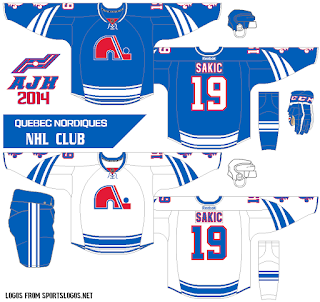
Hi everyone Alan here as we continue on with the countdown towards the 5th anniversary post. Over the years that I have sent my concepts to HJC that resulted in good feedbacks, winning a contest, and winning COTW. But the 1 thing I haven’t succeed it yet and more likely may never going to happen is a perfect score, a 10 of 10! Believe it or not I had a concept that almost got a perfect 10 score but 1 flaw that got in the way. Today is the Quebec Nordiques, it’s been almost two years since I made a Nords concept so why not?

Here’s my old Nordiques concept.


And now the new Nordiques concept.
Same design as the previous concept but with 3 changes. 1: The stripes on the arms, hem, socks, and the pants got two stripes. 2: change the numbers font to standard block with trim. 3: With the whole Adidas taking over as NHL’s jersey manufacturer pretty soon I decide to put the company's word-mark logo to get the feel of it. If you look closely at the arms, hem, pants, and socks, yeah it got the Adidas 3 stripes logo on it for Easter egg! What do you think?

Here’s my second version, it isn’t much of a big thing only just the collar.

Well this week is done! Come here next week for what I call it “Winning week!” that means it’s a showcase of my redesign of my winning concepts from contests, to my only HJC’s COTW. Also once again my “NHL Playoffs Pickz” is back once this NHL season is over and the playoffs begins I’ll be throwing my picks to see who going to go all the way to the Stanley Cup finals and win it all. We know now it’s going to be all-America playoffs because all Canadian teams won’t be in the playoffs this year for the first time since 1970, historically wise it’s only the 2nd time in the NHL that all Canadian teams failed to make it to the playoffs. Until then, see you all next week later.

Wednesday, 6 April 2016

AJH HJA 5th anniversary countdown: A golden Predator

Hello everyone, Alan here to keep this train rolling for my 5th anniversary post. Today was a concept I made around almost 5 years ago that I sent this concept to HJC and it became my first concept I made that got in the running for the COTW, even thou the concept didn't became a winner but it was one of those things that give me a push to be more creative with my concepts witch went on to many numbers of running for the COTW with the one became a winner.
Here' my old Nashville Predators set

And now here's the now Nashville Predators set.
I don't know you can see the checker pattern on the dark jersey but if you see them on the white jersey you know there patterns on the arms, the hem, the socks, the pants, to even inside the collar. I use the team's current guitar pick logo on the shoulders, and the helmets. Use the team's current letter fonts, and current number fonts with my touch. Lastly the team's main logo with the addition of triangle shape with checker patterns behind the logo.
Of course a concept isn't compete without an alternate jersey witch I got one right here.
Same as the set but in blue.
Well once again this post is in the books. Be here for my next post, hopefully I can post some more soon in time for my 5th anniversary post. Until then later.

Monday, 4 April 2016

AJH HJA 5th anniversary countdown: Too many? Not enough!

Hi everyone, Alan here for another countdown to my 5th anniversary post. Sorry for lack of posts for couple of days due to my work life in a nutshell, I'll leave it at that. So this countdown post is a team I pretty much make mostly 1 to 2 a year, I made so many I have to put this link for you all to see, if you all didn't catch my drift today is the Colorado Avalanche.


Yes indeed the design is based on the team's classic first set but little more Reebok cut to it. Here's a first for me, I replaced black with navy blue it seems to fit well with this concept on the jerseys to even the logos in my opinion. I kept the foot logo as shoulder patch, but use the team's current alternate mountain logo for the helmet, and the pants. I tried to make the number fonts look like the team's current alternate fonts with trims around it. Lastly of all the years I made concepts, this set is the first that I made the nameplate vertically arched!

HJC Feedback
Well this one is done, hopefully I'll get back on track again to post more up on this site, till then later.

Saturday, 12 March 2016

AJH HJA 5th anniversary countdown: Milwaukee Admirals Concept Part 4: Nord-Flux-School

Hello everyone Alan here for the final part of the Milwaukee Admirals week. Today it's a concept based on an alternate jerseys I made in 2012 was a nod-back to the teams IHL days when they were the Quebec Nordiques farm club, with some flux back touch to it. Today I decide to make a set out of it, so here it is the Nord-Flux-School Milwaukee Admirals concept.
Pretty much Nordiques jerseys with Admirals stuff on it, from their main logo, their anchor logos, to even that team's current number fonts. Made ice blue main color with navy blue as secondary.

Here's an set mainly navy blue just for fun. Same thing but navy blue as main color.

Well that's it. hope you all enjoy this week there will be more very soon til then, later.

Thursday, 10 March 2016

AJH HJA 5th anniversary countdown: Milwaukee Admirals Concept Part 3: Dropping the silver

Hello everyone Alan here to continue my countdown towards the 5th anniversary post. I'm going to cut to chase here so let's get to today with more Milwaukee Admirals Concept.

Since a feedback about my first set I gave this concept a tweak by removing silver off and it looks pretty darn good if I say so myself. Just navy, and ice blue gives it a better look then what they are currently wear right now.

HJC Feedback


Well part 3 is done, be here this Saturday for the final part of my Admirals week, till then later.

Tuesday, 8 March 2016

AJH HJA 5th anniversary countdown: Milwaukee Admirals Concept Part 2: 2.0

Hello everyone Alan here to continue my countdown towards the 5th anniversary post. Today is part 2 of the Milwaukee Admirals week. Before we get to the concept I didn't get to show you all my old Admirals concepts but today I will now.
Here's my old Milwaukee Admirals concepts.


Now here's the new Admirals 2.0! 
Pretty much the same as my first set you all saw on Sunday, but the difference is the arms and that's all, nothing too much to tell about this concept.
Well this one is in books, be here this Thursday for part 3, till then later.

Sunday, 6 March 2016

AJH HJA 5th anniversary countdown: Milwaukee Admirals Concept Part 1: The first set

Hi everyone Alan here as we continue on with the countdown to my 5th anniversary post. I got 4 concepts but that's the problem I made 4 different concepts for one team, so the solution is I'll make a week out of it! You will see a concept today, one on Tuesday, another on Thursday, and last one on Saturday all nothing but the Milwaukee Admirals. For now let's get to today shall we.

This concept is simple, the stripes on the arms, hem, socks, pants, to even on the wrist cuffs. Using the team's new number font with trim, while standard block with trim for the nameplate. I kept the anchor logo for the shoulders. Lastly the logo, the team's new main logo. It was hard for me mainly because I love their staking Adms logo and use it on all of my Adms concept (and so far to my knowledge if I'm wrong the only one that using the logo for concepts) but I gut it up and use the new logo.

HJC Feedback
Well part 1 is done! Come back Tuesday for part 2 of my Milwaukee Admirals week, till then later.

Sunday, 28 February 2016

AJH HJA 5th anniversary countdown: Chatham Jr.B Maroons

Hello everyone, Alan here for a special post here at AJH HJA. Today marks the beginning of the countdown to my 5th anniversary post this April,  featuring  concepts that made impacts in the HJC, to concepts that was in the running for the HJC COTW, to concepts that won contests, and some of my favorites. Today this concept set is one of my favorites, it's one of junior B team, my hometown team the Chatham Jr. B Maroons. Back in 2011 I made 2 concepts base on the teams previous set before their current set, one was very Reebok, and one very normal. Since then I haven't got back to the idea of doing more Maroons concepts until now.

Here's my old Maroons concepts.


Now here's the new Maroons concept.
On this concept I modified the teams main logo, change the font on the word "Chatham" to fit that classic modern look. Plain stripes on both arms, hem, socks, to even on the side of the pants. Gave the the numbers a modern font treatment, and gave the nameplate the Winnipeg Jets current font. Lastly the shoulder patch old Habs logo but replace the "A" inside the "C" it's the "M."


I made a second version of this concept.
This concept is the same but with gold.

Well this post is in the books, there will be more concepts coming soon as part of my 5th anniversary. Until then later.