Showing posts with label Fantasy. Show all posts

Saturday, 9 August 2014

Summer of Concept Contributor: Beep! Beep! And Quack! Quack!

Hello I'm Alan, I'll get elbow to my head, so you don't have to. "Summer of Concept Contributor" is still rolling on with week number 6 with a double concepts from Ricky M, and one from Jake! On to the concepts.

Montreal Roadrunners Roller Hockey International concept [by Ricky M.]
The Jersey is put together nicely, I know it looks like it was just put together, but it was put together instructively. The logo fits this concept, it also fits with the Roller Hockey International. The number fonts are good, but two things, one on the road it needs black trim around the numbers, and two the front numbers really doesn't need to be there. The swirl on the hem of both jerseys is an nice touch. The colors is good even thou it got black, and navy blue with red as the main color, but it was tamed wisely.


Anaheim Ducks Concept [by Ricky M.]
Up points: Orange as the home's main color is a plus to me. Using the Ducks alternate shoulder patch as the main logo for both home, and road is a good move to me! The home, and road jerseys are well put together. The alternate jersey is normal, but good enough to me that feature the Mighty Ducks era alternate word mark logo that is recolored and looking good. Lastly the NYR's pants with the Ducks colors is a good enough for my cup of tea.
Down points: The lack of hem on both home, and road, and black color numbers, and nameplate is the only things I got beef with.
My suggestion: Add hem stripes on both home, and road jerseys. Make the numbers, and nameplate on the home jersey white.

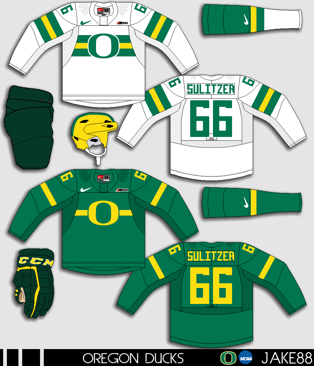
Oregon Ducks NCAA concept [by Jake88]
Up points: The chest stripes and the "O" logo fits the theme for Oregon hockey, the stripes is well done, helmet got that football theme going, and it really help makes it happen. Add small wings on the shoulders is fine with me. Lastly nice call on the fonts for both numbers, and nameplate.
Down points: The dark looks really too plain compare to the white jersey. Green pants, and green gloves doesn't match with the green on the jerseys. Fake lase nuff said.
My suggestion: Make the pants and the gloves the same colors as the jerseys. Give the stripes on the dark the same treatment as the white just switch the green, yellow, and green to yellow, green, and yellow.

Another week of  "Summer of Concept Contributor" is in the books come by next week for another one til then, I'm Alan, I'll get elbow to my head, so you don't have to.

Wednesday, 21 May 2014

Cleveland Barons USHL Concept

Hello I'm Alan, I'll get elbow to my head, so you don't have to. Over at HJC they had a Cleveland Barons ReDesign contest that I jumped in and put it together the thing is it didn't have to be part of the NHL, witch means I can slap on any leagues on this concept, so I put the USHL (United State Hockey League) patch on it, seems fitting to me. Enough yip yapping to my concept.

Now I know you look at this and say it's simple, yes it is simple but it fits the theme for this team. Red is the main color, follow by blue. The numbers are standard block with thick trim around it, and the nameplate is also standard block but without any trim. I use the Dallas Stars shoulder yoke and add trim around it to give that sharp modern look the team. The logo is just like the old NHL Barons logo but it have just one trim around the state of Ohio instead of two.

Well that's today post.  Until then I'm Alan, I'll get elbow to my head, so you don't have to.

Thursday, 10 April 2014

Chatham-Kent Roadrunners concept

Hello I'm Alan, I'll get elbow to my head, so you don't have to. On my April fool's day post I got an Roadrunners concept and said my hometown is getting an OHL team. Well it's just a April fool's joke, but it was good idea. I present to you all the concept that I made for not only for my April fool's day post, but also as part of the HJC's Roadrunners contest, the Chatham-Kent Roadrunners concept.

I use the same template as my Windsor Spitfires concept, but on my horizontal stripes there is 3 small stripes on it. The nameplate is the Winnipeg Jets fonts, and the numbers is the Anaheim Ducks font without the tip in the end. The shoulder patch was originally going to be the main logo but I chose to keep it as a shoulder patch. The main logo is base on a old minor-pro, yes I said it a minor-pro hockey team in my hometown called the "Chatham Wheels" this team came from a league called Colonial Hockey League witch later became United Hockey League, and then became the International Hockey League witch it close it's doors after 2009-2010 season. As for the Chatham Wheels that team didn't last long, after 2 seasons, even fresh off being in the finals the team moved Saginaw to keep the Wheels name for only 2 seasons until renamed themselves to the Lumber Kings, then the Gears, and then move to Ohio keeping the Gears name for only 1 season until the ownership were forced to dissolve and cease operations.

HJC Feedback

 Well that is the post for today, next week I'll post some more concepts later on this month, until then I'm Alan, I'll get elbow to my head, so you don't have to.

Monday, 30 September 2013

NHL, HCIHL, "OH MY!"

Well tomorrow night is the start of the NHL season so here's my picks of who's going in, or out.
* = division winner, # = Top 3 draft, (wc) = wild card for my mid season prediction.

Eastern
1. Pittsburgh*
2. Detroit*
3. Boston
4. Philly
5. Montreal
6. NY Rangers
7. Columbus
8. Toronto
9. Washington (wc)
10. NY Islanders (wc)
11. Buffalo
12. Carolina
13. Tampa Bay
14. Ottawa
15. New Jersey#
16. Florida#

Western
1. Chicago*
2. L.A.*
3. St.Louis
4. Anaheim
5. Vancouver
6. Minnesota
7. Edmonton
8. San Jose
9. Winnipeg (wc)
10. Dallas (wc)
11. Phoenix
12. Nashville
13. Colorado
14. Calgary#

Well that's prediction, hopefully I get to do the mid season prediction later on this season.

Some of you people may know now, I joined the HCIHL fantasy league, my team is the London Sabreswords and made my own jersey set for my team.

HCI Feedback

Here's is my list of draft picks.
1. Evgeni Malkin C
2. Corey Perry RW 
3. Henrik Zetterberg C
4. Sergei Bobrovsky G
5. Craig Anderson G 
6. Ryan Suter D 
7. Taylor Hall LW 
8. Mike Green D
9. Carey Price G 
10. Andrei Markov D
11. Drew Doughty D 
12.  Evander Kane LW 
13. Dustin Brown LW 
14. Corey Crawford G 
15. Jarome Iginla RW 
16. Justin Schultz D 
17. Mark Streit D 
18. P.A. Parenteau RW 
19. Brad Richards C 
20. Tomas Plekanec C 
21. Pascal Dupuis RW 
22. Ryan Nugent-Hopkins C 
23. Brandon Saad LW 
24. Sam Gagner C 
25. Jaromir Jagr RW

Well hope you all enjoy tomorrow night for the 2013-2014 NHL Season opening, til then, later!

Friday, 5 October 2012

AHL Affiliate Fantasy Week Day 5

Well today is the last day so here we go.
If Oklahoma City is affiliate with the Tampa Bay Lightning you get
I named them the Storm just to fit with other sport team like the NBA's Oklahoma City Thunder, and the WNBA's Tulsa Shock to name few. This concepts I made is pretty much different from Tampa, just pretty much use the Lightning' old crest from 07-08 to 10-11 replace the "Tampa Bay" word mark on it and put "Oklahoma City" on the top of the logo and add "Storm" on the bottom, add black to the teams color with blue, grey, and white just give it a little bit more live to it with the stripes and trims around the letters and numbers, I didn't add the Lightning main crest on the shoulders on this concepts because there's the lightning bolt on the side of the pants that pretty much got some people knowing who's this team is affiliate with.

And so that's my "AHL Affiliate Fantasy Week" hope you all enjoy it as much as I do, will I do this again? Maybe or maybe not, but who knows, right now I got other concepts ideas including remakes stuck in my head to work on for now.
Just Maybe?
Just Enjoy!

Thursday, 4 October 2012

AHL Affiliate Fantasy Week Day 4

If Oklahoma City is affiliate with the Dallas Stars you get
See any resemblance on this concept? Yup this would be the same concept as my Dallas Star Alternate concept, I decide to put on OKC with the same look and the same fonts (Kroftsmann font) on the main crest, shoulder patch, NOB, and numbers. The only thing that is different is the color I decide to tease it a little by making it black as the main color instead of green so that the fans can hope for a green alternate jersey that will more likely happen instead of Dallas that seems to fail at deliver a green alternate jersey attempts so many times I lost count.

HJC Feedback (Jets96 version)
HJC Feedback (Ryan version) 

Wednesday, 3 October 2012

AHL Affiliate Fantasy Week Day 3

If Oklahoma City is affiliate with the Washington Capitals you get
Once again same look as their parent club I know but this to me is too good to pass on, I will admit I don't like the caps alternate logo but when I use this on this concept it kinda has that same building look like once again the Oklahoma City Blazers logo before they folded I found it more fitting then Washington, so overall it's pretty much the same nothing too boring, nor over the top.

Tuesday, 2 October 2012

AHL Affiliate Fantasy Week Day 2

If Oklahoma City is affiliate with the Calgary Flames you get
I know what you all are thinking and believe me it look lazy using the Flames current Jerseys RBK Cutter template and the flame colors indeed it's a cheap shot in the gut, but think about this when I first thought of the Oklahoma City Blazers (the old CHL team) the first thing came in my mind is this have the Flames farm club written all over, instead of a flame behind the "B" I used the Blazers old "B" crest on it, and use the Calgary Flames crest for the shoulder patch, also I got rid of that black pit color on the red jersey to make the set look good.

Monday, 1 October 2012

AHL Affiliate Fantasy Week Day 1

If Oklahoma City is affiliate with the Boston Bruins you get

You kinda say it's weird and all, but it could work to me, the Concepts is pretty much like Boston's jerseys both home and road, but there are different, the Yokes are bigger and got two stripes on the yokes, gaps in between the socks, change the shoulder patch with one with the bear with "OKC" on the bottom on one side and Boston's alternate crest on the other, and on the main crest the "B" that Boston use is replaced with a different "B" that base on the Oklahoma City Blazers that used to be part of Central Hockey League once upon a time, so they can have the same name and colors but different jerseys look!

HJC Feedback 

Sunday, 30 September 2012

AHL Affiliate Fantasy Week: Official City to be Fantasized and NHL teams to be affiliate with

The AHL city for my "AHL Affiliate Fantasy Week" is.
 *drum roll please*
Oklahoma City!
Currently the Team is affiliate with the Edmonton Oilers, but I decide to see what happens if Oklahoma City affiliate with 5 different NHL teams, you'll have to wait till tomorrow for what the first NHL team that Oklahoma City affiliate with until then.

Just Maybe?
Just Enjoy!