Howdy everyone Alan here, today we got two concept made by Ricky, it's been awhile since I post some concept contributor so let's get to it.
Arizona Coyotes Concept
Up points: For a Buffaslug style template being used for both home, and road this one really works for me. Adding the shoulder yoke was a nice touch. Lastly love the alternate jersey!
Down points: On both home, road, and alternate I felt like the front numbers made the front jerseys look too cluttered to my mind. The leaping coyote is alright but it doesn't fit both home and road jerseys.
Down points: On both home, road, and alternate I felt like the front numbers made the front jerseys look too cluttered to my mind. The leaping coyote is alright but it doesn't fit both home and road jerseys.
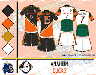
Anaheim Ducks Soccer Concept
Up points: The dark uniform is nice! The stripes is well placed that doesn't interfere with the numbers, and sponsor logo.
Down points: The white uniform is alright but I felt it belongs in the alternate. I feel that the white should have the same treatment as the dark uniform.
Well there go this post is done! come over here Sunday for my concept, til then later.
Down points: The white uniform is alright but I felt it belongs in the alternate. I feel that the white should have the same treatment as the dark uniform.
Well there go this post is done! come over here Sunday for my concept, til then later.


No comments:
Post a Comment