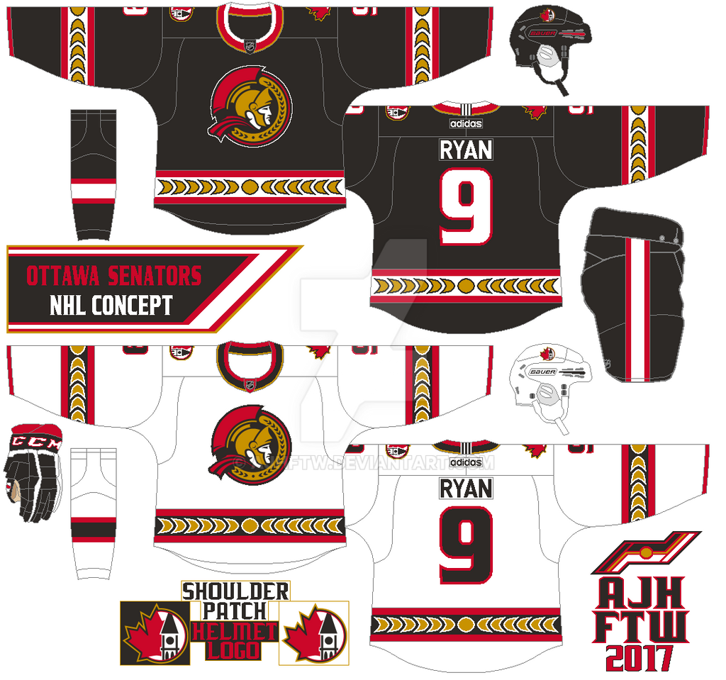
The stripes are simple but with laurel leaves and a circle in the middle in gold. The main logo is the team’s updated and unused alternate logo that I just can’t past on, along with the peace tower maple leaf combo logo that was on the Sens old black alternate jersey from 2000 to 2007 as both shoulder patch, and helmet. Rounded form font for the name plate, the Sens old number font from their classic red wavy jersey that began in 1997 to a sad end in 2007 (after the 2007 Stanley Cup finals loss) to fit this concept.


This modern variation looks spectacular. Plus, cool effects on the stripes with the leaves.
ReplyDelete