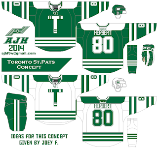
Hello I'm Alan, I'll get elbow to my head, so you don't have to. This week "Summer of Contributors!" is kinda more of ideas given to me thing, this idea for this concept came from Joey F. Long story short, me and joey try to enter in the HJC'c pairs contest, we choose a team, we put this concept together along with other stuff to enter the contest, but there were numbers of flaws that didn't follow the rules, and we didn't get in. We put together a concept that was made for the main jersey set, but use as alternate, even thou I made a white version of it but still as alternate. I was thinking of not sending them to any site, but HJC got a page on their site have people leaving ideas for concept artists to do, so why not, since I did put this concept together with Joey's ideas I'll go for it. Here it is the Toronto St.Pats concept put together by me, and ideas given to me by Joey F.
On this one it got stripes, stripes, stripes everywhere, two stripes on the biceps, two stripes on the wrists, and two stripes on the side of the pants. On the hem, and socks got three stripes. The colors are green, and white, witch it's why it's suppose to be as alternate because The team's real colors are green, and wheat. The logo is a big "T" with two stripes at the ends. Lastly The yokes is shaped like the Dallas Stars current white jersey was used on this concept.
HJC Feedback
HJC Feedback
You all thought this is the only one? Guess again. Around this time last month I got a request by a fan who checked out this site and ask if I could do some concept request, so I decide to give it a shot, and let just say he was pleased with it! Here it is the Toronto Maple Leafs concept requested by John Ocasio.
HJC Feedback
Well that's this week be here next week for more "Summer of Contributors!" Until then, I'm Alan, I'll get elbow to my head, so you don't have to.


The St. Pats concept looks amazing. Unique, but traditional. But I also love the way that the Maple Leafs concept has turned out. The numbers nearly matched the wordmark, but still looks awesome. Great job Alan.
ReplyDelete