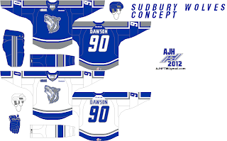
This is the Sudbury Wolves Concept, the concept that I had a macho moment for myself! I mean I had a dream of this concept for a long time and I decide to follow that vision and here we are!
The main crest is the teams alternate crest from there current alternate jersey, the only thing I changed on the crest is the color on it, I change the black to blue, design the arm stripes leaving a gap in between the arm stripes, the fonts on the numbers is the old Nashville Predators fonts they had before their rebrand in 2011, after seeing the Wolves 40th anniversary logo the number 40 is almost look like (maybe I'm wrong) the same fonts as the Preds old ones, right off the bat I just had to put them on these concepts in a huge way, the fonts on the NOB is the Anaheim Ducks fonts, the colors on these concepts the same as always Blue, Grey, and white, the way I put the colors on it had that classic pre-edge feel to it, one of those put a classic colors on a modern jersey, I know it's hard for me to explain it but that how I felt it after putting this concept together a feel good moment.
HJC Feedback
Well that's it for this week, the next post will be my 100th post here on this site, it'll be just my rants about hockey stuff that I'll try to get it off from my chest and maybe a concept on the post too but who knows we'll wait and see until then.
Just Maybe?
Just Enjoy!
And Happy Halloween!


No comments:
Post a Comment