Thursday, 16 October 2014

Concept of the Dead: Found it from the Junkyard

Hello I'm Alan, I'll get elbow to my head, so you don't have to. Today we take a break from some NHA concepts with a concept that came from the now defunct United Hockey League (UHL) witch later became the International Hockey League and after 2009-2010 season the league shut their doors. Today's concept of the dead is a team that played from the UHL from 2004 to 2006, the Motor City Mechanics.

This concept is pretty much the New York Islanders old Reebok edge set with some modern touch, I use both numbers, and letters are from the Nashville Preds old set. Black, maroon, and grey are the colors for this team.

HJC Feedback

Well this one is in the books for today as "Concept of the Dead" rolls on! Until then, I'm Alan, I'll get elbow to my head, so you don't have to.

Wednesday, 15 October 2014

Concept of the Dead: Toronto Tecumsehs concept by me

Hello, I'm Alan, I'll get an elbow to my head, so you don't have to. Today we got the Toronto Tecumsehs concept made by me.

Tuesday, 14 October 2014

Concept of the Dead: The Chief

Hello I'm Alan, I'll get elbow to my head, so you don't have to. Today is the Toronto Tecumsehs made by Ricky.

Toronto Tecumsehs NHA concept [by Ricky]
The logo looks good, the main jersey is purple but for some odd reason it fit this team pretty well to me. The down point on this the main jersey looks plain compare to the clash, the logo, nameplate, and the numbers on the clash are purple it seem doesn't fit it with the cream, scarlet, and black. Overall not bad of a concept, I felt this is pretty much not a match together very well, but that's my opinion. 

Well that's today post, we got more coming so keep your eye on it til then, I'm Alan, I'll get elbow to my head, so you don't have to.

Saturday, 11 October 2014

Thursday, 9 October 2014

Concept of the Dead: (No) Sham(on the)rocks

Hello I'm Alan, I'll get elbow to my head, so you don't have to. Once again we got a concept contributor from Ricky, this time it's the Montreal Shamrocks.

Montreal Shamrocks NHA concept [by Ricky]
Up points: Both the main, and the clash are made to fit the theme of the shamrocks. The main jersey is two color barber stripes is alright with me! The clash is tamed and look pretty dang good.
Down point: Read the suggestion part.
My suggestion: Add black trim around the logo on the main jersey. Add cream trim around the logo on the clash jersey.

Well today's post is done for now until, I'm Alan, I'll get elbow to my head, so you don't have to.

Wednesday, 8 October 2014

Concept of the Dead: Montreal Wanderers by me

Hello, I'm Alan, I'll get an elbow to my head, so you don't have to. Today is the Montreal Wanderers NHA concept by me. Enjoy.

Tuesday, 7 October 2014

Concept of the Dead: One dud Wonder

Hello, I'm Alan, I'll get an elbow to my head, so you don't have to. Today as part of the "Concept of the Dead" this team came from the QMJHL. That's right people, not NHA, "QMJHL!" A team that was so bad the club lasted only 17 games! It's the Plattsburgh Pioneers.
On this concept, I took the Anaheim Ducks arm stripes from their now current home/road set and turn it to the Vancouver Canucks present home/road striping, and added stripes on the yokes for good measure. I darken the team's colours a little bit to give it a more modern feel to it. I use the Columbus Blue Jackets numbers and Carolina Hurricanes letters for the nameplate.

Well, that's it for today. More is on the way until then,  I'm Alan, I'll get an elbow to my head, so you don't have to.

Sunday, 5 October 2014

Concept of the Dead: Haileybury Comets by me

Hello, I'm Alan, I'll get an elbow to my head, so you don't have to. Today is a Haileybury Comets by me.
Saw blade with the letter "H" on it. Both home and clash in their own design nothing more to explain about it.
Well that's this post see you all until then I'm Alan, I'll get an elbow to my head, so you don't have to.

Saturday, 4 October 2014

Concept of the Dead: A silver (or cream) lining

Hello I'm Alan, I'll get elbow to my head, so you don't have to. Today as "Concept of the Dead" rolls on, we got a Cobalt Silver Kings NHA Concept made by Ricky!

Cobalt Silver Kings NHA Concept [by Ricky]
Up points: Stripes on both the arms, and the hem are placed very well. The stripes near the yokes are rare thing to see in other people's concept work, whats even more rare is how it actually fit this concept pretty dang good. The arm stripes are space away from each other were you can easily [if you like] add TV numbers there.
Down point: I feel that the cream color does not fit this team that are called Cobalt "Silver" Kings.
My Suggestion: Switch the cream color with silver and we got our self a winner.

Well that's today post. More is coming until then, I'm Alan, I'll get elbow to my head, so you don't have to.

Thursday, 2 October 2014

Concept of the Dead: Montreal Canadiens NHA by Me

Hello, I'm Alan, I'll get an elbow to my head, so you don't have to. Today is another edition of the "Concept of the Dead!" This time it's my Montreal Canadiens NHA concept.
The home jersey is base on my old Habs alternate concept, only recolor from red, blue and white, to red, green, and white. Once made for my first London Knights concept. The clash is recolored, and the stripes changed. The logo is a combination of the team's 1911-12, and 1912-1916 logos.


Well another "Concept of the Dead" post is in the books and we ain't done yet more coming and there will more post featuring my work will be posted, but will likely have no details written by me about them, just a warning because I'm more working on reviewing on contributors concepts. Until then I'm Alan, I'll get an elbow to my head, so you don't have to.

Wednesday, 1 October 2014

Concept of the Dead: 1.0 Rising

Hello I'm Alan, I'll get elbow to my head, so you don't have to. Today we begin the "Concept of the Dead" and what better way to start this event off with a concept contributor. Let's not waste time and let get this going.

Ottawa Senators NHA concept [by Ricky M.]
Up points: This has "Classic" written all over. The main jersey is well striped as the old jerseys the Sens 1.0. The nameplate sits nicely on a single stripe, and that goes to the numbers as well.
Down points: The clash got a nice stripes going on a slant on the front of the jersey is O.K. but it lacks arm stripes, even with the stripes on the wrist this clash jersey looks unfinished.
My Suggestion: Add stripes on the arms give it the treatment as the stripe slants on the front of the jersey.

Well that's the first post of the "Concept of the Dead" month, more will be posted soon until then I'm Alan, I'll get elbow to my head, so you don't have to.

Monday, 29 September 2014

My NHL 2014-15 season picks

Hello I'm Alan, I'll get elbow to my head, so you don't have to. Next week the NHL season will start so here's my picks of who's going in, or out.
* = division winner, # = Top 3 draft, (wc) = wild card for my mid season prediction.

Eastern
1. Boston*
2. Pittsburgh*
3. NY Rangers
4. Philly
5. Montreal
6. Detroit
7. Tampa Bay
8. Washington
9. Toronto (wc)
10. NY Islanders (wc)
11. New Jersey
12. Carolina
13. Columbus
14. Ottawa
15. Florida
16. Buffalo#

Western
1. Chicago*
2. L.A.*
3. St.Louis
4. Anaheim
5. Colorado
6. Minnesota
7. San Jose
8. Dallas
9. Winnipeg (wc)
10. Phoenix (wc)
11. Edmonton
12. Calgary
13. Vancouver#
14. Nashville#

Well that's my picks be here this Wednesday October 1st as we begin the "Concept of the Dead" month! Nothing but defunct hockey concepts all month long, click on the banner for info if you want to be part of this event. Until then, I'm Alan, I'll get elbow to my head, so you don't have to.

Wednesday, 24 September 2014

To the MOOOOOOOOOOOOOOOOOOOOOOON!

Hello I'm Alan, I'll get elbow to my head, so you don't have to. Now before we get to today's IceHL post I got some updates to tell you all. First with my team Japan concepts posted, my IIHF series is up for ever to see it's on my DeviantArt page. Second, I updated my "Concept of the Dead" page, it's now got a deadline, you got until October 18 to send your defunct hockey concepts if you want to be part of this event.
Now with that out of the way, on to the IceHL jerseys.

Moscow Cosmonauts IceHL [by me]

Truthfully I took my Hamilton Steelcats IceHL set change the collar, and the stitching. Using the helmet logo as the main logo for the front fits the set to my tatse. Red is the main color on these set follow by black, and gold.

Moscow Cosmonauts IceHL [Jake88]
Up points: The designs on both these set are designed nicely! Good choice of fonts on both nameplates, and numbers. Lastly way to put the Russian flag smartly.
Down point: the stripe from shoulder down to the front is good, but the back doesn't have that not even at least on the back of the shoulder yoke.
My suggestion: Read the down point for my suggestion.

Well another week is in the books for now. I'll try to post one more before I start some post for the "Concept of the Dead" month. Until then I'm Alan, I'll get elbow to my head, so you don't have to.

Friday, 19 September 2014

Friday: "ABOUT DANG TIME!"

Hello I'm Alan, I'll get elbow to my head, so you don't have to. Now normally I rant on new jerseys whenever I fell like it, to even not ranting about it. Until today when the Pittsburgh Penguins unveiled their new third jersey for the 2014-2015 season, and all I can say is "ABOUT DANG TIME!"

Check them out!
Sportslogos.net

It took this team a long time to really bring back this classic to the Reebok form, base on their famous 1986 to 1992 set worn and made famous by Mario Lemieux that also brought the Pens their back-to-back Stanley Cup titles. The Alternate Jersey is brilliantly made, the stripes is placed nicely, the colors are the way it's suppose to be. Overall: Buy this jersey in a heart beat!

Well that's all I can rant about this jersey it's perfect enough for me not putting anymore yap about it, but I hope this leads to something more like what the Oilers, Flyers, and the Islanders did that's all I can say.
Remember if you want to be part of October's "Concept of the Dead" event send in your defunct hockey team concepts, I repeat it's not a contest, it's just a showcase, good, or bad nothing more.
Oh and I got a Facebook page, O.K. I'm done for now, until then I'm Alan, I'll get elbow to my head, so you don't have to.

Wednesday, 17 September 2014

From Japan with love!

Hello I'm Alan, I'll get elbow to my head, so you don't have to. Today we got not 1, not 2, not 3, but 4 concept here today! 3 by me and one from a contributor. 2 Japan IIHF concepts, and 2 Osaka Samurai IceHL concepts. Let's get to the concept shall we.

Team Japan World Champions Concept [by me]


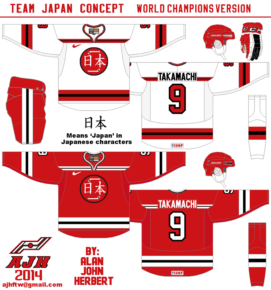
All the stripes are simple, nameplate and the numbers are simple. I gave the yoke the Dallas Stars treatment witch I say it gave this concept some nice flavor to it. I made red as the main color follow by black. The logo is the dot with black trim around it, two hockey sticks and Japanese characters for "Japan" to give this concept a good taste to everyone even this concept was in the running for HJC's COTW back in June.

Team Japan Olympics concept [by me]


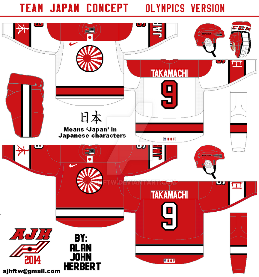
On this one is again simple with some goodies I put on this concept. I paced both Japanese characters, and word mark "Japan" on the arm stripes, made the logo base on the rising sun of Japan, and as always replacing the stupid fake lace with the country's flag.

HJC Feedback

Osaka Samurai IceHL concept [by me]

Using the same template as my Blenheim Blades concept but with some tweaks and add extra stripes to it. Using the Winnipeg Jets letters, and my Kroftsmann fonts for the numbers give this concept of my complete.

Osaka Samurai IceHL concept [by jake88]
Up points: These really got "cultural" written all over it! Dark jersey gave that "Ninja" feel to it, while the white is "Pride" and looks proud to show it! The fonts for both the numbers and nameplates was a nice touch to this concept.
Down points: Even thou the white jersey got pride on it, but for some odd reason this also got that Carolina Hurricanes vibe on it too, but that's to me.
My suggestion: I got nothing to suggest.

Well hope you enjoy this big post today, because it'll be it for this week because of this week on HJC latest contest that caught my eye and I'm working on it for the rest of this week, but don't worry there will be more posts next week. Lastly don't forget to send in your defunct hockey concepts if you want to be part of October's "Concept of the Dead" event, click the banner for the info on how to send it, not a contest, no rules, just showcasing defunct hockey teams on this site. Until then, I'm Alan, I'll get elbow to my head, so you don't have to.

Sunday, 14 September 2014

Blenheim Blades OHA Great Lakes Jr.C concept

Hello, I'm Alan, I'll get an elbow to my head, so you don't have to. Today is Sunday, and tonight I'm off to a hockey game featuring today's concept, the Blenheim Blades.

The Blades were founded in 1965 as the "Golden Blades" until in 1974 when they removed the "Golden" and just called themselves "Blades." The last time this team won a championship was the BCJHL Jr.D title, ever since then this team had a lot of low seed results more than high seeds results, they can't even make it through the first round until the 2014 playoffs were they finally made it to the 2nd round only to get screwed out of it were they had 2-0 series lead gunning for 3-0 lead, but it was in half in the 3rd period in Belle River when the light went out, and instead of ending that game they decide to restart game 3 the next night, with that call the Blades fell apart and lost to the Belle River Canadiens 4-2.

Now with my yap yap aside time for the concept.
This link will show you what their current set looks like. This is just simple with stripes at the right places. I use the Toronto Maple Leafs old nameplate and using the Minnesota Wild old number fonts to fit this theme I was going for, which I am going to explain about the logo now. Thanks to inspiration from the team's old late 90's logo,  I mixed a saw blade, spokes, and the team's current shoulder patch altogether. The shoulder patch is made by me. Lastly, the colours are black, gold, and white.

SG-94 Feedback
HJC Feedback

Well, that's today post! Again if you want to send your defunct hockey concept to be part of October's "Concept of the Dead" send them to me, and I'll post them here! Also, don't forget to like my Facebook page. Until then I'm Alan, I'll get an elbow to my head, so you don't have to.

Wednesday, 10 September 2014

Wallaceburg Lakers OHA Great Lakes Jr.C concept

Hello I'm Alan, I'll get elbow to my head, so you don't have to. Today is Wednesday, to some it's a normal Wednesday, but to me hockey season is here well Junior C league that is even thou I won't be able to attend to the first game of this season, but that doesn't mean I can't show you my concept of this team, so let's get going with the Wallaceburg Lakers OHA Great Lakes Jr.C concept!

The Wallaceburg Lakers is a OHA Great Lakes Jr.C hockey club base from Wallaceburg, Ontario. Established in 1972, they won only 1 Great Lakes Jr.C title in 1999, and at the same year made all the way to the OHA Jr.C finals only to lose in 4 games. After their championship season they've been up and down from making it to the Great Lakes Jr.C finals, to missing playoffs, this team have been through a lot. Last season they wore the Lizard biting a hockey stick with the net in the background as the team's logo! Most of this team's logo history it's always word mark logo that said "LAKERS" on it with they brought it back for the 2014-15 season. Now with yapping about the team's history aside, on to the concept.

The stripes on the arms and hem is the wave style, pretty much simple yet effect to me. The fonts on the nameplate is UConn, and fonts for the numbers are the Connecticut Whale (now Hartford Wolf Pack) I felt the it fits well with this concept. The logo is made by me I try to give wavy like shield with waves in between the team's name above and "Jr.C" below. The colors are indeed green, gold, and black.

SG-94 Feedback
HJC Feedback

Well that's today post. Remember send in your defunct hockey concepts if you want to part of my "Concept of the Dead" month this October. Lastly once again check out my Facebook page, and like it! Until then I'm Alan, I'll get elbow to my head, so you don't have to.

Monday, 8 September 2014

Monday: Long time no see Blues

Hello I'm Alan, I'll get elbow to my head, so you don't have to. Today we got some more goodies from two concept contributors for you all today. let's not waste time and get going!

St. Louis Blues concept (By Caden P.)
Up points: Stripes on the arms, and hem makes both home, and road really pop my eyes in a good way! Love the yokes nice design! Lastly using blue more on this concept is a plus from me.
Down point: Even thou the numbers got a trim around but one trim on the numbers looks plain to me. On the road you pulled the "Flyers" with the nameplate
My suggestion: Give the numbers the same treatment as you did with the arms, and hem stripes.

St. Louis Blues concept (By Ricky M.)
Up point: I like the idea of using the Blues current alternate logo as the main crest.
Down points: The jerseys are good design, but it doesn't fit with this team all to me. The alternate is the only thing that pretty much works for me. Lastly red being use on these concepts I'm not a big fan of.
My suggestion: Replace all of the red with blue to make this concept work to me, remove the vertical piping on both home, and road, and lastly add one more trim around the numbers to give these concept the edge and good enough to my taste.

Well that's today post. Remember to send in your defunct hockey concepts if you want to be part of this October's "Concept of the Dead!" Don't forget to "Like" my Facebook page for my throwback Thursdays, and there will be my extra feature showing off my work with prototypes stuff putting together before being completed. Until the next post here I'm Alan, I'll get elbow to my head, so you don't have to.

Friday, 5 September 2014

IceHL World: Stockholm Hammers

Hello I'm Alan, I'll get elbow to my head, so you don't have to. Well summer is over, kids are back to their schools, and over at my job is busy. What better way to post today with a concept made by me!

Today one my concept that was part of IceHL World contest the Stockholm Hammers.

This one I admitted was rushed, I had 5 hours left til the due date. Simple stripes, and Dallas Stars yoke with trim. SF Piezolectric is the font for the numbers, and the letters are the Columbus Blue Jackets.

Well that's today post, it may been quick but worth it because it's the only Stockholm Hammers you're going to see here, why? Because my next 3 IceHL concept posts will also featuring a contributor IecHL concepts so hope you all enjoy it. Don't forget send in your defunct team concepts if you want to be part of October's "Concept of the Dead!"  For now I'm Alan, I'll get elbow to my head, so you don't have to.

Monday, 1 September 2014

Labour Day Rant

Hello I'm Alan, I'll get elbow to my head, so you don't have to. Hope you all enjoy my last Summer of Concept Contributor. You may see here I change around this site from green, black, and gold to orange, and green. I decide to bright it up nothing more. No concepts today just rants, let's get going.

Concept Contributor posts still going strong and a new Contributor event.
The Summer of Concept Contributor maybe over but there still be more Concept Contributor posts in the future, in fact I announce that this October will be called "Concept of the Dead" all October will feature nothing but defunct teams, teams that are no longer active any more like teams from NHA for an example. If you have any defunct concepts you made to be part of this event send it to "ajhftw@gmail.com. So far total concepts for the "Concept of the Dead" is at 17, that's included me. If received at least 31 total it could be all 31 days of posts all October. Again you want to your defunct team concepts to be featured on my "Concept of the Dead" send them.

St. Louis Blues new set!
It's about damn time that the Blues change their set to a look base on their old set from 1998-2007. The set is nice looking, the stripes, the hem, and the yoke is put together brilliantly. The down point is the socks, I kinda wist they would give it the same treatment as the stripes, the hem. Overall great set for the blues.

HJC Open, and IceHL updates.
Well first one off the bat, I entered the HJC Open, and got the first round out, nuff said. as for the IceHL contests I entered 8 out of 9 them the last 4 wasn't easy for me beating the deadline while at the same time being busy with work that I had to put some other projects on the sideline temporally and so far 2 got in the final four round, I'm waiting what my latest 4 sets end up. My IceHL concepts will be posted this month including some contributors too so keep your eyes over here for them.

AJH HJA on Facebook!
In case you all didn't follow my twitter page yet I had a hard time putting it together that sucker, but in the end it's here so like it and see some updates.

Well that's today post! Hope you all enjoy the rest of your long weekend, and see you all later this week for some more post by me, until then I'm Alan, I'll get elbow to my head, so you don't have to.

Saturday, 30 August 2014

Summer of Concept Contributor: The Finale!

Hello I'm Alan, I'll get elbow to my head, so you don't have to. Today marks the last week of  "Summer of Concept Contributor," and marks the 25th concept contributor post! This week contributor is a contributor that start it all, it was back in 2012, he is Steven G from SG-94. This link was the first concept contributor post featuring Steven. Now this time is Steve G send me a concept base on my favorite OHL team the London Knights.

Up Points: The stripes on both dark, and white are placed right. Love the addition of stripes at the end of the yoke on the white jersey. Nice call on the numbers and nameplate fonts. Lastly even thou I preferred the modern Knight logo, but the way the jersey was put together nicely to help the old school logo look good.
Down Point: The number fonts is a good choice but 1 trim around looks too plain to me.
My Suggestion: Add one more trim around the numbers, add green to the collar on the white jersey.

Well with this post done means the "Summer of Concept Contributor" is over, hope you all enjoy the rest of the summer, as well I would like to thank everyone who send their concepts to me to make this happen. Thank you guys! We will be going back to our normal posts hopefully soon, until then I'm Alan, I'll get elbow to my head, so you don't have to.

Saturday, 23 August 2014

Summer of Concept Contributor: Red vs. Blue

Hello I'm Alan, I'll get elbow to my head, so you don't have to. Well this week is once again another double concept contributor post in week 8 of "Summer of Concept Contributor" once again it's Ricky's turn. Now on to the concepts.

Detroit Red Wings Concept [by Ricky]
Ricky give us a Red wings concept that out of this world. Well not exactly out of this world, but close enough, just putting the team's main logo on the shoulder, two stripes on the arms, straight nameplate is alright with me, and lastly word mark with drop shadow is a nice touch. The problem is the numbers is also drop shadow, but is black with white drop shadow, I felt like it need to be like the word mark just white with black drop shadow, and you got yourself a winner.

Montreal Canadiens Concept [by Ricky]
Up points: seeing the Habs in blue is rare a thing to see, and this one was put together smartly. Adding the yokes, and tie down collar is a nice touch. Add another trim around the numbers is alright with me.
Down points: The only things I can come up with are lack of red trims on the wrist cuffs, and trims on the bottom of the hem.
My suggestion: See the down points.

Well that's this week, next week will be the last of the "Summer of Concept Contributor" and this one is special to me, a concept from a contributor that start it all back in 2012! Also next week will be my 25th concept contributor post, it'll be fun to do next week til then I'm Alan, I'll get elbow to my head, so you don't have to.

Saturday, 16 August 2014

Summer of Concept Contributor: Got some blues?

Hello I'm Alan, I'll get elbow to my head, so you don't have to. The "Summer of Concept Contributor" heart is still beating this week, Joey returns with "TWO" St.Louis Blues concept! Let's get to it.

St.Louis Blues Concept [by Joey F.]
Up point: The logo looks pretty good without the red. using the stripes base on the team's old 90's set is a good idea. The colors are blue, and yellow is a wise pick. The yokes are square but well put together and the Blues main logo as the shoulder patch save this concept.
Down points: the stripes the arms is placed way too low. The numbers is too plain to me without trims. On the road white and yellow just doesn't sit well with me. Lastly on both of them has no stitching on the jerseys, it feels less real, and more just put together without taking time to put it together nicely. 
My suggestion: rise the arm stripes up more, add trims around the numbers, and on the road switch the yellow, and blue to make it road look good. Lastly don't forget the stitching.

St.Louis Blues concept [by Joey F.]
Edited by Joey, he removed the arm stripes and put gradient style on the arms from blue to navy blue on the home, and from blue to white on the road, he also add it on the bottom side of the jersey for good measure. I felt the he should do the same on the yokes and add some yellow to the arms.

Winnipeg Jets Concept (Jake88)
We are jumping from blue and gold, to blue and red!
Up points: Love the stripes on the arms, and the shoulders and the way to use the Flyers like arm template on it that made this concept an eye popper. Nice choices on the fonts for the numbers, nameplate, and even the captain patch too! Using the logo made by Brian Goff made this concept almost complete.
Down points: I like the idea of the maple leaf on the back of the jerseys, but with the numbers on top of it made look too busy to me. both the wrist stripe and hem stripe on the dark jersey look plain to me.
My suggestion: give  both the wrist stripe and hem stripe on the dark jersey the same treatment as the hem stripes on the white jersey instead of blue make it white. I know this may torn everyone hearts but I say remove the maple leaf off the back of the jersey.
Another post done, but we got more to go next week until then I'm Alan, I'll get elbow to my head, so you don't have to.

Saturday, 9 August 2014

Summer of Concept Contributor: Beep! Beep! And Quack! Quack!

Hello I'm Alan, I'll get elbow to my head, so you don't have to. "Summer of Concept Contributor" is still rolling on with week number 6 with a double concepts from Ricky M, and one from Jake! On to the concepts.

Montreal Roadrunners Roller Hockey International concept [by Ricky M.]
The Jersey is put together nicely, I know it looks like it was just put together, but it was put together instructively. The logo fits this concept, it also fits with the Roller Hockey International. The number fonts are good, but two things, one on the road it needs black trim around the numbers, and two the front numbers really doesn't need to be there. The swirl on the hem of both jerseys is an nice touch. The colors is good even thou it got black, and navy blue with red as the main color, but it was tamed wisely.


Anaheim Ducks Concept [by Ricky M.]
Up points: Orange as the home's main color is a plus to me. Using the Ducks alternate shoulder patch as the main logo for both home, and road is a good move to me! The home, and road jerseys are well put together. The alternate jersey is normal, but good enough to me that feature the Mighty Ducks era alternate word mark logo that is recolored and looking good. Lastly the NYR's pants with the Ducks colors is a good enough for my cup of tea.
Down points: The lack of hem on both home, and road, and black color numbers, and nameplate is the only things I got beef with.
My suggestion: Add hem stripes on both home, and road jerseys. Make the numbers, and nameplate on the home jersey white.

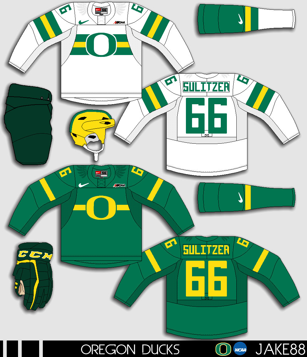
Oregon Ducks NCAA concept [by Jake88]
Up points: The chest stripes and the "O" logo fits the theme for Oregon hockey, the stripes is well done, helmet got that football theme going, and it really help makes it happen. Add small wings on the shoulders is fine with me. Lastly nice call on the fonts for both numbers, and nameplate.
Down points: The dark looks really too plain compare to the white jersey. Green pants, and green gloves doesn't match with the green on the jerseys. Fake lase nuff said.
My suggestion: Make the pants and the gloves the same colors as the jerseys. Give the stripes on the dark the same treatment as the white just switch the green, yellow, and green to yellow, green, and yellow.

Another week of  "Summer of Concept Contributor" is in the books come by next week for another one til then, I'm Alan, I'll get elbow to my head, so you don't have to.

Saturday, 2 August 2014

Summer of Concept Contributor: Heritage gone Classic

Hello I'm Alan, I'll get elbow to my head, so you don't have to. Week number 5 of the "Summer of Concept Contributor" came from Joey, this one is a Heritage Classic concept between the Leafs, and the Habs. Let's get to it.

2016 Heritage Classic Concept [by Joey F.]
Up points: The logos on both of them looks good, something simple, classy, and original! The colors are well picked wisely.
Down points: Numbers on the front is not needed to be on both them jerseys. The arm stripes on both is to low to me. Lastly the small stripes with the big stripes on both the arms, and hem are too tin to me.
My suggestion: Remove the front numbers, raise the arm stripes a little higher, and make the small stripes a little thicker to see them better.

You think that's all I got for you? Well guess again! I got 2 concepts from Jake88!

Washington Capitals concept [by Jake88]
Up points: The chest, and the under arm stripe are base on the flag of Washington D.C. and I have to say I like it! Putting the stars on the arms is always a good move to me. Lastly putting the D.C. stars inside the collar is an nice touch!
Down point/My suggestion: The only thing I have a little issue with is the stars colored in wrong order, instead of red/white, red/white, blue, and blue, it should be red/white, blue, red/white and blue.

Slovan Bratislava Alternate Concept [by Jake88]
Up points: For this "Faux-back" style alternate, this fits the team very well. Word mark logo is classy and and well placed on the jersey. Modern number fonts gave this concept an nice touch!
Down point: Nothing to say anything wrong about this one.

Well that's another week of "Summer of Concept Contributor" see you all next week for some more goodies, until then I'm Alan, I'll get elbow to my head, so you don't have to.