
Hi you all, Alan here for a non-Saturday post here at AJH HJA. Before we get to the concept, I have announced that from October 1st to October 31st, I will be posting concepts, 31 days, one team. From the GOJHL (OHA Jr B. league) is my hometown team the Chatham Maroons! The title will be called "Maroontober." I wanted to do this for a long time, and I think this is an excellent time to do it, so that's my announcement now back to your regular schedule post.
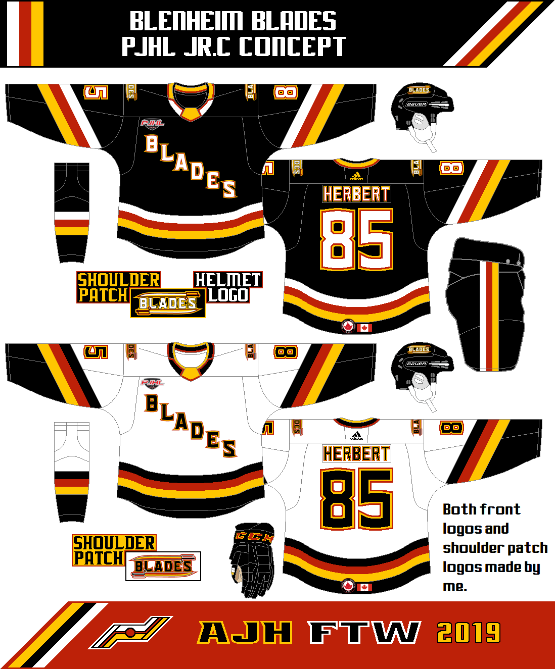
Over 5 years ago, I made a concept for an OHA Jr. C hockey team Known as the Blenheim Blades. 5 years ago they were in OHA Great Lakes Jr. C league and they wore the Calgary Flames pre-edge jerseys with the "BLADES" wordmark logo with a sword underneath it. 5 years later the league is now known as PJHL (Provincial Junior Hockey League) Stobbs Division while the jerseys still the same. If you read my PJHL outdoor game jerseys review the Blades wore the Vancouver Canucks old 96 alternate jerseys that became my inspiration to make a Canucks inspired design in hopes that they can gut out of being red as the team's primary colour and hopefully see them back in black.
 I decide to stick with the wordmark logo minus the sword, change the font, add trims and place it in diagonally across the front like the NY Rangers do. I made a shoulder patch logo (which is also on the helmet too) it just the word "Blades" sandwiched with two swords. Black is the primary colour follow by red and gold to finish the set.
And so this one is done! See you all tomorrow for the Maroontober month just to let you all know there won't be any of me explaining about the concepts because it's just the Maroons wearing NHL design jerseys just recoloured and there are some changes on the fonts for both nameplate and numbers nothing more. Until then, later.
Over 5 years ago, I made a concept for an OHA Jr. C hockey team Known as the Blenheim Blades. 5 years ago they were in OHA Great Lakes Jr. C league and they wore the Calgary Flames pre-edge jerseys with the "BLADES" wordmark logo with a sword underneath it. 5 years later the league is now known as PJHL (Provincial Junior Hockey League) Stobbs Division while the jerseys still the same. If you read my PJHL outdoor game jerseys review the Blades wore the Vancouver Canucks old 96 alternate jerseys that became my inspiration to make a Canucks inspired design in hopes that they can gut out of being red as the team's primary colour and hopefully see them back in black.
And so this one is done! See you all tomorrow for the Maroontober month just to let you all know there won't be any of me explaining about the concepts because it's just the Maroons wearing NHL design jerseys just recoloured and there are some changes on the fonts for both nameplate and numbers nothing more. Until then, later.


