Sunday 29 November 2015

IceHL weekend: Munich Machine

Hi everyone Alan here for a Sunday post here at AJH HJA. To keep this IceHL event going we got the Munich Machine.

This set is simple from stripes to fonts, but only thing different on this one is it got gear patch on the sleeves.

That's it for today post, sorry this one is short, nothing to explain about this one too much. There will more IceHL posts next weekend. Until then later.

Saturday 28 November 2015

IceHL weekend: Helsinki Lynx

Hi everyone Alan here for the third week in a row of posting stuff here at AJH HJA. This weekend and the next weekend will be nothing but my IceHL designs that I entered them in, and just like last year none of them were winners. Today is the "Helsinki Lynx."

The arm stripe came from the Flyers first Reebok set mix with Collar-to-Cuff Yoke Cut style, with a simple hem stripe and the socks with the same stripe treatment as the hem. I use the Carolina Hurricanes current fonts, and use Florida State Seminoles numbers fonts to fit the team's theme.

Well that's it for today, come back tomorrow for some more of my IceHL work, til then later.

Sunday 22 November 2015

Try to warm things up on a Sunday

Hi everyone, Alan here for part 2 of the AHL weekend here on AJH HJA. Today is the Stockton Heat Concept.

Pretty much just simple stripes on both arms, and hem. Simple fonts for both nameplate, and numbers. The logo I pulled the "S" out of the rounded word mark logo.


Well this weekend is in the books. I will try to set some more posts up for the next weekend. Until then, later.

Saturday 21 November 2015

Classically Wild

Hi everybody, Alan here for another weekend post here on AJH HJA. This is part 1 of the AHL weekend post today we got the Iowa Wild.

This one is classic put together to fit a minor league team! The right striping on the arms, hem, to even on the Dallas Stars style yoke. Standard block font for the nameplate, and use the Wild font for the numbers, one those font that I wish the Minnesota Wild still use them.

Well that's Saturday, come back tomorrow for another AHL concept to wrap up the AHL weekend. Until then later.

Sunday 15 November 2015

My wait for that one logo is over

Hi everyone Alan here for once again another post here at AJH HJA.
Today is the Saint John (not St. John) Sea Dogs. Here's the thing, their current logo is alright but I felt like they could have done better. In 2012 they unveiled their first alternate jersey that featured a logo that base on the former AHL team the Saint John Flames, the logo was awesome and it fits the team better then their current one even thou the jersey was terrible but the logo is a must have so I search, and search, and search for the logo and I finally found it! With a lots of cleaning off the pixels to even sizing it to fit the jersey, with some addition of tweaks on the logo and there it is my Saint John Sea Dogs Concept.
Yes I know this is the same design you seen over and over again sadly this design was suppose to be made just for the Sea Dogs but as years of trying to find the logo to even my hopes of trying get another taste of COTW from HJC I pretty much in term "Reeboking" the design (yes I know it's not a word but bear with me on this one.) Using it with the color placement base on the team's first set. Nameplate is Winnipeg Jets font. Lastly UConn's font for the Numbers.

So that's it for this post more will come in better time, or more likely the weekends. Until then, later. 

Saturday 14 November 2015

Hit the Stadium like a hurricane!

Howdy everyone Alan here for yet another post here at AJH HJA. Today is a concept that it's came in mind of "what if the Carolina Hurricanes plays in the Stadium Series?" Well here it is my Carolina Hurricanes Stadium Series concept. Even thou I did made a black one from two years ago, but this one I can't miss out! Let's go.

Warning flag logo in the front with a a hockey stick being red instead of silver, with warning flag stripes everywhere from the arms, hem, socks, pants, heck even the yokes.

HJC Feedback
Icethetics Feedback

Bonus Concept!

Carolina Hurricanes Stadium Series concept in red! Not to explain on this one.

Well this one is in the books, I'll try to keep this train rolling with some more. Until then, later.

Friday 6 November 2015

Colorado Avalanche Concept: Stadium version

Hello everyone Alan here for today's post, from my last post I forgot to link a font site, it's J-LOG Custom Fonts. It's a font site made by John O. go and check it out!

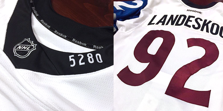
Well to try for myself to get back on track I got a concept, a Stadium Series Concept that is. Today Colorado Avalanche. But First I'm reviewing their 2016 Stadium Series Jersey, and their new alternate jersey.

Stadium Series
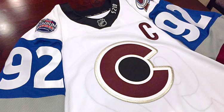
image from http://www.icethetics.co/
This is not Avalanche! This is a Disaster! Bad stripes, over size TV numbers, awful collar, and the list goes on. Just terrible jersey one of worst.

Alternate Jersey
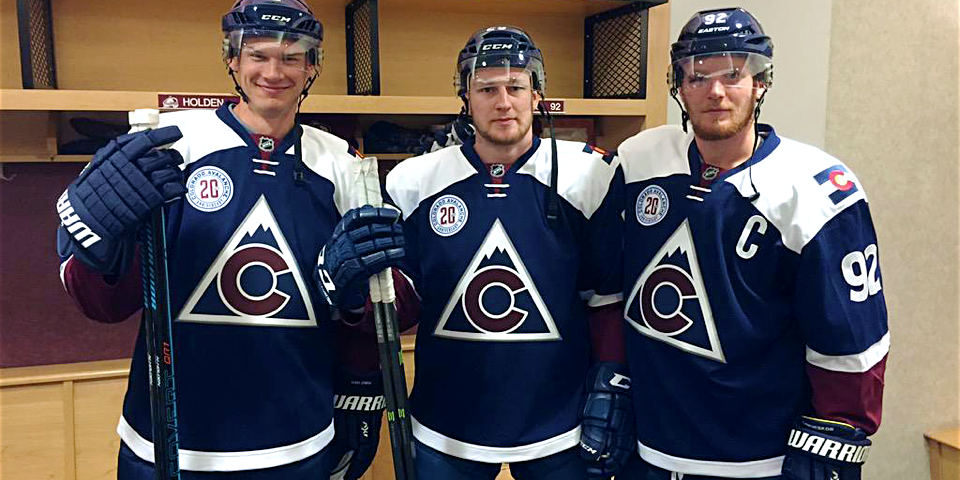
image from http://www.icethetics.co/
Let see here, they call it a tribute to the state's hockey history. Hey Guys here's an idea how about using one of these as your alternate jersey! The logo is fine and all, nice nod to the old Rockies, but in my opinion it belongs on the shoulders not on the front. Navy jersey is good, but with the white yokes ruins it. Lastly the number fonts is new and fresh, but lacks trims. Overall: Could have been a good alternate jersey, but the things I talked about keeps me away from buying this one, even at 50% off.

With that of the way it's time for my Stadium Series Concept as part of the HJC's Stadium Series contest few months ago, let's take a look.

Mountain stripes on the arms and on the sides to fit the Stadium series theme, just simple but effect. Of course when it comes to Stadium series there are odd pieces to make it more "Stadium Series" and that's is the pants, burgundy on the front, and steel blue on the back, hey if the Kings can get away with white pants why not with this one?


Well this post is done. I'll try my best to keep this boat going, til then later.

Tuesday 3 November 2015

AJH HJA Have Returned! (for now)

Hi everybody, Alan here after a taking a summer break from this site, witch it was more longer then I thought, let just say I been busy with life outside the concept world, I'll leave it at that.

Anyway while I'm on my summer break I took two requests from John O. You might remember him from his past requests I did was the Toronto Maple Leafs, and the Ottawa Senators. Today I'm going to show you my work put together by request by John O. Let's begin.

Chicago Black Hawks Stadium Series Concept

Nothing too big it's a white version of the Hawks 2014 Stadium series with some tweaks, 1. The main logo is not chromed (thank goodness.) 2. The team's shoulder patch is on both sides of the jersey. Lastly 3. Nameplate and the number fonts is in title "J-Log Rebellion" custom made by John himself, the numbers got trims base on NY Rangers 2014 Stadium series and the best part he doesn't want the TV numbers tilted (a plus for me!)

HJC Feedback

Minnesota Wild Nike Concept

This is pretty much the Wild's first set in a Nike template, the only thing different is the nameplate font, just like the Hawks it's "J-Log Rebellion"

After I forgot to inform John about the Nike template where the back is curved while the front is straight, so he request to give the front a Reebok curve treatment.

So that's it for today, hopefully I'll get back on track because I got tons of concepts to post here. Til then, later.