Hello
I'm Alan, I'll get elbow to my head, so you don't have to. Hope everyone is having a great day as much I am, today I'm just going to some rants slash jersey reviews, let's get going.
Thoughts on the Winter Classic uniforms.
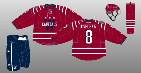
Washington Capitals
 |
| Picture Credit: The (unofficial) NHL Uniform Database |
Up points: Colors was a good choice for the winter classic game. The pants is a good choice. Tie-down collar is a surprise for me but it fits with the jersey. Stripes on the hem, and the yokes are well put together, and very Capital like! Lastly stars on the arms is always O.K. with me.
Down points: the logo is good but with both red and blue at a darker shade looks blended together, the lack of trim around the logo didn't really give eye popper effect at all.
My Jersey Collection Rate: Wait until it's on sale.
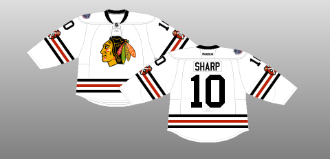
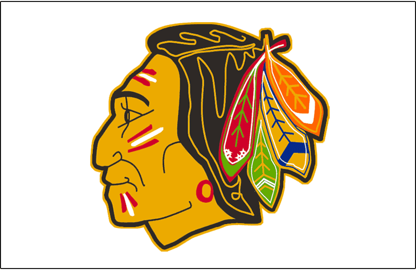
Chicago Blackhawks
 |
| Picture Credit: The (unofficial) NHL Uniform Database |
Up points: For a jersey base on the 1957-58 style this is a darn good winter classic jersey to see on the ice! Secondary logo on the arms is a plus for me.
Down point: If you're doing a winter classic jersey you can at least use the logo base on 1957-58 jersey.
My Jersey Collection Rate: Buy it at the full price.
Thoughts on the Stadium Series uniforms.
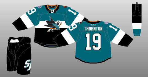
San Jose Sharks
 |
| Picture Credit: The (unofficial) NHL Uniform Database |
Up points: No chrome logo "YES! Thank god!" The uniform is Habs'ish but it look pretty good to me. Lastly I like the shoulder patch, it really fits with the team really well.
Down points: The chest stripe didn't go all the way around the back. Whats up with the large TV numbers that doesn't have trim with it, really Reebok? Large secondary logo on the pants, why? The collar, who came up with that idea? Lastly the jersey you got more teal on it, but you got more black then teal on the sock, really guys?
My Jersey Collection Rate: Buy it when is 50% off the price tag.
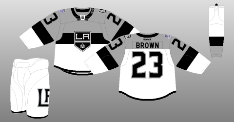
LA Kings
 |
| Picture Credit: The (unofficial) NHL Uniform Database |
Up points: Logo not chromed is a plus for me, using the team's previous Stadium Series "LA" logo as shoulder patch is a smart move. Lastly despite the black chest stripe didn't go all the way around but they did kept grey above the white cleanly.
Down points: Again large TV numbers, why Reebok? The collar is just like the sharks it just too unnecessary big, "what were they thinking?" Lastly you guys got the nerve, the nerve I say that all the things you do, who in the right mind thinks that it's a good idea to make the pants white? I mean my god, putting a big secondary logo on the pants doesn't help out to make it better, it's worse. Just when you thought the Caps first season with white pants was bad, this one ruins the jersey in general.
My Jersey Collection Rate: Buy it without the vision of the white pants stuck in your head.
Whalers getting out of Plymouth?
In OHL news that I heard and read that the owner of the team wants to move his team to a different city due to poor attendance, which was a shocker to me because this team had a lot of success of being in the playoffs minus 2 years, including the 1995 OHL title, and nobody wants to see this team play! The other reason is the USA development program offers some big money to play in Plymouth rink over staying in Ann Arbor MI, witch more shocking in this source say the owner of the Whalers also owns the rink as well witch is weird to me non the less. So what location that the owner of the Whalers wants to go to? Flint, MI? No! Hamilton? Wrong! He wants his team to move to Chatham! That's right he want to move the team, and I'll say it again just to let it sink in, "A OHL team to my hometown Chatham!" Now I know you all are thinking is "why am I not going crazy about this?" Well history always said that ever time my town is in talks about from a OHL team, to even talks about getting a new rink, it's ether drift away to a point that it was just a myth, or some big shot wants the city money to built their arena the way they want without losing chunks off their account. I'm not saying that my town is broke and all but we are not spending the money the right way that's all. Unless this owner of this team knows what he's in for, and willing to take a big chunk of his bank to built us a new arena then I'm all for it and it'll help my town along the way too, just look at St. Catharines when they got themselves a OHL team and getting a new arena people over there questioned it and when the new arena got built the people talk nothing but praises about it, hopefully it will have the same impact for my town like what St. Catharines got, for now all I can do is to sit and wait to see how this ends up.
Oil changes in Edmonton
After years of top draft picks later and the Oilers are still hitting rock bottom, you would've thought by now this team would rank at least close to a 9th place spot right now but sadly they are not! To think they were 1 win short to win the cup in 2006, and now here they are. Right now they're been on losing streaks from one big chunk to another, something need to be fix and fast, they have to pick what straws they got left to do that before the trade deadline.
Swords balancing act
My London Sabreswords HCIHL team had a great first 3 games, then went on a bad losing streak, at this time this week my team is 6-5. I'm hoping for a turn around for the rest of this season if I can keep up updating my rosters, mostly my goalies.
Reasons for my lack of posts to putting projects aside
After my "Concept of the Dead Month" this site have been lacking posts both this month, and last month, the reason is I've been busy with a lot stuff so much I haven't got the chance to do any concept making, even I had the chance to do them I felt burned out from a rough day at my job. Heck I had plans that I want to put together for this site that have to be put in back burner to even forgetting about plans. Therefore I apologize for the lack of posts to you all that were expecting some better numbers of post made by me for the last two months, I will try to do the best I can, I can't say it will never going to happen again but I'll try.
Well that's today post, hope you all have a Merry Christmas, Happy Hanukkahs, Happy Kwanza, Happy Decemberween, Happy whatever Holidays you're celebrate. Happy Holidays everyone til then,
I'm Alan, I'll get elbow to my head, so you don't have to.


