Hello I'm Alan, I'll get elbow to my head, so you don't have to. Well 2014 is here, and I got nothing to say. But I do got some concepts in line for today. I got lazy last week after an rough week including this also, my apologize if anyone was expected an post last week. we got 1 from me, and 3 from an contributor. Let's get going.
Macon Whoopee Concept [by me]
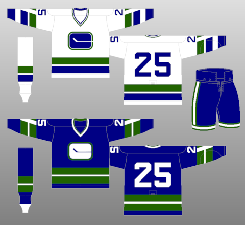
 "Whoopee!" My 2nd Macon Whoopee concept from 2013, unlike my first Whoopee set this one is an little bit toned down to an classic form. The jersey is base on the Vancouver Canucks very first set, but instead of the "V" it's "M" and "W" on the arm stripes, hem stripes, and even on the logo. As specking of logo, the logo was base on the team's first logo back in the CeHL days only some few tweaks on it, including shoulder patch for good measure. The colors is well picked to fit this team with blue, green, and white.
HJC Feedback
New York Islanders 3rd concept [by Ricky M.]
 Despite this is an overrated template, but there's a little rule "Make an concept that is better then the Islanders ugly old set!" Ricky did just as that with this one, witch is was part of the HJC's "Make the fishstick logo look good contest." Using the Preds collar is O.K. if he add white trim to it, it'll look sick with the piping connected. Adding the yoke with two stripes at the end of it was an nice touch. The choice of nameplate and numbers is questionable, but pulled off nicely. The colors on the logo is O.K, I questioned the gold, but to me it's a lot better then using 4 stripes that the Islanders seems to never want to let it go. Overall: This may not be a good enough jersey to the Islanders taste, but it could be a good Stadium Series to my opinion.
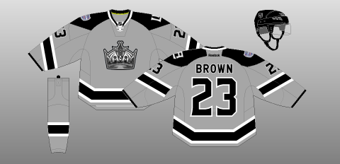
San Jose Sharks 3rd concepts [by Ricky M.]
 Up points: The jersey design is good, like the side stripes, less is smart. The arm stripes is simple, but good.
Down points: The main logo is good from far away, until looking at it up close and there are some pixels all over the logo. The number fonts is O.K, but the colors seem to be off to me, if it weren't for the trims, it would blend with the jersey. I'm O.K with orange, but I feel that this doesn't fit the Sharks well to my opinion. Lastly the nameplate is small.
My suggestion: Switch the orange with black, and the black with orange. Remove the front numbers, I feel that it didn't really needed at all. Lastly make the nameplate bigger.
Minnesota Wild 3rd concept [by Ricky M.]
 Up points: Jersey design is very nice looking, the stripes, the piping, and cuffs are put together perfectly. Nice choice of collar. Finally the fonts of numbers, and nameplate is a wise choice.
Down points: The colors are a bad choice to put, yellow as the main color, follow by red, green, and wheat. The nameplates are small. Lastly the main logo is fine, but it looks plain to me with the jersey design so modern.
My suggestion: Make green as the main color, follow by red, yellow, and gold. Make the nameplate bigger. Finally add trim around the main logo.
Well that's my post for today, there will no posts for the rest of this month, why? Because I'm planning on putting a lot stuff together in one for my "200th" post here on AJH HJA. Until then, I'm Alan, I'll get elbow to my head, so you don't have to.
Macon Whoopee Concept [by me]

HJC Feedback
New York Islanders 3rd concept [by Ricky M.]
San Jose Sharks 3rd concepts [by Ricky M.]
Down points: The main logo is good from far away, until looking at it up close and there are some pixels all over the logo. The number fonts is O.K, but the colors seem to be off to me, if it weren't for the trims, it would blend with the jersey. I'm O.K with orange, but I feel that this doesn't fit the Sharks well to my opinion. Lastly the nameplate is small.
My suggestion: Switch the orange with black, and the black with orange. Remove the front numbers, I feel that it didn't really needed at all. Lastly make the nameplate bigger.
Minnesota Wild 3rd concept [by Ricky M.]
Down points: The colors are a bad choice to put, yellow as the main color, follow by red, green, and wheat. The nameplates are small. Lastly the main logo is fine, but it looks plain to me with the jersey design so modern.
My suggestion: Make green as the main color, follow by red, yellow, and gold. Make the nameplate bigger. Finally add trim around the main logo.
Well that's my post for today, there will no posts for the rest of this month, why? Because I'm planning on putting a lot stuff together in one for my "200th" post here on AJH HJA. Until then, I'm Alan, I'll get elbow to my head, so you don't have to.


