Monday, 28 April 2014

Concept Contributor: Going green

Hello I'm Alan, I'll get elbow to my head, so you don't have to. It's been weeks since the last time I did a Concept Contributor post, so let's get on with the concept.

Celtic FC concept [by Ricky]
Up points: For a concept base on a Scottish Football (soccer) club, it's a good looking concept. The stripes is nicely placed. The fonts fits with this concept very well. The Celtic patterns are awesome!
Down points: the bright green color doesn't seem look right to me.
My suggestion: Make the bright green on all of them to normal green like on the white jersey.

Well, today's post is in the books. Hopefully round 1 be done later this week so I can do my review of that round including my round 2 picks, until then later.

Friday, 25 April 2014

Team Sweden Concepts

Hello I'm Alan, I'll get elbow to my head, so you don't have to. Remember my team USA concepts? Well today I got another one! This time Team Sweden.

This World Champions Concept is simple, simple jersey design, simple numbers and nameplate fonts. The difference is the collar, I put the Nike 's short collar and add a tie down strings on it. The main logo is the big shield with the country's iconic three crowns logo on top of it. The logo, and the numbers has two thin trims around it. The sleeve patch logo was made by me, originally I had the country's boat logo, but had a heck of the time to have at the right size, so I made one of my own.

This one I'm proud of putting this sucker together. Unlike the World Champions version that has little bit of white on it, this one got more white on this one, white trims on the arms, and hem stripes, pretty much everywhere. The main logo got the three crowns logo on top of the shield with the diamond shape with the country's flag inside of it. The sleeve patch is just like the WC concept, nothing to say about it. Lastly the collar, remember those stupid fake lases that Nike thought they're smart with? Well guess what? I say "Screw you Nike, and your stupid fake lase!" I replaced it with the flag of Sweden.

HJC Feedback 
SG-94 Feedback

Well that's today post. There are some series already done, but I'm going to post about it on my next edition of "The Playoffs Pickz" until then I'm Alan, I'll get elbow to my head, so you don't have to.

Tuesday, 22 April 2014

NCAA outdoor game concept Michigan vs. Michigan State

Hello I'm Alan, I'll get elbow to my head, so you don't have to. I got nothing to yap about right now, so I got a concept for you, so let's get to it.


On the Michigan Wolverines the jersey was base on my special event concept I did, but two things I change. One was the jersey switched from blue to yellow with blue stripe, and white trim. Second the logo is the big "M" on it with the wolverine inside of it. On the Michigan State jersey is pretty much simple with the angle yoke, and just like the wolverines there is a Spartan logo inside the big "S" so there you go my outdoor game concept.

HJC Feedback Icethetics Feedback

Well hope you enjoy a quick post by me, there will be more coming and the next round picks coming soon, until then I'm Alan, I'll get elbow to my head, so you don't have to.

Saturday, 19 April 2014

Team USA Concepts

Hello I'm Alan, I'll get elbow to my head, so you don't have to. Hope you all read my Playoffs Pickz from Wednesday? If didn't I got the link right here. Now enough about that on to the concepts. What you get when you have me, concepts, world champions, the Olympics, and Canada's rival USA have in common?  You get Team USA Concepts, both World champions, and Olympics versions that's what! Let's get going.

On this one I use a standard USA logo that they can't use at the Olympics. Arm stripes I try to give it a wave look to it. The hem stripes is straight in the front, but wavy in the back. The shoulder patch is made by me. Nameplates, and numbers are standard block font.

Just like the World Champion version with the arms, hem stripes, fonts, and shoulder patch. Instead of the tie-down collar I switch it with a different collar. I took the 2012 Olympics Man's Basketball logo, and add the flag underneath the USA word mark with two gold stars to represent the two gold metals that Team USA won.
Well that's your double dose post for today til then, I'm Alan, I'll get elbow to my head, so you don't have to.

Wednesday, 16 April 2014

2014 NHL Playoffs Pickz: Round 1

Hello I'm Alan, I'll get elbow to my head, so you don't have to. Today this site is 3 years old, and I admit I never thought I can keep this site as long as I can, but here we are, and what better way to do a 3rd anniversary post then to some playoffs pickz! 30 teams played 82 games, only 16 teams makes it to this year playoffs, but only one will be this year Stanley Cup champion. The question is who will win? The real question is who will move on to the 2nd round? Well let's get going with the "2014 NHL Playoffs Pickz" round 1 by me!

Eastern Conference
Boston [A1] vs. Detroit [WC2]
Boston: The Presidents Trophy winner is more ready then ever, heck Iggy played like he is in mid 20's, primed and scoring like crazy, some players are in their "A" game.
Detroit: The Wings are in the playoffs for the 23rd year in a row, just barely with some key players injured yet they're here.
 Overall: Bruins will have the edge on this one.
My Pick: Bruins over the Wings 4-1


Tampa Bay [A2] vs. Montreal [A3]
TBL: Last year they missed the playoffs, this year they're in the top 3 of the Atlantic division, what's makes it more surprising they did most of this season without Steve Stamkos and the the team took a risk and traded Martin St.Louis to the Rangers for Ryan Callahan, so far it's pretty well a winner for the Lightning.
Montreal: The Habs had their ups, and downs this season but in the end their in. The players were playing their "A" game, mainly Price who is playing like he's in the Olympics! The Habs are the only Canadian team that is in the playoffs.
Overall: One of these teams have what it takes to go to the second round no ifs, or buts about it.
My Pick: Habs over the Lightning 4-3


Pittsburgh [M1] vs. Columbus [WC1]
Pittsburgh: Just like last year the Pens played well in this season to be number 1 in their division.
Columbus: Well deserving to be in the playoffs, they got players who are at their "A" game, and the number 1 cop playing like he played last season that got him the Vezina trophy!
Overall: I don't see Columbus moving on to the 2nd round, but I do see this series going all the way!
My Pick: Pens over CBJ 4-3


NY Rangers [M2] vs Philadelphia [M3]
NYR: Got ousted in the semis, but this year they got some good players, good enough to hopefully go all the way to the finals.
Philly: Last year they played bad, this year they put their heads back in the game and made it to this year playoffs.
Overall: The way these two teams played this season in 2 to 2 season series ,it could go 7 games, but I got a feeling it won't be a 7 games.
My Pick: NYR over the Flyers 4-2


Western Conference
Colorado [C1] vs. Minnesota [WC1]
Colorado: After taking a big downfall from previous season, the team did some fixing with some good draft picks, trades, even the staffs, and here you go the team is back in the playoffs.
Minnesota: For the 2nd year in a row the Wild are in the playoffs, nothing to say about it.
Overall: Wild got in the playoffs, but the Avalanche got this one.
My Pick: Aves over the Wild 4-1


St.Louis  [C2] vs. Chicago [C3]
St.Louis: The Blues got game this season, but do they got what it take?
Chicago: Last year Stanley Cup champions are here and ready to defend their title.
Overall: The blues maybe better then the Hawks division wise, but in the playoffs it's a whole different story.
My Pick: Hawks over the Blues 4-2


Anaheim [P1] vs. Dallas [WC2]
Ducks: The team is determent to go all the way and win the cup.
Stars: For the first time since 2007-08 season they are back in the playoffs.
Overall: The Stars may have returned back to the playoffs, but the Ducks will make a quick series out of this.
My Pick: Ducks over Stars 4-0


San Jose [P2] vs. LA [P3]
SJS: The Sharks had a good season, over 100 pts this season is good enough to in the top 3 in their division.
LA: The Kings played very well this season, nuff said.
Overall: Battle in Cali one will rise, one will choke.
My Pick: LA over SJS 4-2


Well that's my picks for round 1, later this week I got another post coming, and it'll be a concept. Until then later.

Sunday, 13 April 2014

Calgary Flames Concept

Hello I'm Alan, I'll get elbow to my head, so you don't have to. Nothing to talk about on this post as this year's NHL season ends today with some games to close off a crazy season we got, and on April 16th the playoffs begains, so today's concept featuring a team that is not going to the playoffs the Calgary Flames let's get to it shall we.
Do you see a striking resemblance? Yes this is the same template as many other concepts I made, so this one is quick for me to explain about. Use the colors of red, yellow, and dark red. The nameplate is the same as the flames currently got, the numbers I used the Dallas Stars current number font, but with trims around it.

DD60 Feedback

Well that's today, be here later this week as I give you this year's "NHL Playoffs Pickz" until then I'm Alan, I'll get elbow to my head, so you don't have to.

Thursday, 10 April 2014

Chatham-Kent Roadrunners concept

Hello I'm Alan, I'll get elbow to my head, so you don't have to. On my April fool's day post I got an Roadrunners concept and said my hometown is getting an OHL team. Well it's just a April fool's joke, but it was good idea. I present to you all the concept that I made for not only for my April fool's day post, but also as part of the HJC's Roadrunners contest, the Chatham-Kent Roadrunners concept.


I use the same template as my Windsor Spitfires concept, but on my horizontal stripes there is 3 small stripes on it. The nameplate is the Winnipeg Jets fonts, and the numbers is the Anaheim Ducks font without the tip in the end. The shoulder patch was originally going to be the main logo but I chose to keep it as a shoulder patch. The main logo is base on a old minor-pro, yes I said it a minor-pro hockey team in my hometown called the "Chatham Wheels" this team came from a league called Colonial Hockey League witch later became United Hockey League, and then became the International Hockey League witch it close it's doors after 2009-2010 season. As for the Chatham Wheels that team didn't last long, after 2 seasons, even fresh off being in the finals the team moved Saginaw to keep the Wheels name for only 2 seasons until renamed themselves to the Lumber Kings, then the Gears, and then move to Ohio keeping the Gears name for only 1 season until the ownership were forced to dissolve and cease operations.

HJC Feedback

 Well that is the post for today, next week I'll post some more concepts later on this month, until then I'm Alan, I'll get elbow to my head, so you don't have to.

Sunday, 6 April 2014

Double Contributors: The Aftermath

Hello I'm Alan, I'll get elbow to my head, so you don't have to. Hope you all enjoy my April fool's day post, if not meh I try. I decide to bring back those two concepts made by one concept artist back to give my thoughts on them, let's get going.

Anaheim Ducks alternate concept [by Ricky M.]
 Up point: Base on the Ducks first alternate jersey, this one surprise me. Change the jade to orange, and the eggplant to black help this jersey pretty good. The yoke looks better rounded at then pointy, and looks less crowded. Lastly using the tie down collar makes this concept look classic to me.
Down points:  The fonts on both the numbers, and nameplate are also base on the team's first alternate jersey, I felt like it didn't need it at all.
My suggestion: Make the numbers, and nameplate standard block fonts and you got yourself a winner.

Vancouver Canucks alternate concept [by Ricky M.]
 Up point: This one use the right colors on this jersey that base on the team's first alternate jersey. Using the team's current nameplate, and numbers fonts with trims is a good choice. Tie down collar is an nice touch to this concept. Lastly nice idea of using the full body Johnny Canuck logo on the front makes it complete!
Down point: The nameplate, and numbers are silver and I felt like it look like it blended with the jersey to me.
My Suggestion: Make the nameplate, and numbers white, and it'll be perfect.

Well that's today's post, hopefully I'll get another post this week featuring my concept, until then I'm Alan, I'll get elbow to my head, so you don't have to.

Tuesday, 1 April 2014

2014 Jersey News!

Hello I'm Alan, I'll get elbow to my head, so you don't have to. Well I got some eye catching news to share with you all that could be for real, let's check it out.
 
Anaheim Ducks revival their new alternate jersey.
After months of rumors, the Ducks can happily report that this November the Ducks will hit the ice with there new alternate jersey. Base on the team's first ever alternate jersey that last only 1 season, the team decide to give the "wild wing" a second chance, but with some more orange. The fans will be happy to see these alternate on the ice then the rumored Stadium Series jersey.

OHL expanded to Chatham-Kent
After years of wait, my hometown got themselves  a OHL hockey club named the "Chatham-Kent Roadrunners. As part of the OHL big expansion plan that expanded from 20, to 24. With the buzz around the new club reviled the team's jersey set before they debut in 2015.
The team use maroon as the team's main color, followed by gold, and black. The logo is base on a Colonial Hockey League team (witch later became the United Hockey League 1991-97, and became the International Hockey League 2007-2010) the Chatham Wheels that last only two season (1992-1994.) The owners believes that the city of Chatham deserve an OHL team, witch will help not only the city grow, but also help the OHL grow too.

Canucks new alternate jersey for 2014-15 season
The Vancouver Canucks announced that they are replacing the team's 3rd jersey with their new 3rd jersey for 2014-15 season. Today the team reviled their new jersey.
Base on the team's first alternate jersey in 1996 recolored to the team's current included the addition of dark blue. The team put the skating Johnny Canuck logo on the front as the team's main logo for the alternate jersey. The 3rd jersey will hit the ice in December 2014.

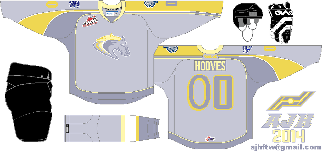
Swift Current Broncos new special event jersey
The WHL's Swift Current Broncos have reviled their new special event jersey. for the first time in two years the team decide to bring back the "My Little Pony" night, but instead of choosing any 6 jersey, they got only 1 to see it in action, and it's in titled "My Little Pony's Derpy Hooves" night.
Using the old 2009 NHL all-stars game jersey, using different fonts on both the letters, and numbers. Lastly using  the colors of Derpy Hooves.

Well that's all the news I got for you all hopefully I get some concepts put together later this month. Until then have a nice "April Fool's Day" later.

Anaheim Ducks concept, and the Vancouver Canucks concept made by Ricky M.
Chatham-Kent Roadrunners, and Swift Current Broncos Special event concept made by me.