

Showing posts with label NY Rangers. Show all posts
Showing posts with label NY Rangers. Show all posts
Saturday, 12 October 2019
Saturday, 10 February 2018
NHL Adidas concept: New York Rangers

The stripes on the dark jersey is based on the team’s old style from 1978 to 1997 with the collar having more white and little red on it. The white is the team’s current white but the yoke stripes is curved and the collar is red with white trim. The front word mark logo and the numbers is J-Log Rebellion Sans Small Caps with the Rangers drop shadow treatment, while the nameplate is their current font and vertical arched. Lastly the “NYR” logo on the helmet.
Sunday, 8 January 2017
Request to explain
Hi Everyone Alan here
for my first post of 2017 here at AJH HJA. I’ll explain of the reason why for
the lack of posts since late November, in early November I got everything all
ready and all my posts is set up, scheduled to be posted everything is going as
planned so well that I worked on my new project that involves with NHL and
Adidas. On Nov 6, 2016, my grandmother passed away peacefully it hit me hard it
really hit me emotionally and it threw me off badly I had a hard time trying to
get back on track with my concepts. In first week of December almost a month
after my grandmother’s passing I got an e-mail from John O. for another concept
request, to me it’s just what I needed to get my mind off things that’s been
hitting me emotionally and with that I got the request done for him and he love
it. So, today’s concept is the New York Rangers Fan Request concept.

This one is indeed a
classic pre-edge Lady Liberty design in Reebok cut form. Front logo, shoulder
patch is indeed the same as the classic, but two things that are different. 1st
I put the shoulder patch logo on the helmet, and 2nd the fonts for
both numbers and nameplate is J-Log Rebellion Sans Small Caps custom made by
you guess it John O.
Well with concept
done and thanks to the request I’m slowly getting back on track of my NHL
Adidas series project I won’t be posting them until I get all 31 teams made.
Now for quick note if anyone questions it I have been uploading some of my
concepts on my Deviantart page I’m still uploading some of my concepts on my
Photobucket page as well but the reason is I felt like I haven’t pay much
attention to my Deviantart page so I decide to upload more of my concepts on
that page to show that page isn’t dead while my Photobucket page I just uploading
so far just fan request concepts. So once my NHL Adidas series is done, I’ll be
uploading them on to my Deviantart page with its own gallery just like my OHL
series, and my IIHF series. Other note to add is I’ve updated my Links page
well it’s not a big one just adding links to John’s pages one is his FFont
page, and the other Dafonts page if you want new fonts check out those pages.
Will there be any
non-concept posts? Depends on how I feel like ranting I might try to do a
jersey review post but don’t hold your breath just in case.
Well that’s all I can
do for now, until then later.
In Memory
Audrey Hunter (Nan)
1929-2016
Saturday, 12 July 2014
Summer of Concept Contributor: Power Rangers! (See what I did there!)
Hello I'm Alan, I'll get elbow to my head, so you don't have to. Welcome to week 2 of my "Summer of Contributors!" This week is another Joey concept, but this time is a full body concept of the Tampa Bay Lightning alternate concept. Also we got a Rangers concept from Ricky. Let's get to it.
Tampa Bay Lightning Concept [by Joey]

Up points: Black is the main color on this one, blue came in second, that's how the team should be doing right now. The vertical arm stripe is classy, but to me it really fits the team good.
Down points: The "BOLTS" logo is good, but it's lacks trim around it. The numbers look plain without trim around it. The hem stripe is too thick, it makes the front look too busy. Lastly the stripes on the socks is place too low to me.
My suggestions: Thin the hem stripe, add trims around the "BOLTS" logo, and the TV numbers, and raise the stripes on the socks.
New York Rangers Concept [by Ricky]
 Up points: Stripes on the arms, hem, and even on the yokes is well put together, using the Liberty logo is a good pick to my mind, and lastly red as the team's main colors is rare to see on the Rangers but this works!
Down point: The shoulder patch is placed too close to the collar to me. The Liberty logo doesn't match with the colors on the jersey.
My suggestion: Change the blue on the jersey to navy blue like the Liberty logo, and it's good to go.
New York Rangers Concept [by Ricky]
Down point: The shoulder patch is placed too close to the collar to me. The Liberty logo doesn't match with the colors on the jersey.
My suggestion: Change the blue on the jersey to navy blue like the Liberty logo, and it's good to go.
Well that's this week post, see you all next week for another addition of "Summer of Contributors!" Until then I'm Alan, I'll get elbow to my head, so you don't have to.
Friday, 14 February 2014
The Big 200th post!
Hello I'm Alan, I'll get elbow to my head, so you don't have to. Welcome to my 200th post here on AJH Hockey Jersey Art! We got concepts by me, concepts from an contributor, and some other stuff right here all in one post. Let's not waste time and get things going shall we.
From my September 30th post I made prediction for the 2013-14 NHL season, and as promise (well I promise myself even thou we're on Olympic break) I give you my mid season prediction.
Here's my prediction from Sept 30th post.
* = division winner, # = Top 3 draft
Eastern
1. Pittsburgh*
2. Detroit*
3. Boston
4. Philly
5. Montreal
6. NY Rangers
7. Columbus
8. Toronto
9. Washington
10. NY Islanders
11. Buffalo
12. Carolina
13. Tampa Bay
14. Ottawa
15. New Jersey#
16. Florida#
Western
1. Chicago*
2. L.A.*
3. St.Louis
4. Anaheim
5. Vancouver
6. Minnesota
7. Edmonton
8. San Jose
9. Winnipeg
10. Dallas
11. Phoenix
12. Nashville
13. Colorado
14. Calgary#
Now here's my mid season prediction on how it'll look like at the end of this season.
* = division winner, # = Top 3 draft, % = wild card teams that could have a chance of getting in the playoffs.
Eastern
1. Pittsburgh*
2. Boston*
3. Detroit
4. Montreal
5. NY Rangers
6. Tampa Bay
7. Columbus%
8. Philly%
9. Toronto%
10. Washington%
11. NY Islanders
12. Ottawa
13. Carolina
14. Florida
15. New Jersey
16. Buffalo#
Western
1. Chicago*
2. Anaheim
3. L.A.
4. St.Louis
5. San Jose
6. Vancouver
7. Minnesota%
8. Colorado%
9. Dallas%
10. Nashville%
11. Phoenix
12. Winnipeg
13. Calgary#
14. Edmonton#
Now to the concepts
Team Canada Concept (Olympics Version) [by me]
 Just like my other Team
Canada concept only different is the main logo. Simple stripes on the hem, the socks, and on the side of
the pants. Simple stripes on the arms with a maple leaf cut off the end
of the middle stripe. The logo of team Canada with the classic word
mark from their alternate logo. The numbers, and nameplate are standard block.
Just like my other Team
Canada concept only different is the main logo. Simple stripes on the hem, the socks, and on the side of
the pants. Simple stripes on the arms with a maple leaf cut off the end
of the middle stripe. The logo of team Canada with the classic word
mark from their alternate logo. The numbers, and nameplate are standard block.
HJC Feedback
SG-94 Feedback
Winnipeg Jets Alternate Concept [by Ricky M.]
 Up points: Nice combination of pieces, well put together, even thou the jersey were made from Thrashers old Reebok set. Using the team's word mark logo as the main logo is O.K with me.
Down points: Fonts on both numbers and nameplates made doesn't fit this jersey to me. Red as the main color doesn't suit my taste at all.
My Suggestion: Change the fonts, and switch the red with blue.
Creighton Blue Jays NCAA Concept [by me]
 This was an recolored version of my Boston Bruins concept. I felt that this template would fit the blue jays very well.
HJC Feedback
Stadium Series Anaheim vs LA concept [by Ricky M.]
 Anaheim
Up points: The jersey got hem stripe on this one then the official one that doesn't. Numbers on the back isn't stretched, witch it's a good thing. Using the shoulder patch from the team's alternate set was a wise choice.
Down points: Gold color under the arms is not my cup of tea. No stripes on the pants makes it too plain, and almost ruin the jersey.
My Suggestion: Change the gold to orange, and add stripes to the pants.
L.A.
Up points: Nicely done on the stripes, the team's old logo that was main crest from 1998 to 2002, and as shoulder patch from 2002 to 2011 is on this one is surprising, and an good choice to my taste.
Down points: Despite there is purple on the jersey, but I felt that this needs more on this jersey. Just like the Ducks pants no stripes.
My Suggestion: More purple on the stripes, and collar. Add stripes on the pants.
Stadium Series Rangers, Islanders, and Devils [by Ricky M.]
 NY Rangers
Up points: Using the lady liberty logo was an awesome idea to do! Red as the team's main color really made the jersey pop in a good way.
Down points: The blue under the arms, blue helmet, and blue socks are the 3 things that is keeping the look from near perfection.
My Suggestion: Make the stripe under the arms, blue helmet, and blue socks red!
New Jersey
Up points: The jersey design is well tamed, the stripes on both arms, and hem is well put. The yoke is well modern with some classic feel to it.
Down points: Red stripe under the arms. Black on the logo, and pants throws the jersey way off!
My Suggestion: Switch the black on the logo, and the pants to green. Turn the arm stripes from red to green.
NY Islanders
Up points: Orange is the best choice as the main color follow by navy to put an nice touch. Yes there navy blue stripe under the arms, but with cuffs on the wrist make sense to me. The stripes is well made.
Down points: Aluminum silver ruins it of what could be a perfect Stadium series jersey. The sock stripes does not match the stripes on the jersey.
My Suggestion: Lose the aluminum silver, and give the sock stripes the same treatment as the stripes on the jersey.
And lastly I got link here, it's to my banners I made in honor of contests I won including my first HJC's COTW!
Well that's today big 200th post! I hope you'll enjoy it may not be a big post that you all expect, but should be good enough. There will be more post coming but slow, I'm pretty much busy with work to even posting for HCI. Until then, I'm Alan, I'll get elbow to my head, so you don't have to.
Team Canada Concept (Olympics Version) [by me]

HJC Feedback
SG-94 Feedback
Winnipeg Jets Alternate Concept [by Ricky M.]
Down points: Fonts on both numbers and nameplates made doesn't fit this jersey to me. Red as the main color doesn't suit my taste at all.
My Suggestion: Change the fonts, and switch the red with blue.
Creighton Blue Jays NCAA Concept [by me]

HJC Feedback
Stadium Series Anaheim vs LA concept [by Ricky M.]
Up points: The jersey got hem stripe on this one then the official one that doesn't. Numbers on the back isn't stretched, witch it's a good thing. Using the shoulder patch from the team's alternate set was a wise choice.
Down points: Gold color under the arms is not my cup of tea. No stripes on the pants makes it too plain, and almost ruin the jersey.
My Suggestion: Change the gold to orange, and add stripes to the pants.
L.A.
Up points: Nicely done on the stripes, the team's old logo that was main crest from 1998 to 2002, and as shoulder patch from 2002 to 2011 is on this one is surprising, and an good choice to my taste.
Down points: Despite there is purple on the jersey, but I felt that this needs more on this jersey. Just like the Ducks pants no stripes.
My Suggestion: More purple on the stripes, and collar. Add stripes on the pants.
Stadium Series Rangers, Islanders, and Devils [by Ricky M.]
Up points: Using the lady liberty logo was an awesome idea to do! Red as the team's main color really made the jersey pop in a good way.
Down points: The blue under the arms, blue helmet, and blue socks are the 3 things that is keeping the look from near perfection.
My Suggestion: Make the stripe under the arms, blue helmet, and blue socks red!
New Jersey
Up points: The jersey design is well tamed, the stripes on both arms, and hem is well put. The yoke is well modern with some classic feel to it.
Down points: Red stripe under the arms. Black on the logo, and pants throws the jersey way off!
My Suggestion: Switch the black on the logo, and the pants to green. Turn the arm stripes from red to green.
NY Islanders
Up points: Orange is the best choice as the main color follow by navy to put an nice touch. Yes there navy blue stripe under the arms, but with cuffs on the wrist make sense to me. The stripes is well made.
Down points: Aluminum silver ruins it of what could be a perfect Stadium series jersey. The sock stripes does not match the stripes on the jersey.
My Suggestion: Lose the aluminum silver, and give the sock stripes the same treatment as the stripes on the jersey.
And lastly I got link here, it's to my banners I made in honor of contests I won including my first HJC's COTW!
Well that's today big 200th post! I hope you'll enjoy it may not be a big post that you all expect, but should be good enough. There will be more post coming but slow, I'm pretty much busy with work to even posting for HCI. Until then, I'm Alan, I'll get elbow to my head, so you don't have to.
Wednesday, 1 January 2014
Top 11 NHL Outdoor games jersey
Hi everyone Happy New Year everyone as we are hours away from the Wings-Leafs Winter Classic game. One of six outdoor games this year so I decide to do a first ever "Top 11 NHL Outdoor games jerseys." Let's not waste time and get going.
11. Anaheim Ducks
 |
| Picture Credit: The (unofficial) NHL Uniform Database |
The idea of Anaheim Ducks in orange jersey was always in many fans mind, and every concept artist desire, and dream come to life. But this one is "NIGHTMARE!" Chromed logo, one thin hem stripe with thick side panel, half stripes on the arms, and tilted TV numbers. The only thing good from this disaster jersey is the "OC" shoulder patch, and that's all.
10. New York Islanders
 |
| Picture Credit: The (unofficial) NHL Uniform Database |
Despite of just the "NY" chromed logo, the nameplate, stretched numbers in the back, tilted numbers, white yoke, and just one hem stripe. This one got an good collar, and the arm stripe is pretty much tamed, not the best, but better then the Ducks.
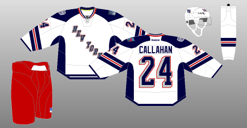
9. New York Rangers
 |
| Picture Credit: The (unofficial) NHL Uniform Database |
This one was an disappointment for me, stretched numbers in the back, tilted numbers, one hem stripe, and thick side panel. The arm stripe is messed up in an bad way. The collar, yoke, and the "New York" word mark logo makes up for an not so good jersey that got that "Lady Liberty" feel to it.
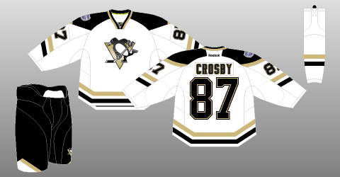
8. Pittsburgh Penguins
 |
| Picture Credit: The (unofficial) NHL Uniform Database |
This one maybe like the others, but it's better then the team's current set. I like the stripes on both arms, and hem. An small vegas gold on the back of the yoke could have gone all the way to the front of the yoke. Finally using the Oilers collar is an good call! Overall: It just an SS jersey, but fix it more and it could be the next set for the team.
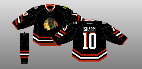
7. Chicago Blackhawks
 |
| Picture Credit: The (unofficial) NHL Uniform Database |
This had everything going, but fell short, stretched numbers in the back, chromed logo, and tilted numbers. But at lease they have hem stripes on it. Overall: If it weren't for stretched numbers in the back, chromed logo, and tilted numbers. This one would be the team's future 3rd.
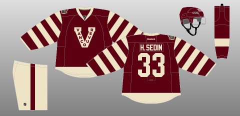
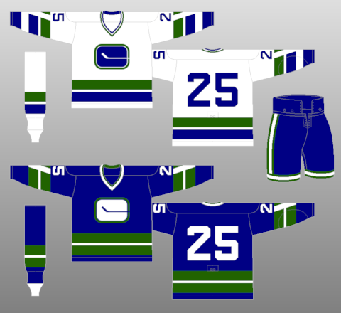
6. Vancouver Canucks
 |
| Picture Credit: The (unofficial) NHL Uniform Database |
Last year this was worn by the Canucks, on March 2 the team will wear it again. The jersey is alright but I felt like they should wear their first jersey from the beginning, and cream pants "Not a big fan!" Nothing too much to say about it, moving on.
5. Los Angeles Kings
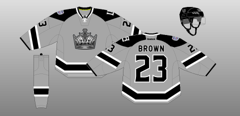 |
| Picture Credit: The (unofficial) NHL Uniform Database |
Out of all Stadium Series jerseys, this team is one of my favorite! The chromed logo really fit this jersey nicely. Grey as the team's main color on this jersey is really an eye catcher. I got nothing to say about this, despite of the tilted TV numbers, this one is an solid SS jersey.
4. Detroit Red Wings
 |
| Picture Credit: The (unofficial) NHL Uniform Database |
Classic, and nostalgia. The stripes are wisely place, straight nameplate is fine with me, numbers are classy, and the logo pure classic. The downer is the word mark above the logo make it busy, and vintage white, really? Overall: Good WC jersey but two things kept it away from the top 3.
3. New Jersey Devils
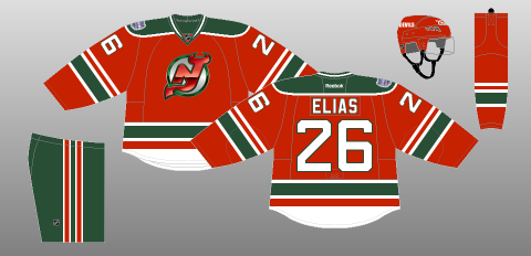 |
| Picture Credit: The (unofficial) NHL Uniform Database |
Even though the logo is chromed, but glad that this team did not followed the other teams that give jersey collectors an eye sore. Base on the team's first ever set. Overall: Very classic jersey, favorable, and why haven't the team promote it to full time 3rd?
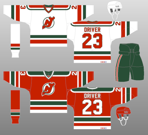
2. Toronto Maple Leafs
 |
| Picture Credit: The (unofficial) NHL Uniform Database |
Stripes, stripes, stripes everywhere on this jersey! Despite I hate this team, but you got to give them credit they know how to present classic jerseys nicely. Overall: Nice WC jersey from an team I hate.
And the Number 1 of the top 11 NHL Outdoor games jersey is.....
1. Ottawa Senators
 |
| Picture Credit: The (unofficial) NHL Uniform Database |
I'm going off the record and say that I hate vintage white, such a overrated colored, but this one was used very well done to my taste. An vintage white version of the team's current 3rd jersey. Nice stripes that is well balanced that is simple but great. Overall: Vintage white or true white make it full time road along with the current 3rd as home to replaced the team's current set.
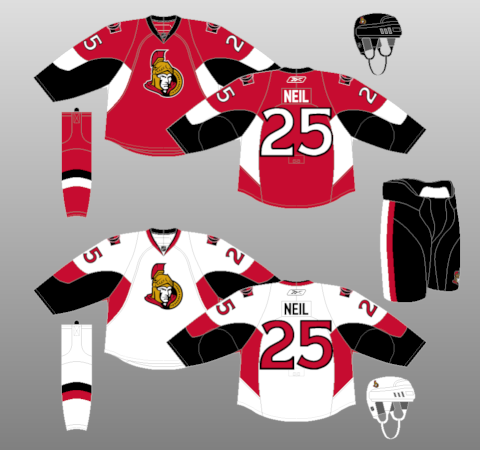
And that's my top 11 NHL Outdoor games jerseys hope you'll enjoy the Winter Classic, and other outdoor games, until then, I'm Alan, I'll get elbow to my head, so you don't have to.
Subscribe to:
Posts (Atom)