Saturday, 30 August 2014

Summer of Concept Contributor: The Finale!

Hello I'm Alan, I'll get elbow to my head, so you don't have to. Today marks the last week of  "Summer of Concept Contributor," and marks the 25th concept contributor post! This week contributor is a contributor that start it all, it was back in 2012, he is Steven G from SG-94. This link was the first concept contributor post featuring Steven. Now this time is Steve G send me a concept base on my favorite OHL team the London Knights.

Up Points: The stripes on both dark, and white are placed right. Love the addition of stripes at the end of the yoke on the white jersey. Nice call on the numbers and nameplate fonts. Lastly even thou I preferred the modern Knight logo, but the way the jersey was put together nicely to help the old school logo look good.
Down Point: The number fonts is a good choice but 1 trim around looks too plain to me.
My Suggestion: Add one more trim around the numbers, add green to the collar on the white jersey.

Well with this post done means the "Summer of Concept Contributor" is over, hope you all enjoy the rest of the summer, as well I would like to thank everyone who send their concepts to me to make this happen. Thank you guys! We will be going back to our normal posts hopefully soon, until then I'm Alan, I'll get elbow to my head, so you don't have to.

Saturday, 23 August 2014

Summer of Concept Contributor: Red vs. Blue

Hello I'm Alan, I'll get elbow to my head, so you don't have to. Well this week is once again another double concept contributor post in week 8 of "Summer of Concept Contributor" once again it's Ricky's turn. Now on to the concepts.

Detroit Red Wings Concept [by Ricky]
Ricky give us a Red wings concept that out of this world. Well not exactly out of this world, but close enough, just putting the team's main logo on the shoulder, two stripes on the arms, straight nameplate is alright with me, and lastly word mark with drop shadow is a nice touch. The problem is the numbers is also drop shadow, but is black with white drop shadow, I felt like it need to be like the word mark just white with black drop shadow, and you got yourself a winner.

Montreal Canadiens Concept [by Ricky]
Up points: seeing the Habs in blue is rare a thing to see, and this one was put together smartly. Adding the yokes, and tie down collar is a nice touch. Add another trim around the numbers is alright with me.
Down points: The only things I can come up with are lack of red trims on the wrist cuffs, and trims on the bottom of the hem.
My suggestion: See the down points.

Well that's this week, next week will be the last of the "Summer of Concept Contributor" and this one is special to me, a concept from a contributor that start it all back in 2012! Also next week will be my 25th concept contributor post, it'll be fun to do next week til then I'm Alan, I'll get elbow to my head, so you don't have to.

Saturday, 16 August 2014

Summer of Concept Contributor: Got some blues?

Hello I'm Alan, I'll get elbow to my head, so you don't have to. The "Summer of Concept Contributor" heart is still beating this week, Joey returns with "TWO" St.Louis Blues concept! Let's get to it.

St.Louis Blues Concept [by Joey F.]
Up point: The logo looks pretty good without the red. using the stripes base on the team's old 90's set is a good idea. The colors are blue, and yellow is a wise pick. The yokes are square but well put together and the Blues main logo as the shoulder patch save this concept.
Down points: the stripes the arms is placed way too low. The numbers is too plain to me without trims. On the road white and yellow just doesn't sit well with me. Lastly on both of them has no stitching on the jerseys, it feels less real, and more just put together without taking time to put it together nicely. 
My suggestion: rise the arm stripes up more, add trims around the numbers, and on the road switch the yellow, and blue to make it road look good. Lastly don't forget the stitching.

St.Louis Blues concept [by Joey F.]
Edited by Joey, he removed the arm stripes and put gradient style on the arms from blue to navy blue on the home, and from blue to white on the road, he also add it on the bottom side of the jersey for good measure. I felt the he should do the same on the yokes and add some yellow to the arms.

Winnipeg Jets Concept (Jake88)
We are jumping from blue and gold, to blue and red!
Up points: Love the stripes on the arms, and the shoulders and the way to use the Flyers like arm template on it that made this concept an eye popper. Nice choices on the fonts for the numbers, nameplate, and even the captain patch too! Using the logo made by Brian Goff made this concept almost complete.
Down points: I like the idea of the maple leaf on the back of the jerseys, but with the numbers on top of it made look too busy to me. both the wrist stripe and hem stripe on the dark jersey look plain to me.
My suggestion: give  both the wrist stripe and hem stripe on the dark jersey the same treatment as the hem stripes on the white jersey instead of blue make it white. I know this may torn everyone hearts but I say remove the maple leaf off the back of the jersey.
Another post done, but we got more to go next week until then I'm Alan, I'll get elbow to my head, so you don't have to.

Saturday, 9 August 2014

Summer of Concept Contributor: Beep! Beep! And Quack! Quack!

Hello I'm Alan, I'll get elbow to my head, so you don't have to. "Summer of Concept Contributor" is still rolling on with week number 6 with a double concepts from Ricky M, and one from Jake! On to the concepts.

Montreal Roadrunners Roller Hockey International concept [by Ricky M.]
The Jersey is put together nicely, I know it looks like it was just put together, but it was put together instructively. The logo fits this concept, it also fits with the Roller Hockey International. The number fonts are good, but two things, one on the road it needs black trim around the numbers, and two the front numbers really doesn't need to be there. The swirl on the hem of both jerseys is an nice touch. The colors is good even thou it got black, and navy blue with red as the main color, but it was tamed wisely.


Anaheim Ducks Concept [by Ricky M.]
Up points: Orange as the home's main color is a plus to me. Using the Ducks alternate shoulder patch as the main logo for both home, and road is a good move to me! The home, and road jerseys are well put together. The alternate jersey is normal, but good enough to me that feature the Mighty Ducks era alternate word mark logo that is recolored and looking good. Lastly the NYR's pants with the Ducks colors is a good enough for my cup of tea.
Down points: The lack of hem on both home, and road, and black color numbers, and nameplate is the only things I got beef with.
My suggestion: Add hem stripes on both home, and road jerseys. Make the numbers, and nameplate on the home jersey white.

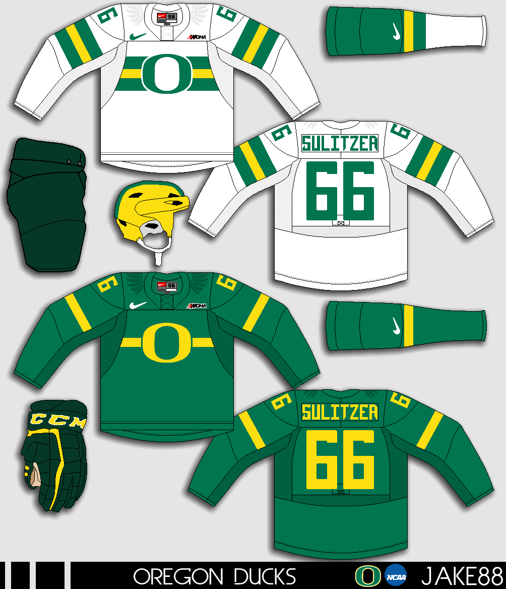
Oregon Ducks NCAA concept [by Jake88]
Up points: The chest stripes and the "O" logo fits the theme for Oregon hockey, the stripes is well done, helmet got that football theme going, and it really help makes it happen. Add small wings on the shoulders is fine with me. Lastly nice call on the fonts for both numbers, and nameplate.
Down points: The dark looks really too plain compare to the white jersey. Green pants, and green gloves doesn't match with the green on the jerseys. Fake lase nuff said.
My suggestion: Make the pants and the gloves the same colors as the jerseys. Give the stripes on the dark the same treatment as the white just switch the green, yellow, and green to yellow, green, and yellow.

Another week of  "Summer of Concept Contributor" is in the books come by next week for another one til then, I'm Alan, I'll get elbow to my head, so you don't have to.

Saturday, 2 August 2014

Summer of Concept Contributor: Heritage gone Classic

Hello I'm Alan, I'll get elbow to my head, so you don't have to. Week number 5 of the "Summer of Concept Contributor" came from Joey, this one is a Heritage Classic concept between the Leafs, and the Habs. Let's get to it.

2016 Heritage Classic Concept [by Joey F.]
Up points: The logos on both of them looks good, something simple, classy, and original! The colors are well picked wisely.
Down points: Numbers on the front is not needed to be on both them jerseys. The arm stripes on both is to low to me. Lastly the small stripes with the big stripes on both the arms, and hem are too tin to me.
My suggestion: Remove the front numbers, raise the arm stripes a little higher, and make the small stripes a little thicker to see them better.

You think that's all I got for you? Well guess again! I got 2 concepts from Jake88!

Washington Capitals concept [by Jake88]
Up points: The chest, and the under arm stripe are base on the flag of Washington D.C. and I have to say I like it! Putting the stars on the arms is always a good move to me. Lastly putting the D.C. stars inside the collar is an nice touch!
Down point/My suggestion: The only thing I have a little issue with is the stars colored in wrong order, instead of red/white, red/white, blue, and blue, it should be red/white, blue, red/white and blue.

Slovan Bratislava Alternate Concept [by Jake88]
Up points: For this "Faux-back" style alternate, this fits the team very well. Word mark logo is classy and and well placed on the jersey. Modern number fonts gave this concept an nice touch!
Down point: Nothing to say anything wrong about this one.

Well that's another week of "Summer of Concept Contributor" see you all next week for some more goodies, until then I'm Alan, I'll get elbow to my head, so you don't have to.