
Hell everyone Alan here for another non-concept post here at AJH HJA. From January 11 to January 12 the PJHL's Stodds Division did an event called "Outdoor Shiny Series" it took place at Lanspeary Park in Windsor Ontario. Six teams played in this showcase, so when it comes to outdoor games one thing comes in mind is the jerseys, one looks good, one is over gimmicky, and the rest were meh. Today I'm going to review them, but first here are the links that I got photos from each team's Facebook page I cropped some pictures to focus on the jerseys in general.
Wallaceburg Lakers Facebook Page
Wheatley Omstead Sharks Facebook Page
First, two teams for me to review them are the Lakeshore Canadiens and the Petrolia Flyers.
Lakeshore Canadiens


Blue Habs dark jersey with big white chest and arm stripes with thin red lines, while the hem got just red and white thin stripes. The numbers are standard block is white but with red and blue trims around it helps to make it readable from far away. The team's primary logo works really well with the blue jersey far better than their current set they got.
The down point is the socks don't really match with the jerseys, and that's the only thing I had a beef with it.
Overall: I hope this team decides to promote these jerseys as the new dark jersey.
Score: 8 out of 10
Petrolia Flyers


I like how they did with the stripes under the arms to the sides with the additions of maple leafs on it, the socks match it well with the jerseys.
Red and white digital camo is an alright theme, but it really not necessarily need on the whole jersey it kinda blends with blue letters that make it hard to read from far, the collar was just lazy. Lastly, the logo is very outdated and does not fit well with the jersey.
Overall: too many ideas create one lousy jersey.
Score: 3 out of 10
Now off to the next 2 teams, The Amherstburg Admiral vs Wallaceburg Lakers
Amherstburg Admiral


Believe it or not, these were the team's first jersey set from the beginning along a light blue light jersey (for real!) it's just the Pittsburgh Penguins winter classic with standard block numbers in gold along with white trim around it. I'm not going to start ranting about the logo I'll put it simply it's just old end of story. Nothing much to say anything else about this just the pants barely match with the jersey and the white helmet throws the whole thing way off.
Overall: Not very much classic from a team that started in 2013.
Score: 2 out of 10
Wallaceburg Lakers


Now I said before many time I hate vintage white/cream white colour, but there is that rare time that I'm alright with it, and this one is okay with me. Montreal Canadiens style in cream jersey as main colour along with green stripes and gold trim. Numbers works very well in this one being gold with green and cream for the trims. Black equipment throws off the look, and green socks didn't really help out either.
Overall: Good looking jersey, but the equipment and socks throw off of what could be a classic set.
Score: 5 out of 10
Last two, Wheatley Omstead Sharks vs Blenheim Blades
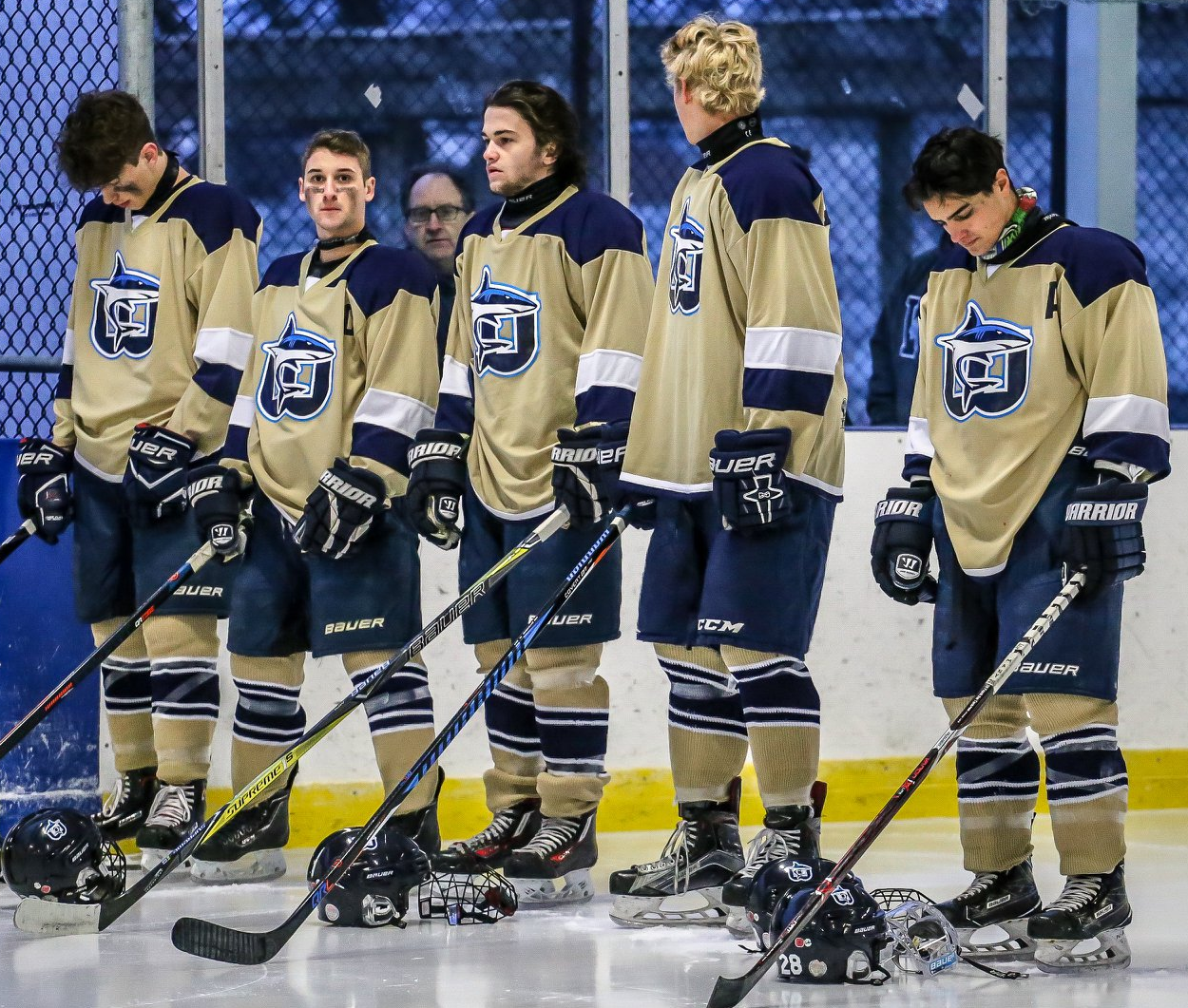
Wheatley Omstead Sharks


The logo is the best ever in this event, it's so good I'm hoping they'll make it permanent shortly. The gold jersey doesn't fit well, while there is navy blue and white are on the jersey but no light blue. Stripes and yoke are well balanced, but the socks need to match with the uniform to make it look complete.
Overall: If they make the gold either silver or light blue this one would be a good looking jersey.
Score: 6 out of 10
Blenheim Blades

 The jersey is the Vancouver Canucks old alternate 3rd with just the letter "B" on the front, that's all I can say about it. If they change the logo, nameplate and the numbers from gold to white, then it would barely look different and readable too.
Overall: It's different but not different enough.
Score: 5 out of 10
Well, hope you all not got tortured by this post. Come back next time, and there will be a concept post I promise. Until then, later.
Wheatley Omstead Sharks Facebook Page
First, two teams for me to review them are the Lakeshore Canadiens and the Petrolia Flyers.
Lakeshore Canadiens


Blue Habs dark jersey with big white chest and arm stripes with thin red lines, while the hem got just red and white thin stripes. The numbers are standard block is white but with red and blue trims around it helps to make it readable from far away. The team's primary logo works really well with the blue jersey far better than their current set they got.
The down point is the socks don't really match with the jerseys, and that's the only thing I had a beef with it.
Overall: I hope this team decides to promote these jerseys as the new dark jersey.
Score: 8 out of 10
Petrolia Flyers


I like how they did with the stripes under the arms to the sides with the additions of maple leafs on it, the socks match it well with the jerseys.
Red and white digital camo is an alright theme, but it really not necessarily need on the whole jersey it kinda blends with blue letters that make it hard to read from far, the collar was just lazy. Lastly, the logo is very outdated and does not fit well with the jersey.
Overall: too many ideas create one lousy jersey.
Score: 3 out of 10
Now off to the next 2 teams, The Amherstburg Admiral vs Wallaceburg Lakers
Amherstburg Admiral


Believe it or not, these were the team's first jersey set from the beginning along a light blue light jersey (for real!) it's just the Pittsburgh Penguins winter classic with standard block numbers in gold along with white trim around it. I'm not going to start ranting about the logo I'll put it simply it's just old end of story. Nothing much to say anything else about this just the pants barely match with the jersey and the white helmet throws the whole thing way off.
Overall: Not very much classic from a team that started in 2013.
Score: 2 out of 10
Wallaceburg Lakers


Now I said before many time I hate vintage white/cream white colour, but there is that rare time that I'm alright with it, and this one is okay with me. Montreal Canadiens style in cream jersey as main colour along with green stripes and gold trim. Numbers works very well in this one being gold with green and cream for the trims. Black equipment throws off the look, and green socks didn't really help out either.
Overall: Good looking jersey, but the equipment and socks throw off of what could be a classic set.
Score: 5 out of 10
Last two, Wheatley Omstead Sharks vs Blenheim Blades
Wheatley Omstead Sharks


The logo is the best ever in this event, it's so good I'm hoping they'll make it permanent shortly. The gold jersey doesn't fit well, while there is navy blue and white are on the jersey but no light blue. Stripes and yoke are well balanced, but the socks need to match with the uniform to make it look complete.
Overall: If they make the gold either silver or light blue this one would be a good looking jersey.
Score: 6 out of 10
Blenheim Blades


Overall: It's different but not different enough.
Score: 5 out of 10
Well, hope you all not got tortured by this post. Come back next time, and there will be a concept post I promise. Until then, later.
Amazing review. Although I'm impressed with Lakeshore's jersey style cuz of the traditional Montreal Canadiens style. But the one on Petrolia's behalf, it looked like it got paintball/graffiti-like. And the rest seem a bit ok, but not good enough.
ReplyDelete