Hello, everyone Alan here for the final part of my top 31 NHL 2017-18 set here at AJH HJA. Let’s not waste any time and finish this baby off.
10. Montreal Canadiens
 |
| Source: NHL Uniform Database |
One of those teams that had designs on their jerseys that are untouchable which I’m ok with it. Sadly, the only issue I have a beef with is the collar, they did alright with the home but the road they miss the mark with it if they made the white blue then I could be alright with the set.
9. Detroit Red Wings
 |
| Source: NHL Uniform Database |
To some, it’s plain old same old design, but to me, it’s a classic, the logo is beautiful, the stripes are good. The thing I would like to see improvement from this pretty much add laces to the collars put the stadium series “D” logo on the shoulders, and update the wordmark logo on the helmets and this set will be in my mind can sit in the top 3.
8. Chicago Blackhawks
 |
| Source: NHL Uniform Database |
Their set is classic and well earned to be in my top 10 list, the collar is the issue I got beef with that kept it away from being in the top 5 if they fix the collar up with the addition of laces this one would be a winner.
7. Los Angeles Kings
 |
| Source: NHL Uniform Database |
To many, it’s not the greatest but they are my favourite. The design of the jerseys is nice, I like the font on the numbers it really fits the team’s theme very well. If they just make the crown as the main logo and put the “LA” on the shoulders this set would easily be on my top 5 no ifs or buts about it.
6. Winnipeg Jets
 |
| Source: NHL Uniform Database |
To tell you all the truth I really love this set it got good stripes, modern fonts for both letters and numbers, and the logos fit the team very well. I got nothing to say anything bad about it. Well besides the collars that is.
5. St. Louis Blues
 |
| Source: NHL Uniform Database |
The Blue went from having a one-hit wonder set from 2007 to 2014 to a set that really fit the team very well, as they carried over to Adidas with some additions to the jerseys, it’s clean and sharp and kept the blue and navy blue apart from each other. Overall a darn good set for the Blues.
4. Toronto Maple Leafs
 |
| Source: NHL Uniform Database |
The collars are bad that’s understandable, but the jerseys they got is excellent, the stripes are nicely well placed, the numbers and nameplate fonts are very traditional, and lastly the logo it’s the best old school/upgrade that this team needed in a long time. The only thing I felt that they should bring back the shoulder patch they wore from 2010 to 2016 if they brought that back this set would be a winner in my book despite how much I hate this team.
3. New York Rangers
 |
| Source: NHL Uniform Database |
Another team with a classic set that in general untouchable with their nameplate vertically arched like Detroit but with their famous drop shadow trim that works so nicely, one of those team that can pull off wordmark logo on the front jersey very well, and the colours are fantastic. Just another classic team with a classic look that doesn’t need any change to it.
2. Pittsburgh Penguins
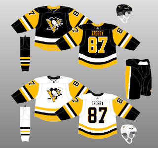 |
| Source: NHL Uniform Database |
The Pens had one of worst set from 2007 to 2016 it was painful to even with two winter classic alternate weren’t enough to help them until they brought out the classic set base on the team’s Stanley Cup run from 1988 to 1992 with a hem fix on the road it’s a wonderful set and it carried over to Adidas very well despite the collar issue it didn’t hurt the set enough to be on my top 3.
And the number 1 of my top 31 2017-18 NHL Jersey is
1. Boston Bruins
 |
| Source: NHL Uniform Database |
This set is somewhat same as the Reebok era but thanks to Adidas the set works so well, the yokes on the Adidas is better then the Reebok set, both the letters and numbers may have now just one trim but it’s more readable than the Reebok one, lastly, they kept it classic and full with their collars not like one those half colour collar like most other teams got. Oh, another thing, remember their old Reebok 3rd jerseys that got black socks to go along with them? Well, the home jersey got them replacing their historic gold socks with black and the home jersey looked more complete then ever and that’s why this team is number 1 of my top 31.
So that’s my what do you’ll think do you guys agreed or disagreed with me what’s your top 31 or at least top 10. Come back next week for more concepts both by me and requested until then, later.


Wonderful top 10 of jersey sets. Well-deserved. Although the Red Wings', Blackhawks' & Canadiens' sets looks perfectly well mostly cuz of tradtion, but the same goes for the Rangers', Penguins' & Bruins' sets being on the top 5.
ReplyDeleteBut I will admit, the Jets' set looks very cool in its modern flavor since coming back in early 2012 or so. In the end, the transitions of the modifications under the Adidas template for all teams had paid off.