
Hello everyone Alan here for today's post, from my last post I forgot to link a font site, it's J-LOG Custom Fonts. It's a font site made by John O. go and check it out!
Well to try for myself to get back on track I got a concept, a Stadium Series Concept that is. Today Colorado Avalanche. But First I'm reviewing their 2016 Stadium Series Jersey, and their new alternate jersey.
Stadium Series
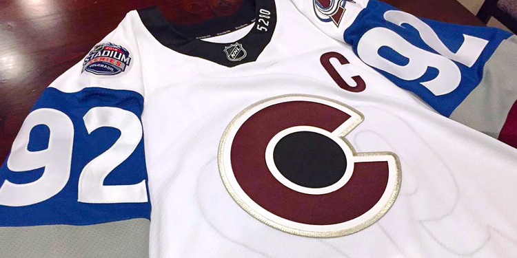
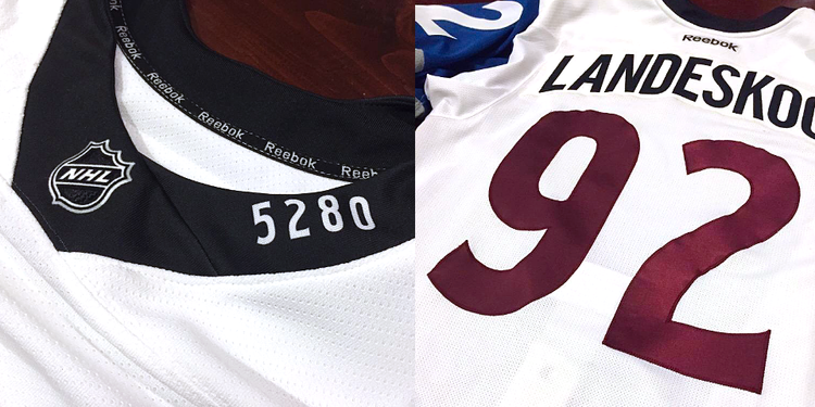
This is not Avalanche! This is a Disaster! Bad stripes, over size TV numbers, awful collar, and the list goes on. Just terrible jersey one of worst.
Alternate Jersey
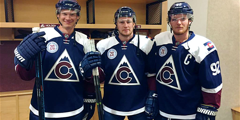
Let see here, they call it a tribute to the state's hockey history. Hey Guys here's an idea how about using one of these as your alternate jersey! The logo is fine and all, nice nod to the old Rockies, but in my opinion it belongs on the shoulders not on the front. Navy jersey is good, but with the white yokes ruins it. Lastly the number fonts is new and fresh, but lacks trims. Overall: Could have been a good alternate jersey, but the things I talked about keeps me away from buying this one, even at 50% off.
With that of the way it's time for my Stadium Series Concept as part of the HJC's Stadium Series contest few months ago, let's take a look.
Well to try for myself to get back on track I got a concept, a Stadium Series Concept that is. Today Colorado Avalanche. But First I'm reviewing their 2016 Stadium Series Jersey, and their new alternate jersey.
Stadium Series
 |
| image from http://www.icethetics.co/ |
 |
| image from http://www.icethetics.co/ |
Alternate Jersey
 |
| image from http://www.icethetics.co/ |
With that of the way it's time for my Stadium Series Concept as part of the HJC's Stadium Series contest few months ago, let's take a look.

Well this post is done. I'll try my best to keep this boat going, til then later.
No comments:
Post a Comment