
Hi everyone, Alan here for the final week of my "NHL Adidas series" and what better way to finish it off with my favorite team the Winnipeg Jets!
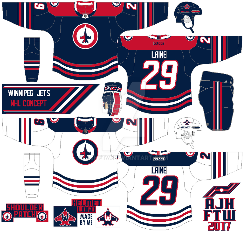
The design is based on the team’s WHA days with modified yoke. Removed the maple leaf off the logo and recolor it for both front of the jersey and on the shoulder. The helmet logo is made by me a different form jet with a “W” on top of it. Lastly, I kept the team’s current font to make this concept complete.
HJC Feedback
Well this series is in the books, yes there were scores from 7 to close to 5 from HJC, to a shocking first COTW win since May 2013. In the end, this was a ride I'll never forget, I went through busy schedules, to fan requests, to the passing of my grandmother, but I did it.
That's all for now, see you next week for my NHL Adidas concept extra! Until then, later.
Looks amazing the concept. Love the red as a primary color, and no offense to the Jets fans who see the sky blue color by the way. I bet this how would the Jets looked like if they had that shade of red & navy blue, if the franchise didn't had to relocate to Phoenix at that time.
ReplyDelete