
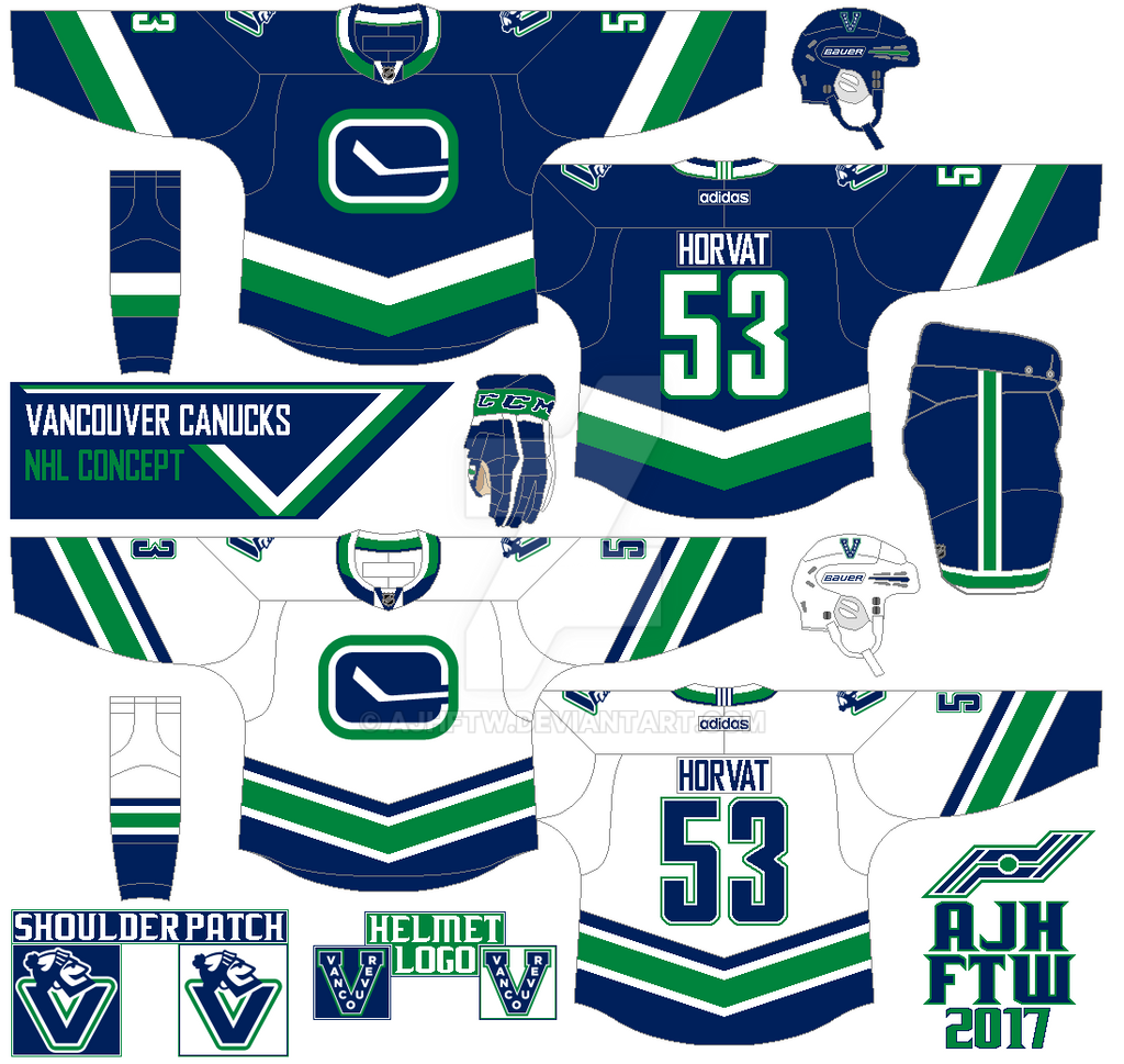
The main logo is the modern stick in the rink logo without the silver trim, using Johnny Canuck head above the “V” logo for the shoulders. Arms, and hem stripes are slanted into a V-shape including the shoulder yoke. The team’s current font is used on both nameplate and the numbers. Add thick trim around the numbers on the dark, while the white jersey got two thin trims but the nameplate on both jerseys does not. If you look closely at the collar on both jerseys has a “V” behind the NHL shield logo.
That's what I call a cool variation for a concept of a team of tradition. Very impressive as well.
ReplyDelete