
Hello readers, Alan here to keep this ship staying on course here on AJH HJA. Today is an AHL concept that has been stuck in my head since this team came into scene, today it's the San Jose Barracuda.
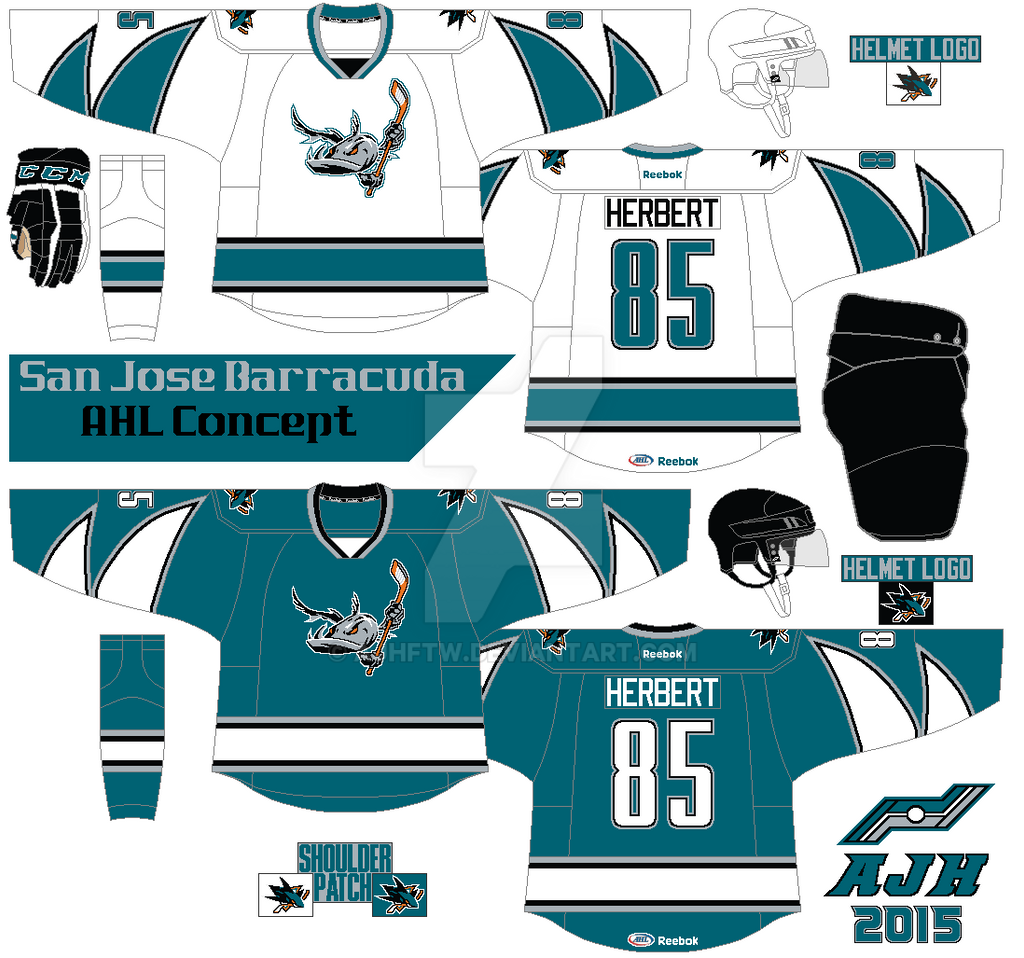
First up the logo, I remove the corporate logo background behind the barracuda, and remove the grin off the barracuda to make it look better to my taste. The arm stripes is base on the team's corporate logo. The colors are teal, black, and silver, I choose silver over orange because I felt it doesn't fit this concept to my taste. Lastly I use the Sharks old number fonts before the edge era.
HJC Feedback
Icethetics Feedback
Well this weekend is in the books, hopefully I got some more in line for the next weekend til then, later.
HJC Feedback
Icethetics Feedback
Well this weekend is in the books, hopefully I got some more in line for the next weekend til then, later.
Honestly, I dig the concept, from the 2000's Sharks number font to the shark fins on the sleeves. Fabulous job.
ReplyDelete